Analysis Ninjas: Move Beyond The Top Ten. Find Love (/Insights).
 You know what is the one thing stopping you from finding truly actionable insights from your web data?
Web analytics gems lie deep in the data and we spend our lives looking at the top ten rows of data.
It does not matter which report you look at. Affiliates. Products sold. Referring URL's. Pages viewed. Search keywords. Promotions. Geographies. Really pick any report with any dimension you want to look at, we spend our time (and valuable space on our dashboards) looking at the top ten.
We look at the top ten rows of data because:
1. Too much data from our web analytics tools.
2. Lack of clarity from our business leaders about what the site is solving for.
3. Not enough hours in the day to overcome challenge #1 and #2.
But if you just look at the top ten rows of anything here are the two corrosive problems:
1. The top ten of anything rarely changes (with the exception of hourly changing content – news – sites).
2. The top ten only focuses on the head, while the magic is in the long tail of anything. Magic related to finding challenges in your business. Magic related to finding opportunities. Magic that will help identify things you can actually action.
Allow me to make the case for you to look beyond the top ten rows in your reports by sharing three short stories. In each case I request you to look beyond the specific request and tool, rather focus on the analysis and how you could possibly apply it. I hope is to inspire, not to prescribe.
For example take a look at this report. . . .
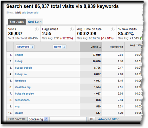
I am sure when you look at it now it appears all mysterious, full of potential. You can't wait to take it out for a first date and then another and by the third date if you do the same old thing it gets boring. You are done looking at the bounce rates and time on site and conversions of these keywords. In the best case scenario you have even optimized landing pages. Good.
The first week's over, now want? Why keep reporting the top ten keywords on you Executive Management Global KPI Dashboard?
Look at the top of that table. For this website 86,837 visits came from 8,939 keywords!
What's going on with the other 8,929 keywords?
We never bother with them both because it is really hard to look at more than 10 rows of data. Harder still to look at 30 or 50 or 70 rows of data. Not only do we have a hard time interpreting insights from lots of data, we can't actually physically look at that much data and find insights.
Last month this blog received 40,662 Visits from 26,137 key words. The top 12 keywords accounted for 5k visits. The other 26,125 keywords accounted for 35k visits! By analyzing just the top ten see how many visitors I would be ignoring?
Here are three techniques I use to overcome the trap of the top ten rows. . . .
1. Advanced Table Filtering.
In the past we all used the standard reports that our web analytics tools churned out.
I don't do that any more. If you show me a report and it is not a custom report that you have created to better pull relevant kpi's into one place then please know that I will think less of you.
A sign of non-laziness is that you bother to atleast create custom reports. A best practice is to pull atleast some input metrics (Visits) with some attribute metrics (% New Visits), have something that denotes customer behavior (bounce rate) and it is criminal not to have atleast a couple outcome metrics (goal conversion rate, per visit goal value).
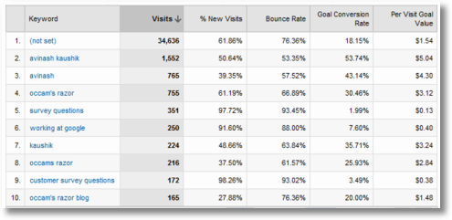
That best practice gives me this report for my search keywords. . . .
[Click on the image for a higher resolution version.]
It is a useful report that helps me understand performance much better than the standard reports from Omniture, Google Analytics, WebTrends etc etc.
But remember I have twenty six thousand keywords referring traffic to this blog.
I want to very efficiently look through them to find something useful.
I want to locate my most important brand terms that perform magnificently for me. To accomplish that I click the link called Advanced Filter under that table and do this. . . .
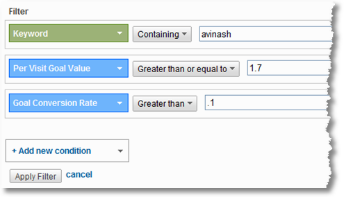
I move beyond the limitation of the top ten rows by creating a simple inline filter.
Find keywords:
containing "avinash"
where the "per visit goal value" is greater than $1.7 (a higher bar since the average is 1.3) and
the Goal Conversion Rate is greater than 10% (again another high bar compared to the site average)
Notice that I can only run a smarter query because I had created a custom report, without it I would have to use the "lame" metrics that I might get in the standard report (or immediately proceed to extracting all the data, all metrics and spending next four hours in excel doing what I can in two seconds in Analytics).
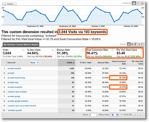
In a second the table transforms into. . . .
[Click on the image for a higher resolution version.]
You know what's in the table?
Keywords we should make love to because regardless of if they bring a lot of traffic or little, they hugely deliver to the bottom line. Making love might be too small a emotion when you realize compared to a site average of $1.3 the per visit goal value is $5.5. And look at that conversion rate!
Also notice up top. . . I quickly went from tens of thousands of keywords to just 193 I should focus on. I need to analyze these keywords, search engines, landing pages, products sold, leads received, and so much more to figure out:
1. what is going on here that is so right that it works like magic and
2. how much can I replicate the lessons learned
Far too often we focus on our losers. Here I start by focusing on winners and see if I can do more of what I know already works.
I could just as well have mined my data to look for
-
people on non-branded terms
people who come on every variation of the names of my two books
people who come from China
people who use a cluster of terms I consider most competitive or. . .
The limit to the data I can mine (and I use that word loosely here) is the imagination I have (or better put: the intelligence I possess about important business questions).
So do this. Use inline advanced table filters to go from tens of thousands of rows to just a few that you need to focus on.
Yes you can absolutely do this in Excel. But it will take you five times the amount of time and effort required because. . . please pay attention. . . in this case you are querying the entire dataset of your website and in Excel you'll keep going back and forth to get more data or dump it or write more complicated queried or. . . you catch my drift.
Advanced Table Filters can be used in any report in Google Analytics (Yahoo! Web Analytics also has a very similar feature, actually YWA had it before GA! :)).
The one limitation of the approach is that you'll more optimally analyze your known knowns. You'll even get to understanding your known unknowns. But not your unknown unknowns.
For pulling lots of data from lots of rows all together into one place I do so love tag clouds.
Download all your keywords into a text file (twenty six thousand or so in my case) and upload them into Wordle and bam!
[Click on the image for a higher resolution version.]
O M G!
Did you think that by doing something so simple you could get such a quickly glance-able view of so much data?
I love search keyword tag clouds because they can tell you about the health of the company when it comes to search.
In my case, above, for example I LOVE the fact that above and beyond everything the word Analytics dominates it all, and what makes me happier is that the word Survey is so prominent (you all know I love qualitative data, now here is proof that my blog attracts so much of that traffic).
I worry a smidgen that people will think this blog is about Google Analytics, it is not, so I am happy that the word Google appears atleast as much as the word Web (and variations like website and online etc). I can't drill down in wordle so easily, but I use technique #1 (above) and it turns out 30% of the time the word Google appears in search queries in the spirit of "working for google", and another 30% for queries like "google insights for search", "google ad planner" etc (tools I have blog posts on). My mind is relieved.
See how I can understand about a strategic concern, at least a bit, using a technique as simple as a tag cloud?
Another thing I am rather ecstatic about is the sheer diversity of the keywords in search queries. It is not my brand that dominates (boo hoo! cry cry!) but rather "category" terms (which bring the "impression virgins"). Metrics and Conversion and Data and Questions (look at that!) and Analysis and Customer and Intelligence and Bounce and Best. . . .
That sweet spread validates some my Search Engine Optimization strategy (something I spend a lot of time on) – go for diversity and attract new people to my "franchisee".
Or in your case it may not. It may tell you different things. The main point is it would be hard to understand some of these macro factors in your data by looking just at a table in your web metrics tool of the top ten keywords!
Here is a tag cloud for a small company you might have heard of, Gatorade. The data does not come from them (obviously), it is from Compete. . . .
[Click on the image for a higher resolution version.]
I am not a SEO expert, can't underscore that enough, but everything that could possibly be sub optimal about seo/ppc is wrong with Gatorade.
The one brand term dominates their referring search keywords. This in of itself is not a bad thing, Gatorade is a huge brand. But what it indicates clearly that their site attracts people who already know Gatorade and are "pre converted", when perhaps a greater use of the website would be to attract the impression virgins and blow them away with the greatness of Gatorade so they'll never consider Powerade or any other brand.
Look at the diversity of keywords.
Find any?
People use tens and thousands of different ways to find even a web analytics blog. Look at how much different types of content there is on Gatorade.com and MissionG.com and Gssiweb.com and it is quite clear that Gatorade's tag cloud is telling a sad story.
Finally for all the money that Gatorade is handing out to premier current athletes (and the really expensive content Gatorade has on its website related to those top athletes) only two show up in the tag cloud. One that used to be important (though he is still a big brand) and the other that sadly ran over a fire hydrant a couple weeks back. That shows how exposed the Gatorade brand (atleast online) is should something unfavorable happen to these two guys.
I would humbly dramatically change Gatorade's SEO and PPC strategies tomorrow morning.
It is amazing how when you have so much data in one place, using such a simple technique, that you can find some very intriguing patterns in your data, stories that might validate what you are doing right or expose everything that is wrong with your digital strategy.
Simple but effective. Try it for your site. What do you find?
This is my latest love. I mean it.
I was so happy when I first saw it because of this constant quest I am on to take lots of data and show it on a page.
Zach and the team at Juice Analytics have created two powerful visualizations: Referrer Flow and Keyword Tree.
I adore that last one.
You simply go to http://analyticsvisualizations.appspot.com click on Keyword Tree and you are on your way!
The visualization uses the free, open and multifaceted Google Analytics API. In a few seconds you'll get something pretty and intelligent (how often have you seen those two together :)). . . .
[Click on the image for a higher resolution version.]
It's a tree. With branches. :)
While in the case of tag clouds it is difficult to understand the relationships between different words that exist in your search queries, that is not the case with keyword trees.
I was looking up the relationships for the word "avinash", image above, click for a higher resolution version. I am looking at hundreds upon hundreds of rows of data visualized all in one page.
I can easily see long tail queries like "top 10 key metrics web analytics avinash" or head ones like "kaushik blog" or even "kaushik web analytics 2.0 pdf" (my book is not available in pdf form but now I know lots of people are looking for it and so maybe we should get it out fast!).
I can simply walk through the various branches of the tree and it helps me understand in a very powerful way the relationships that exist in my data. It always throws up surprises (partly because of my top ten rows table driven existence I have never actually looked at so much data in such a easy to understand way).
The fun though does not stop here. I can actually look at keyword trees using different metrics.
In this view I am looking at the data for the keyword "tracking", the colors shown highlight the bounce rate metric for each relationship. . . .
[Click on the image for a higher resolution version to be truly impressed!]
Now I know the queries that stink like a skunk, the deep reds, and find some sweet ones, "event tracking" is one such word (lots of visits with very little bounce).
But I can switch and say. . . . well our bounce rates stink so we'll not use that as a success metric :), let's use the % of New Visitors as a success metric. Ok no problem, press the button on the control panel on the right and. . . .
[Click on the image for a higher resolution version to be truly impressed!]
Notice the relationships change, the queries you would have paid attention to will change, what you will action will change. Just with the press of a button.
You can also flip the size of the words. I am using Visits in both cases above, but you can just as easily go for quality (in this case) and use New Visits. I would love to see some kind of Outcome metric there, given my passionate and sustained obsession with measuring end success.
You can do lots of true analysis, for free, with your data and get the kind of insights tables from Google Analytics and Yahoo! Web Analytics and WebTrends and CoreMetrics simply can't provide.
Let me share two snapshots to make that point.
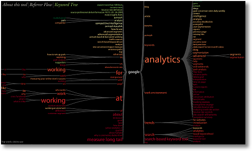
I was genuinely shocked at the complexity of the tree and branches associated with the word "google". . . .
[Click on the image for a higher resolution version to absorb the whole thing!]
The darn thing did not even fit my laptop monitor (1440×900), and there was so much going on that it took me a while to absorb all the lessons.
Meanwhile for the "analytics" branch I can see, at a glance, the 70 or so queries that cause the "main flare" and it gives me a peek into the the head of my visitors unlike anything else. Talk about collecting VOC (and actually understanding it!!).
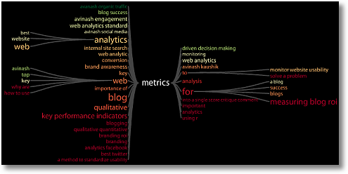
On the other hand I was quite saddened to see the report for the word "metrics". . . .
[Click on the image for a higher resolution version.]
Remember this blog is all about data and metrics. Yet the tree is so "shallow". Or better put it is less a tree and more a bush. Or maybe just a shrub.
For all of the reasons I was less than thrilled with the gatorade data in #2, I am less than thrilled here. From competitive intelligence analysis I know that there is a ton of volume on Google for queries related to "web metrics", and variations, yet I have not done a good job of attracting that traffic.
The above picture does not simply tell me that I need to do a better job of doing SEO for "web metrics", the real lesson is that I need to put in a ton of effort to attract the long tail for "web metrics" because that is where most of the volume is.
You will probably find other lessons from this exercise on your data. Hopefully there is no doubt by now that valuable lessons do await you if you put in the effort to start switching from using tables and excel and shift to using other data analysis / visualization techniques.
Each effort above uses something very simple and while none of them are a panacea, your understanding of web metrics data will not be the same boring self.
Have fun.
[Bonus Item: #4: One strategy to escape the top x rows is listed in the second half of this post, jump to just after the picture of Tiger Woods (!!): Focus On “What’s Changed”.]
Ok… your turn now.
What do you think of these strategies? Have you used them before? Worked for you? Have you used other data visualization techniques that liberate you from the trap of top ten rows? What tools do you use? Got models / approaches / strategies you want to share?
We would all love to learn form you. Please share. Thank you.
PS:
Couple other related posts you might find interesting:
- “Dear Avinash”: Be Awesome At Comparing KPI Trends Over Time
- Consultants, Analysts: Present Impactful Analysis, Insightful Reports
- How Thick is Your Head and How Long is Your Tail?
- Make Web Analytics Actionable: Focus On “What’s Changed”
- Web Data Quality: A 6 Step Process To Evolve Your Mental Model







December 21st, 2009 at 06:59
Excellent post as always. BTW do you know how to export every single keyword in GA? The maximum allowed is 500 rows so in your case you will have to download 52 different sets.
Thanks for the lesson.
December 21st, 2009 at 07:05
Great post Avinash. Please don't think too less of us, but we've fallen in to this trap a bunch, but are doing much better at using Custom Reports and Advanced Filters. We just learned of Juice Analytics' Keyword Tree from a post at SEO Moz a couple of weeks ago. We've used Wordle in our company for several months and I very much agree that it is a great tool for gaining quick insight using a large volumes of unstructured qualitative data. We've used it for customer satisfaction survey data, emails to our customer service department, search terms and more.
December 21st, 2009 at 07:48
I think Advanced Table Filtering in GA is one of the best releases that GA has ever had. That + secondary dimensions really helps me out a lot. I'm very glad to see that you blogged here about it Avinash!
As far as my techniques go – well you'll probably laugh but I use column sorting in my report tables a lot! Sorting by a metric was "OK" before, but now with Advanced Segments and Advanced Table Filtering, I can remove insignificant-volume keywords / pages / campaigns (insignificant meaning ones that get less that 5 or 10 visits, or something like that), and focus on the relevant, statistically significant ones. Yes folks, column-sorting :)
Have a happy new year!!!
December 21st, 2009 at 08:37
I have to say that this is one the "funnest" blogs so far. I love the long-tail keyword tool and tag cloud ideas. I had to play with both of them right away and after showing that data to my boss we're planning on using these fun & insightful tools to motivate our editors to properly tag their content on our sites and give "unrecognized" keywords on their end more value.
Thanks for posting this, Avinash!
December 21st, 2009 at 09:12
Hi, Avinash,
Great post as always.
As for search terms the first problem indeed is their number, the second is the typing errors.
Something like text mining seems to be interesting for reducing the number of search terms (search phrases) to a limited number of categories. Text mining could handle this : typo correction, synonyms, automatic categorisation.
Any ideas on this ?
December 21st, 2009 at 11:19
Wordle and Keyword Tree – Best Christmas Gifts yet. Thank you! Wordle will be great to show the executives and Keyword Tree is so helpful for SEM, SEO and site usability for our team.
December 21st, 2009 at 12:31
Thanks Avinash for a great post. Interesting that you mention about information overload because just yesterday I was tweeting about the need to balance information scarcity and attention scarcity. Sometimes in trying to resolve a situation where we have no data, we end up having a solution that pukes too much data without insights — and with folks not paying attention to what is important (because of info overload and lack of clear goals as you point out) results in that solution being used sub-optimally.
I am always for learning about new tools and techniques that makes my job easier and gives more actionable insights — and today I got a new one to play with (keyword trees)- Thanks! :-). I have done branded vs category keywords analysis before but this seem to open some new doors for me.
December 21st, 2009 at 15:29
Good stuff, but I'm not sure I would go along with the data from your word cloud being evidence that Gatorade isn't visible for non-converts. You're going to see a similar word cloud for any brand of Gatorade's marketing girth, and quite honestly, I would say something is amiss in the offline if they aren't hording all the branded traffic. Not to mention, that cloud tells us very little about the concepts people are associating with Gatorade (unless you have like, a microscope or something). With a site/presence like theirs, that data is absolutely crucial to content/optimization decisions. I wrote a blog on my site that elaborates on this.
December 21st, 2009 at 16:26
Juice's Keyword tree doesn't work.
I tried it several months ago and it didn't work then and it doesn't work now.
Maybe there's still some bugs in it.
Let me know when they get it working properly.
December 21st, 2009 at 20:47
Thanks for posting this, Avinash!
Excellent post.
Have a happy new year!!!
December 21st, 2009 at 23:07
Great Article!!
"Advanced Table Filtering" is the point I completely relate to.
I am trying to use Juice’s Keyword tree, logged in through GA, but cant get it to work!!
December 22nd, 2009 at 01:45
Fred: You can use the &limit=xxxxx parameter in the url to get as much data as you want. More details here:
Back to Basics: Tip for exporting rows
Of course you can also of course use the GA API to pull out every single row of your data from Google. You would use something like…
https://www.google.com/analytics/feeds/data?ids=ga:xxxx&dimensions=ga:keyword,ga:medium&metrics=ga:visits,ga:transactionRevenue,ga:transactions&start-date=2009-12-01&end-date=2010-01-01&max-results=10000
Joe: Nothing to be ashamed of!! Column sorting can be very useful. :)
Zyxo: I am slightly confused about the question.
Is your concern about the search queries people wrongly type into Google/Bing/Yahoo? In that case I think the search engines are getting really really smart about suggesting correct spelling as you type or after you see the search results.
Or is the concern that people type the wrong thing into the search engine, then come to your site and now you want to teach the right spelling?
If you could please share some context I'll be happy to see if I can answer.
Dave: I completely understand your concern.
The gatorade tag cloud is just one part of a more exhaustive analysis I had done, sadly I can't share all that context. But if you go look at the overall story (using CI tools) of the gatorade performance then I think in that context you'll see some of the points I made.
With regards to other concepts in your comment….
I encourage you to click on the image on the blog and view the large sized version, that will surely illuminate a few more key points.
I also encourage you to think of how much value gatorade is getting from other concepts if even with a high resolution version you need a microscope to seem them. See my point?
Thank so much for sharing your feedback, much appreciated.
-Avinash.
December 22nd, 2009 at 02:06
Hi,
tnx for the 2 new applications to play with!
One thought though
when I print out my keywords for the cloud. it is in a list with "keyword" and "number of searches on it"
Does this not influence my cloud?
example
keystring A B C is searched 1000 times
keystring D is searched 10 times
keystring D E is searched 1 time
in the cloud D is biggest while it is only searched 11 times! I think you should warn for that "hickup" in your post.
sidequestion, do you know a way to export keywords (in google analytics) in a way to avoid above example?
cheers
December 22nd, 2009 at 07:31
Djemmers: The tag cloud is distinct from visits generated by individual search queries (the things you see in your GA, Omniture, WebTrends search report). It is looking for existence of words in search qieries.
In as much Wordle is not taking into account how many times a word is in search queries. Only how many times a word exists in the data (without making any judgment on the value of it as in Visits or Conversions).
As in my example (the first tag cloud in the post) it is simply telling me how diversified the words are, if the words I want show up often enough, how many times the word kaushik appears. It just validates my SEO strategy.
Then I go to step 2, trying to figure out where I am making money. :)
There are tag clouds that will use Visits to do the size (as in the case of the Juice keyword trees) and even use the color of the word to show bounce rates or conversions. But sadly Wordle does not do that.
I hope this helps.
Avinash.
December 22nd, 2009 at 09:10
Hello Avinash -
An excellent post, thanks. I read your post and about five others as a year end overview of analytics, seo, and sem strategy and tactics. It influenced me to write a related post in this "conversation of blogs" – http://www.webfadds.com/2009/12/the-art-science-of-keywords-conversions/
I agree with you about delving deeper into Analytics via filters and custom reports, and I too enjoy the visual look at things you covered in your article. What's interesting is that I use a tag cloud widget in my footer area that returns different results than the Wordle.net cloud. Since it tracks what people click on at the site, it may be more useful. For example, WordPress is more prominent in that cloud than in the one generated by Wordle.net.
I am still working with clients to help them understand how to tie this to $ goal values — more education is in order.
Best to you in the holidays -
Scott
December 22nd, 2009 at 09:18
In the game of Go, there's a concept of "good shape" (http://en.wikipedia.org/wiki/Shape_(Go)) , which means your stones are in mutually supporting, efficient positions. Good players can see good shape and bad shape at a glance.
Tools like our Keyword Tree and Wordle make those concepts visible to search analysts. Comparing the Wordles for Gatorade and your site shows Gatorade's "bad shape" — and it would be much, much worse if Worldle sized for traffic.
Our goal with the Keyword Tree (and Referrer Flow) is to make concepts like "healthy" and "unhealthy" traffic visually distinct–so you can see what "good shape" and "bad shape" look like.
We have had occasional problems with the Google authentication system–if you're having problems with the Keyword Tree, try clicking the "Change Google Analytics account" on the main page, then "Sign in as a different user" on the login page. Sign in with your usual Google Analytics account. You can email me at chris.gemignani@juiceanalytics.com if you're having trouble.
December 22nd, 2009 at 10:59
Avinash, This is mind blowing!
I love the keyword tree. I didn't know about this tool. So I'll have to play with it a little bit more. I am sure the users are loving it. Visual tools makes life so much more easier.
As for the Tag Clouds, why do I have a feeling that the same Gatorade instance will happen for a lot of the businesses ? The simple reason being, branded keywords comprise of a chunk of the search. Separating out Paid vs. Unpaid might lend a more unbiased outcome. What do you think?
Best of Luck for all the good things you are doing for the global Analyst community.
December 23rd, 2009 at 02:58
Great post as always Avinash!
I use Wordle for SEO but i never thought of that.
One question though: you say, "Download all your keywords into a text file" and in Google Analytics, i can only download 500.
Any idea?
Charly Wargnier
December 23rd, 2009 at 03:39
Bibi: You are right that for strong brands the tag cloud would be "concentrated". My humble perspective is that in our wonderful world of fragmented audiences where we can reach deep, that it should not be.
Segmenting with paid and organic would be of value. My experience is that the organic one will look much more diversified and the ppc one will look a lot more focused. But either way the analysis would certainly be of value.
Thank you!
Avinash.
December 23rd, 2009 at 04:44
Yo Avinash
You have a way of showing us how to use mountains of data and- as the guy in that movie says, "explain it to me like i'm a 3 yr old"!!! lolz
Great job!
Keep em coming…will definitely try out the word tree and whats changed.
S
December 23rd, 2009 at 14:24
I always look forward to the new tools you share with your readers. Wordle and Juice Analytics were a very neat new way to view data. Thanks so much!
December 26th, 2009 at 17:02
Avinash -
This was such a great post. Thank you for sharing Wordle and Juice Analytics. I cannot wait to leverage them for insights.
The advanced filters from GA have made analysis so much easier. I have been using them for about a month or so now and the level of insight i can get has raised tremendously.
Thanks!
December 28th, 2009 at 20:23
As always great post. For people who got use to the Top Ten, this is what they should start hunting the lower layer.
I always look at the Tag Cloud as an area of interest from your user. What they care the most. Also by linking the search engine result with your Tag Cloud tracking, it is another fun thing to watch. This is to validate users behavior.
As I wrote on my other post, this is what your user want and can certainly reduce bounce rate by showing right information/content to the users.
Thanks again for post this is another interesting piece to look at.
Happy New Year
Ken
December 31st, 2009 at 04:24
Hi Avinash – In your report example for 'Advanced Table Filtering' in GA the greatest traffic shown is for '(not set)'. I've set up a custom report to drill keyword traffic in a similar way, and also see the greatest volume allocated to (not set).
Any ideas as to what (not set) relates to, and why it is appearing in reports filtered to include keyword traffic only?
Great post and great tool tips, many thanks and a Happy New Year! Dave
December 31st, 2009 at 09:27
Dave: Google Analytics as a silly habit of showing not set in any custom report even if you had drilled down by keywords. By drilling down by keywords you are not "filtering" by keywords, you are looking at all rows of data and not set typically be the highest value.
You will also notice this in other reports (especially if you do custom reports which I am quite prone to), such as campaign reports etc.
Of course it is easy to go to the extra trouble and nest step to filter our not set or apply a segmentation filter. Ideally the team at Google will one day fix this legacy issue.
Avinash.
January 2nd, 2010 at 15:19
indirectly on topic -I just got the new book, and am about to curl up with it, then come back to this post…and all of your posts, really.
I was so excited when Amazon showed up yesterday! what in the world does that say about me;-)
thank you, Avinash, for being one of my key invisible mentors!
January 3rd, 2010 at 20:12
Avinash, I am just about done reading Web Analytics 2.0 and I must say that this book is Excellent, great work!! I would love to see you take on a tough subject that I deal with everyday.
Here is the challenge, we sell TV Installations, Home Theater Installations and other various in-home services or we like to call them "Productized Services". When we first launched the website we had only 5% of our customers that would transact on the web unassisted. The other 95% would browse around the site but then call our 800# and purchase over the phone.
We have continually improved the site and we are up to about 25% (from 5%) that will transact on our site unassisted. This creates a very unique challenge, I try to manage our PPC campaigns strictly based on Conversions and Cost per acquisition, but the phone conversions leave a huge Black Hole as we currently can not tie them back to a "Keyword", etc. We do ask the customer and we will get the answer of Google, Yahoo, etc. I know it is not realistic to then ask them, "Hey, what keyword did you search for?" I am sure that there are other followers of yours that have similar challenges and would love to read your input on this subject. Thanks, Chris Mauzy
I would love to provide you any other data that you would need to understand my challenge.
January 5th, 2010 at 07:32
Very good stuff, thanks for this.
Unfortunate that the Juice tools only work with GA – I'm currently stuck using WebTrends, which is great for some things but really, so, so burdensome when I want to extract a very simple statement like "86,837 visits came from 8,939 keywords." *rolls eyes*
A note on the Wordle thing – you can right-click any word and delete it from the cloud. The cloud will then readjust – so if (as in the Gatorade example) a particular "known" term is skewing the image, it's pretty easy to dig deeper by getting rid of the overwhelming word.
January 18th, 2010 at 15:36
I am a novice SEO and SEM, i try to discover more and more about Google Analytics / PPC / trends and all of that
Today i fill like a kid who "discovered the ice cream" :D …
Thank you for helping me to make My first step in understanding what this "toy" is all about :)
February 23rd, 2010 at 05:53
@Djemmers & @Avinash
Wordle has an advanced feature where you can include the value (for example visits) using this pattern for each line
[keyword phrase]:[number]
That will give you the weighted graphic you perhaps are looking for. However, doing it this way keeps every phrase together so it does not unleash the "magic" of long tail analysis that the regular use of Wordle does. We find it useful for quickly looking at CPC performance data (CTR, Cost per Conversion, etc…) quickly can tell you where to focus.
http://www.wordle.net/advanced