5 + 4 Actionable Tips To Kick Web Data Analysis Up A Notch, Or Two
 We lovingly craft reports every day. We try to make sense of what they are saying. When we hear nothing we try to bludgeon them, hoping for the best.
My hope in this post is to share some simple tips with you that might make your reports and analysis speak to you a bit more. Suggestions that might increase the probability that you'll bump into things that might be insightful, and communicate data more effectively.
None of them are very hard to do, but I think they make a world of difference.
Excited? Here we go. . .
#1: Go as deep as you can. Then, a little bit more.
Far too often in our daily lives we let our job titles limit how deep we go in our analysis.
For example let's say I work at a delightful car / health / spaceship insurance company. Naturally all of my analysis is focused on the efficiency of the website in moving the Visitors quickly from the landing page to click on that delightful Submit Quote button.
I am focused on what the site does because that is what my job title says: Web Analyst
I am analyzing campaigns (which ones convert better and which worse), I am looking a little bit at the bounce rates, and of course I am totally obsessing about my seven step quote submission funnel (and how to reduce abandonment).
Bottom-line: Quote, quotes, quotes.
And that is fine.
The data is easily available in the web analytics tool so why not.
Here's my advice: You should kick things up a notch. Don't focus just on the quote (the part the site does), include the final conversion to a paying customer (even if that data is offline).
The picture you get from stopping at Quotes might be very different from stopping at Policies Purchased.
Here's what you are focusing on (and it is good):
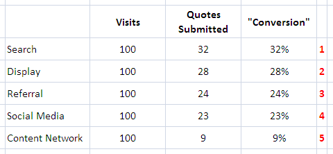
All my experience in these things suggests that it is dangerous to think that the Conversions column is representative of the final outcome.
Here is what it probably looks like (and this is going from good to great):
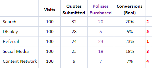
See how the ranking changed?
You would make different recommendations right? Would it save your company money? Would it make you refocus your efforts on where improvements are needed?
You betcha!
For straight ecommerce websites the first picture is what you use every day. But for most other types of businesses the final success does not exist in web analytics tool. So what? Get the data out of the crm / erp / "backend" system. . . dump it into excel. . . write a simple formula!
Usually you don't need a complicated multi year data warehousing effort with expensive business intelligence tools to buy. At least for this scenario you just need a column and a short movie data with your online IT person and a longish coffee break with your "backend" IT person to get the right primary keys set up. Then you can bring your sexy back!
Go deep.
You are paid to find real bottom-line impacting insights (remember line of sight to net income?). Do that.
If you are a purely ecommerce business then you can go a bit deeper too. Consider doing quarterly analysis that focuses on calculating customer lifetime value. Up a notch.
If today you are a content site that is only focused on measuring content consumed try to go deeper to understanding CPA of the ads or Visitor Loyalty. Once again going one step deeper, up a notch.
And so on and so forth.
Make it a point to pause every Friday at 0900 hrs. Look at your most important work / report / dashboard. Then ask yourself this: "How can I take my view of the data one step deeper?"
Now figure out how to do that. That'll impress me, your boss and your mom.
#2: Join the PALM club. [PALM: People Against Lonely Metrics]
This rule actually comes from my second book, Web Analytics 2.0. [Page 318, Principles for Becoming an Analysis Ninja, if you have the book already.]
The rationale for this rule, joining the PALM club, is quite simple.
You need a someone in your life. I need someone. Everyone needs someone else. A boy friend. A girl friend. A cat. A "you complete me" person.
So why not your metrics?
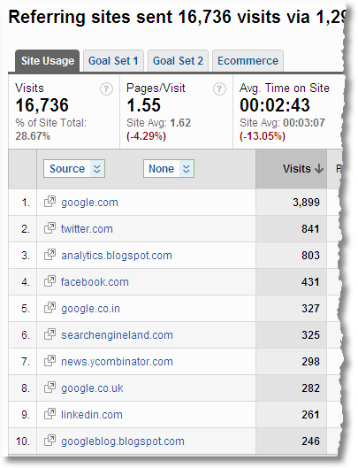
We do reports / dashboards like this one all the time:
Ok great.
I know the top referrers sending traffic to my site in a month. Maybe I can appreciate more the power of Twitter or google.co.in or whatever.
You might even impress me next month with a updated version of this where some of these might have shifted a bit up or a bit down.
I might not do anything with the data… but you surely hypnotized me for a few seconds.
This is the problem with lonely metrics.
They don't have any context. They fail to communicate if 841 visits from Twitter were any good. In fact is any of the above good or bad? How do you know?
Why not find a BFF for your lonely metric and present something like this. . . .
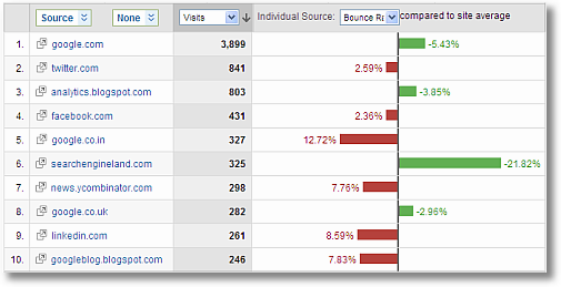
Much better right?
I found a "you complete me" for my Visits metric, Bounce Rate.
Now in an instant I can not only see which referrers are big or small, I can see which ones are "good" or "bad".
I could have picked conversion rate as the bff. I could have picked % new visits. I could have picked connection speed or mobile platform or underwear size.
Whatever makes most sense for my business. But putting two minutes of thought into my metric would help make my report a little bit more useful.
Kick it up a notch. Right?
Never ever never never never ever present any metric all by itself.
If you want a cop out then at least trend it over time. If you actually want love then join PALM and don't let your metric be lonely.
Let me close with one of my favorite examples of this rule, this one's to inspire you if you have a pure content (non-ecommerce) website. . . .
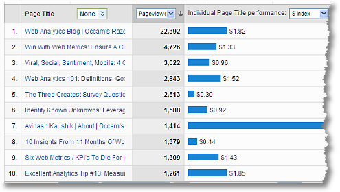
Good to know what content's being consumed. Column: Pageviews.
Much much much better to know what the $ index value is for each.
See that crazy blue line that's literally off the chart? You would want to know that about the 1,414 pageviews right?
Now go find your dashboards, your reports, your data pukes (sorry!) and make sure that for every dimension you are not reporting success or failure using just one metric. Join PALM!
[Tip: Not that you are trying to but if you want to impress me but if you are then make sure the second metric you pick is as close to an outcome metric as possible. Or an actual outcome metric. I. Love. Outcomes.]
#3: Measure complete site success. Measure everyone's success.
One of my greatest passions when doing analysis is to look at the complete view of things. Rather than just the obvious.
An application of that passion is to look at all the jobs the website is doing, representing all the work that is being done by people in your company who touch the site.
Ecommerce is too easy an example of this so let me use a non profit example.
San Francisco Aids Foundation is a charity I support. It does incredible work to prevent new HIV infections.

The only way SFAF stays in business is if you and I make donations. As an Analyst I would focus all my energies on trying to figure out how many donations we are getting and where those people come from and what they are doing on the site etc.
But donations is just one measure of success ("macro conversion"). There are other jobs that the site is trying to do, and people who work on those jobs. So why not measure those?
For example. . . .
* SFAF helps prevention through information sharing and providing services. One key way of doing this is providing forms and information as downloads. Example see all the downloads on the Science & Public Policy page. Or the Bulletin of Experimental Treatment for AIDS.
I can track downloads easily (using event tracking or "fake" pageviews) and help quantify those micro conversions.
* There are a ton of micro conversions on the Advocacy Action Center page. Sign ups. Successful searches for elected officials. Tell-a-friend's.
* On the How You Can page, and other places on the site, there are links to other websites. Why not track these through outbound link tracking to see if we are sending people to the right place.
* Oh and of course the important micro conversion of signing up Volunteers!
Measure the above four micro conversions, in addition to the macro conversion of donation, helps give a complete view of success. And what to do better.
Maybe Google is really good at Volunteers and not optimal for attracting people who donate. If you focus only on donations you'll devalue Google. Or maybe facebook is the best source for sharing information (downloads). And more such things.
Not only are you measuring all that matters. . . . you are validating the jobs of people who put together all that content.
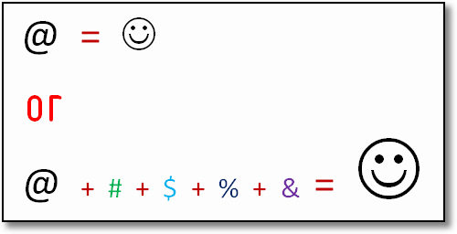
Most of the time we don't do this. We, web analysts, just focus on one thing and then we wonder why we don't have the impact we want to, or why everyone does not pay attention to us.
Broaden your view!
If I were analyzing Amazon I would measure sales AND affiliate signups, signups for amazon prime, credit cards, wish lists, "like's" on reviews, self publish inquiries, free downloads….
If I were analyzing L'Oreal Paris it would be sales AND reviews, coupons downloaded, successful completion of "Profile My Skin", videos watched, sign ups for mobile alerts….
In both cases a complete view of the website and success of every person who works on the site.
Ninjas do that. You should too.
[UPDATE: A key next step, post micro conversions identification, is to identify the Economic Value. See this post for specific ideas about how to do that: Excellent Analytics Tips #19: Identify Website Goal Values & Win!]
#4: Be smart about using time. Move beyond MoM.
This is one of the most common view of data presented in web analysis…
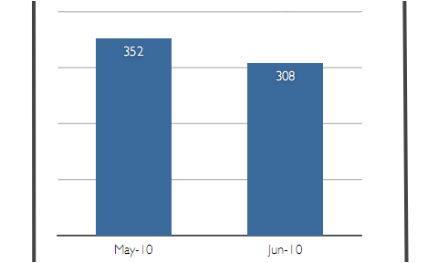
The picture illustrates the performance of a metric over two consecutive months.
This is of course better than just showing data for June.
The problem occurs when you proceed to look at six such graphs on your dashboard and then proceed to use the trends to deliver insights. You are reading too much into the ups and downs, you are inferring things that might not even exist.
Two months do not a trend make. Important lesson.
Not even for the world's most flat line no seasonality business.
So here is a best practice. . . . at least add three months. . . . if the data looks like below you'll think one thing (and every different from above pic)…
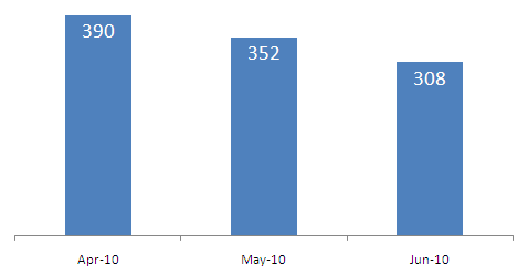
But if the data looks like the image below. . . . you'll think something else. . . .
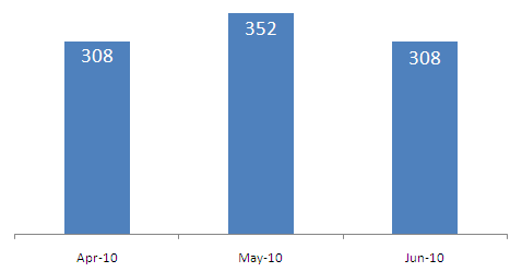
Worry in one case. Jubilation for the temporary awesomeness for May in the other.
The more time you put into this graph (and if you have as much space as above you can easily add at least six months and it will still look pretty) the better.
But if I can only have three I love using current, prior, same month last year.

Better context right? Will take you off on a completely different line of inquiry, all from adding June 2009 to look at June 2010.
If June is the last month of your quarter and you have a cyclical business then maybe you want to compare Apr, May, June 2010 and have the first column be March 2010 because you want to see how the last month of this quarter did vs last month of the last quarter (because Apr and May don't really show if the trend ended as high or low as it should have ended).
So on and so forth.
Remember:
1. Don't look at just one month or just two consecutive months.
2. Understand your business and its cycles of up and down. Use that understanding to pick the right comparative time period / time horizon.
3. If you do present your data as a trend it does not hurt to include some "tribal knowledge" and throw in some annotations! Like this…
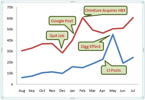
Sweet momma that is awesome!
Kick it up a notch, ok?
#5: Present data better, make insights obvious.
There are so many ways to present data that a small section of a blog post is insufficient. And of course there are so many people who are better at this than I am.
Let me just say that the way you present data matters, a lot. I'm not saying you should make it pretty. I could not care less if it is pretty or not. I'm saying present it in a way that the insights you think exist in the data become more obvious.
Here is a "data element", from an actual dashboard, that I really like. It might not be sexy but it is extremely functional and it is super awesome at communicating the smarts of the Analyst.
Three month trend for one very important business metric…
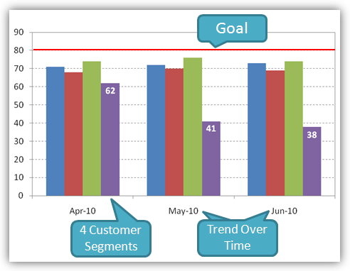
First note that rather than just showing one column for the performance of this metric it shows four. One for each key segment of the customer that the company has.
This would require you to know the business (good thing), know its customers (great thing) and track the segmented data. IE have your act together.
Second note that the data is for three months. You could show more but in this case you don't want to overwhelm the Executive. If you go more months, shrink the segments.
Third, really important, note that the overall goal is clearly indicated in the picture. 80. And to get that number you would have to talk to Finance and Marketing and HiPPO's and get an agreement up front. This is absolutely magnificent, key to you building relationships and finding insights.
The nice thing about our picture above is that the overall metric would get averaged out and show a trend similar those we showed in tip #4 above.
But would it be insightful enough? A single metric trend would hide insights.
In this case it is pretty clear that Blue, Red, Green segments are doing fine. In fact the one that is absolutely most important, Green, we are doing ok.
The stink bomb in the pile is Purple. It has been dragging the overall metric down (and you know that even if the overall metric is not even shown!).
And you know how much gap you need to overcome for each segment, and were to prioritize your work (PURPLE!!).
This is just one tiny, I call it "functional", way of presenting data.
The presentation is ok, could be made more pretty.
What's precious is the process that went into creating the element – talking to leaders, meeting with Finance and Marketing, identifying the key metrics, finalizing customer segments, and establishing goals.
We often don't do all the above work (the things that are mandatory for data driven organizations) and even if we do it we don't show it because we show lame single line graphs.
Don't do that.
Kick it up a notch. You are working very hard at your job, make sure your work shows up and helps identify better insights.
Those were the five simple things you can do every day to make the most of your daily data analysis. They are not very hard to do, and they'll pay outsized dividends.
I am not someone who leaves the good enough alone. No sirree bob!
With love and affection here are 4 more bonus tips on improving your analysis and truly kicking things up a few notches:
#6: Leverage segmentation, daily.
All said and done the number one way to move from being a Reporting Squirrel to an Analysis Ninja is to leverage segmentation. Every tool has on the fly current and historical segmentation feature set. Use it.
I'll honestly not respect anyone is not applying at least some primitive segmentation to their data.
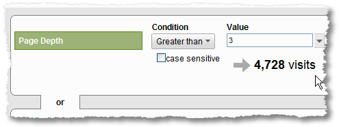
Learn how to:
- ~ Web Analytics Segmentation: Do Or Die, There Is No Try!
~ Google Analytics Releases Advanced Segmentation: Now Be A Ninja!
#7: Move beyond the top ten rows of data, seriously.
The "head" of your data will sustain finding insights for a month or two. You might even action something. The real gold lies in your ability to analyze tens of thousands of rows of data at one time. It is harder to do, and hence the rewards are bigger and your competitors will eat your dust more.
Learn how to:
- ~ Analysis Ninjas: Move Beyond The Top Ten. Find Love (/Insights)
~ Make Web Analytics Actionable: Focus On "What's Changed"
#8: Perform "pan-session" analysis, and win big.
One of the absolute criminal behaviors in web analytics (and indeed online marketing) is that we are so obsessed about Visits, and visits based analysis.
Few people sleep with you on the first date. So why is that your mental model?
Every true Analysis Ninja focuses on measuring customer behavior of one person (or in our case Unique Visitor) over the entire span of that person's interaction one our website.
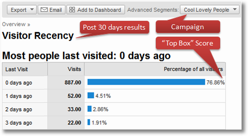
Hence my devotion to measuring Days and Visits to Purchase. Truly analyzing how people buy. Or analyzing Visitor Recency and Visitor Loyalty to understand now just the first Visit (and conversion) but rather subsequent Visits (and conversions).
I tell you this is honestly kicking your web analysis up five notches, not just one.
Learn how to:
#9: Evolve to multichannel analytics, achieve analytics nirvana.
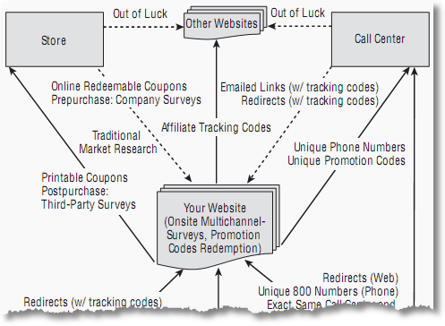
There is perhaps nothing harder and nothing more impactful than getting good at multi-channel analytics.
Measuring the offline impact of your online activities gives your business a view of success that is truly orgasmic. If you get good at measuring the impact on your website of your offline activities (television, catalogs, billboards etc) then you have truly accomplished the rarest of the rate.
Learn how to: Multichannel Analytics:
Feeling like an Analysis Ninja already?
Of course not, you have to go do all these things! :)
Remember that tips 1 through 5 you should be able to do quite easily, just need to remember them and remember to use them. Tips 6 through 9 take time, they take a lifetime. Remember them, practice when you have time and slowly evolve over time.
Ok?
Good luck.
As usual it's your turn now.
What are your favorite tips for data analysis? When you present data what is the "trick" that you use most often to be awesome? Have you used any of the tips above? Got any favorites? What do you think it takes to morph from a Reporting Squirrel into an Analysis Ninja?
Please share your feedback / critique / tips and all via comments.
Thanks.





July 26th, 2010 at 03:15
Hi Avinash – as always a great post. I have two stories for you that illustrate your points quite nicely:
At a job I had a long time ago someone had done some analysis of the lifetime value of a sale of insurance. They had worked out how many times they had renewed and what the profit margin was, etc. Then they'd segmented it for online and offline users. That was great for us because it pointed out that whilst online customers didn't renew as much, they cost less to get there in the first place, so the LTV was higher (which equalled more budget for us).
The next job I had we did the same thing, but for various different online sources of insurance. We'd traditionally shunned one source because it was believed that it wouldn't renew at a high rate and was more likely to claim. We debunked this by using analysis of our backend database and hence spent more money on acquiring these customers (despite their high cost of acquisition).
I've also recently being doing some data analysis to come up with targets for the forthcoming year. To do this I've been looking at historical data and the projects that we have ongoing. However I've had build so many caveats into the data based on anomalous behaviour from previous years that I've had to build in the annotations into my forecast! It would be so much easier if there were no historical trends!
Cheers,
Alec
July 26th, 2010 at 04:44
Ahhhh. Wonderful post. This hits exactly where I live.
And it's also why we had our lead form developed so that it parses our GA cookie and pushes referral data right into our CRM.
At the end of the day, my Google Analytics reports become a snapshot, but the CRM reporting gives us the real data: Who buys. Not just who wants to talk to us.
July 26th, 2010 at 05:07
Thank you for another excellent post. The problem I have been having is getting people to see past the single metric, and this has some great examples.
One issue I still have is to get people to look past the presentation. They can see the trend, but many times cannot see what to do. Sometimes I think the pretty pictures get in the way, but I have not determined a better solution yet.
July 26th, 2010 at 05:56
Hey Avinash. It DOES take a lifetime to morph into an Analyst Ninja from a Reporting Squirrel. I'm not even convinced that I'm fully morphed myself! (Which I reckon is a good trait to have, to some extent).
I've used a LOT of your tips, and some other things here and there as well, to try to get my point across and show meaningful data for the client. I will say that the way in which you present your data (e.g. how you show it) is a huge factor in customer / client education and understanding.
It's also important to know what NOT to say, or what NOT to show. This also shows that you have your stuff together and that you've spent time and listened to your client / customer, and that you're very well aware what sore spots / buttons you shouldn't be touching or pushing. Sometimes (and I know from experience) saying what NOT to say can be an impossible obstacle to negotiate.
July 26th, 2010 at 09:27
I liked the idea of always pairing one metric with another in order to give some insight. Shouldn't every metric be paired with a dollar value? ie: Which referring sites produced the most revenue?
Second – is there little/no value in looking at month-over-month metrics? You recommend comparing year-over-year and previous month… but what if there's a quick fix to boost traffic or conversion rate?
This is often my conundrum. I don't often get much value from MoM, other than quick-fix suggestions. Then again, there must be some significant reason why traffic/revenue went up or down, and there must be a way of correcting this that can help to bend the seasonality a bit and improve year-over-year.
July 26th, 2010 at 10:16
Hi Avinash – Great post as usual.
One thing that I really liked was the chart where you showed bounce rate for referring domains (against average) making the report so much more interesting.
I am trying to replicate this report in excel but not having much luck. Any ideas?
Thanks!
Indu
July 26th, 2010 at 10:56
I think a goal for every metric would put them in perspective. Funny, energetic and thought provoking.
Thanks.
July 26th, 2010 at 10:59
Imagine my surprise today when I read your post and realized I've done several of the things you mention in the last few weeks!
My favorite tip is to make sure that your segments are meaningful to the people you support as well as yourself.
The value of data goes down if people have troubles interpreting it or if you end up with a apples/oranges comparison to what they're really after.
Yes, this seems pretty basic, but raise your hand if you've done a killer analysis and no one was impressed because you solved for the wrong equation.
July 26th, 2010 at 11:21
Concerning #5 ("Present Data Better"), something that really helped me was Stephen Few's book "Information Dashboard Design" (http://bit.ly/bwEkx0). I had some decent Excel dashboards put together, but after reading his book I felt it opened up a whole other world of presenting data (four words that will change your data presentation life: bullet graphs and sparklines).
And once again, thanks for the great post Avinash! :)
July 26th, 2010 at 18:17
For the San Franciso Aids Foundation they could also use Tynt to see who's copying their content – yes I did read the post about it :)
A nomination for PALM I'm using right now – Referrer with City as a second dimension, filtered by eq.edu.au domain – I'm identifying school sites that are regional or urban that refer to the departments main site, with the aim of providing more relevant regional content
cheers
Jon
July 26th, 2010 at 20:03
[...] 5 + 4 Actionable Tips To Kick Web Data Analysis Up A Notch | Occam's Razor by Avinash Kaushik RT @avinashkaushik: 5 4 Actionable Tips To Kick Web Data Analysis Up A Notch, Or Two http://zqi.me/9eeeUn – Keidra (kdc) http://twitter.com/kdc/statuses/19594603381 (tags: via:packrati.us) [...]
July 26th, 2010 at 20:39
How you present data is so critical for you to show you value or get a proposal / project over the line. Some great resources which have helped me think outside the square (sorry for the boring analogy) are
http://www.gapminder.org/
http://junkcharts.typepad.com/
The ability to boil down multiple metrics and show the important trends is an important skill to learn.
Thanks Avinash, you always get me thinking.
July 26th, 2010 at 21:52
Rob: The optimal path is to use a balance of "pictures" (graphs, charts etc) and words that contain your insights. If you are presenting critical few metrics I wanted to share my idea: an "action dashboard".
~ The "Action Dashboard" (An Alternative To Crappy Dashboards)
I hope that inspires you to create something that works for you!
Joe: Data presentation is certainly an art that can take a long time to master. I think it is less about making it pretty or sexy and all about understanding your audience and how best to communicate.
And in that vein you are absolutely right that knowing what not to say is also important. Sometimes because you don't want to embarrass. Other times because you don't want to conversation to go down a rat hole. And other times still because you don't want to appear smarter than you are! :)
Ben: It is often possible to pair some of the metrics we are reporting with a dollar value. Most of the times though you can pair it to be an outcome, it might have a $ value or not. But always an outcome!
There might be cases were you could use month over month, but trust me it is really really rare. Two months do not a trend make!
Indu: I was using a standard report in Google Analytics to index bounce rate against site averages.
It is pretty easy to replicate it in excel thought. I think you have my second book Web Analytics 2.0, please jump to Page 318 to see how.
Jon: I like the suggestion using Referrer with City and then filtering it down to just the sites that might be more directly relevant for you.
Summary: Understand your business & priorities before you get into the data. :)
Joey: Excellent suggestions! I love both those sites. I also like the Juice Analytics blog in this context:
http://www.juiceanalytics.com/writing/
Avinash.
July 27th, 2010 at 05:53
Avinash,
Thanks for you tips and thoughts. I appreciate it because you are teaching us that we need to take a stronger more holistic approach. Many people think you can improve over night or just by doing one simple step, but you really get it.
July 27th, 2010 at 11:14
Awesome post.
I especially like and appreciate the point that discusses tracking multi-channel marketing efforts.
Recently, my company had ran an adword landing page for a company. On that landing page, there were two main points of engagement. One was a 1-800 phone number and the other was a contact form. The form submission conversion rate was a measly 1-2%. However, upon checking out our mongoose metrics account (phone tracking) we found out that the landing pages conversion rate was 17%! If we had not gone the extra step to implement phone tracking, that landing page may have been scrapped!
July 27th, 2010 at 11:24
Hi Avinash,
I always like the chapters in your books and your blog posts that tackle analysis methods. These help form strange data unions (in my brain) and make me think differently. All good tips above.
One thing that I've been thinking about lately in terms of analysis is the geographic factor. If you are selling insurance and you sell home, auto, business, renters, and boat insurance, are there any geographic trends for these? Or better yet, geographic & seasonality trends? Example, do people in the southwest ask for quotes on auto insurance significantly more in the fall? Do people in the midwest seek renters insurance more often in the spring? If you start tracking individual user behavior, you can tie that behavior to your backend customer database where you have their states, zipcodes, etc..
I like your call for annotations. Helps make charts much more meaningful and brings context to the table. They help reduce the number of 'why' questions from the clients, too.
July 27th, 2010 at 13:59
Hi Avinash,
I love the annotations feature in Google Analytics. It's a really powerful way of pairing up the "what" (the metrics) and the "how" (the things we did to get those results).
It's a shame annotations aren't exposed via the API though. Being able to automate annotations, tied to code deployment or other activities, would be magical.
Cheers!
July 27th, 2010 at 23:02
Brian: Hurray! Very clever thinking to implement Mongoose up front. I wish more people did that by default. It is not even that expensive (think of how bad the decisions are that you might be making without that data!!).
Thanks for adding this example, I am sure it will inspire others to grab their missing 17%.
Rick: Great idea for geographic segmentation. Especially in the US I believe this makes a lot of sense because of all the rules and different types of companies doing different kinds of things. All of which of course makes us, malleable simple customers, behave differently! :)
Eliminating Why questions is a valuable quest!
Jason: Perhaps someone from the GA team will read your request and prioritize it higher. :)
Avinash.
July 28th, 2010 at 05:21
Thanks for this Avinash – I spent the last day outlining the monthly online reporting and you've given me a few more ideas to take it to yet another level!
Great stuff, I have been meaning to check out your books for a while and will do now.
July 29th, 2010 at 07:22
Another lovely post – thank you again!
I have a question/challenge tied to you tip #1, which I think may be of interest to others who sell b2b.
I have been trying to "go deeper" with our analytics for a while now. But there is a problem. We sell to businesses, and almost exclusively online. But, because we sell to business, the person who comes to our site with a credit card to actually buy our stuff is very often not the same person who has previously found and looked at/trialled the product. So we find it very difficult to make that final link between actual purchasers and earlier website conversions (cookies don't work basically).
I imagine many other people who sell b2b have the same problem.
Do you know of any analytics software that could help us with this?
(I know about Hubspot's tool for doing this, which looks good, but can't be bought without buying into the whole Hubspot package.)
Any thoughts/help would be much appreciated.
July 29th, 2010 at 07:41
Clare: We have a long sales cycle, so I utilize Woopra to Tag visitors by IP Address. No perfect, but it's VERY cost effective, and bridges the gap between a shopper and a buyer in the B2B world for the most part (assuming they share an IP and not a computer/cookie).
Woopra also makes it easy to find the network name if it's available, which are often appropriately named for many businesses.
Depending on the traffic you get though, it can become a tax on your time. Something else that autotags IP addresses might be in order for you.
July 29th, 2010 at 10:01
Clare: Kevin replied to your comment, please see his kind reply above.
Here is my humble perspective…
Overall IP addresses are not the most reliable source of data (and that is saying a lot in the web analytics world where few things are reliable :)). Addresses change dynamically. People mask them. People visit from different networks (say home and work). And so on and so forth.
I am not even going to touch on the potentially weariness if you look at someone's IP and then call the org saying: "hey we saw you visited our site, how about a 90% discount?".
The problem you describe is unique: Different people in a company will visit before someone will buy. But consider using other incentives for people tell you who they are.
Perhaps you can give valuable downloads, for which they will share their info (even if just company name and email). Or display a phone number (unique to the site) that they can call to get pressing questions answered. Or a email subscription for a newsletter. Or give them a discount code for opening an account, no matter when they buy. Or a Toy Story ticket for sharing some info. Or… I am sure you can think of clever things (as I am not a b2b business!).
You give something of value, you get something of value.
In this context it is always better to ask. Or at least to do what Kevin is suggesting (and you were thinking) AND also ask (even if all you do is use a quick survey like 4 Q or Kissinsights).
-Avinash.
July 29th, 2010 at 10:15
Thanks Kevin and Avinash,
This is kind of where I had got to in my thinking. I used to work in "real world" marketing and any sales person who didn't ask "where did you here about us?" of any new enquirer was shot at dawn! Used to work pretty well in terms of getting a clear fix on which bits of our marketing spend were working best for us.
I guess I was just hoping there would be something a bit more technologically advanced, and less prone to the shortcomings of human memory on offer now :-)!
I will certainly give Whoopra a look, sounds like it could be interesting.
July 29th, 2010 at 10:28
Avinash is certainly correct in the assertion that IP addresses are about as reliable as weather forecasters.
Woopra does deflect some of that. Not all of it.
These are (some of) the reasons that all B2B web analysts are grossly underpaid for our diligent work :)
July 29th, 2010 at 23:06
Avinash,
Enjoyed the post. What I like about this post (and a few others) is that at the concept level much of your advice is very much applicable across the board and not just to business/Marketing folks.
For example, if you are on the IT side of things then don't just blindly tag pages and everything in it but try to understand what the business is trying to do — maybe you will come up with a better alternative.
Or you could go deeper into a specific area like 'redirects' and understand the extent of various types of redirects in place (302, meta-refresh, 301..) and proactively suggest ways of improving the site and/or SEO efforts — your business partners will be delighted :-)
They can even use your multiple success criteria – and not just look at pure IT metrics but metrics that cross-over and play a role in optimization and search.
All in all, you have some great fundamental advice that should be taken in for what it implies for one's own job.
Regards,
Ned
July 30th, 2010 at 03:38
@Ned: Those are some really great thoughts that got my brain pumping. Since I work in the small business space for the most part, you made think of using events and segments to identify things that might actually have an effect on the true IT kind of things.
For example, setting "goal" criteria (or a similar mechanic) to look at views of a new video upload that carries a heavy server load, etc.
Or, getting away from IT, perhaps consider the page views/orders of a product that is particularly expensive to ship, or has a chance of generating a lot of customer service phone calls.
We often forget the impact that marketing has ACROSS an organization, aside from the boom or bust on sales. We impact operations and IT daily, and we can help them be better prepared for what may lie ahead based on today's web visits, and on recent trends.
July 30th, 2010 at 08:53
@Kevin, good thinking and you are absolutely on the right track in terms of where you are headed.
I am a proponent of "value co-creation" :-) and so persuade adopting a biz model where we get away from functional objectives and decision making and move towards a model of collective insight/value generation.
[Note: You still have to excel at what you do - no excuses for that :-). However, the key is how you the leverage your expertise for the betterment of the Enterprise/Customer instead of a siloed outlook]
Cheers,
Ned
July 30th, 2010 at 10:10
[...]
Read more: http://www.kaushik.net/avinash/2010/07/actionable-tips-web-data-metrics-analysis.html#ixzz0vBPW59Xg), and it really got me thinking about how I perceive web analytics as far as scope and need.
I think I’ve been pigeon holing analytics usefulness to determining the value of an AdWords campaign, or that of a Twitter conversation, or our SEO efforts. At the end of the day, web analytics can be useful to an entire organization. Let’s have a look:
[...]
July 31st, 2010 at 23:41
[...] 5 + 4 Actionable Tips To Kick Web Data Analysis Up A Notch, Or Two [...]
August 2nd, 2010 at 09:15
[...]
Another great article by Avinash: Which data to analyze to make analytic reports more clear and useful.
[...]
August 2nd, 2010 at 13:10
I really like this post, Avinash. In particular, I appreciate your points about lonely metrics and trends. Putting metrics in context with other meaningful metrics is, in my experience, the absolute essence of good analysis and the best way to extract value.
I thought it was also worth pointing out the audience of any analysis also has some responsibility for ensuring quality and value (i.e.kicking it up a notch). I wrote a post a few weeks ago directed at managers, executives and other business leaders who are often the recipients of these analyses. It's called 11 Ways Humans Kill Good Analysis at http://www.retailshakennotstirred.com/retail-shaken-not-stirred/2010/06/11-ways-humans-kill-good-analysis.html. I thought maybe you and your readers might enjoy it.
August 3rd, 2010 at 20:41
Avinash,
One of the things I think is missing from most analytics teams/reports is a right brained creative thinker.
Someone who can look at the data and see the connections and whole picture, even though some bits may be missing.
August 3rd, 2010 at 21:25
Mark: I could not agree more with you.
You've highlighted one of the big problems with web analytics: Not having people who are comfortable with Precision and not wasting their life chasing Accuracy.
In my Six Step Web Analytics Data Quality Soul Cleansing Process step #5 encourages exactly what you have identified….
Make data connections. See the big picture. Don't spend your lives living in trees! :)
Thanks for sharing your feedback.
Avinash.
August 4th, 2010 at 10:15
Hi Avinash,
Another inspiring post. I don't think you can overstate the value of #5. Showing and telling your bosses or clients that you recognize THEIR goal goes such a long way.
As (aspiring?) ninjas, we spend so much time in the data trenches uncovering things WE know will add value and tell the story. For Hippos, on the other hand, less tends to be more.
As Joe pointed out in his comment, sharing too much can get you into trouble. Not because we're trying to hide information, but because it can lead us down irrelevant tangents.
If it's the Hippo going down that tangent asking questions and drawing conclusions where we know we shouldn't, we start getting into trouble.
The more often we can tie back our key points to the overall goal, the more we can stay on target. It connects with them both on a business level and, I believe, an emotional level. It tells them we're listening, we're sensitive to what they care about and it shows how what we're doing is getting us to that goal.
August 4th, 2010 at 14:21
Another great post Avinash. I've been using segmentation for some time now and I am now an official member of PALM. Thank you for the insights, as always, this is information I can immediately apply to my everyday efforts.
Thanks again!
September 16th, 2010 at 04:40
Hi Avinash,
i have a question concerning: SEM and landingpage bounce rate for e-commerce: Is there a rule for a good or bad bounce rate for a landingpage. I made a report: keywords sem and bounce rate and we have quiet a big variency.
Cheers
Robert
September 17th, 2010 at 21:35
Robert: If you use Google Analytics then you can use the benchmarking report to at least get some idea of how you are performing overall against a competitive set.
Here is another post that helps you understand how to get context (including using benchmarks):
http://www.kaushik.net/avinash/2008/03/context-is-king-baby-go-get-your-own.html
Finally the only good bounce rate for sem landing pages is one that goes down every month. :)
Use this post to find ideas on how to reduce it:
http://www.kaushik.net/avinash/2009/08/tips-for-improving-high-bounce-low-conversion-web-pages.html
Avinash.
December 5th, 2010 at 10:52
[...]
Vrei să le cunoşti tehnicile de ranking pentru cuvintele tale cheie? Analizează şi distribuţia de anchor texte pentru profilul lor de link-uri, nu numai optimizarea on-page.
Never ever never never never ever present any metric all by itself. (Avinash Kaushik – Web Data Metrics Analysis)
Nu trebuie să luăm în consideraţie un singur factor atunci când ne uităm la competiţie. Analiza link-urilor competitorilor se bazează pe tehnici avansate de investigaţie, pentru ca informaţiile disparate să fie puse cap la cap – şi trase concluziile necesare pentru optimizare.
[...]