Viral, Social, Sentiment, Mobile: 4 Delightful Web Analytics Solutions
 Stale.
One thing that I never want to be.
We all have a tendency to learn up to a point, we get comfortable and keep chugging along rarely investing in our ongoing education.
I call it the slow but sure path to irrelevancy.
Let me share my prescription for avoiding irrelevancy: Try new things.
Simple right?
At any given time I have six or seven interesting tools running on this website. That's not including others I actively seek out around the web. Most of them are not even related to my current job or problems I know of. And that's on purpose.
I want to constantly be in the know of new and more clever ways of working with data, tools that are often solutions to problems we don't know we have yet or tools that are sometimes seeking problems to solve!!
Irrelevancy is not fun. Stale people are not appealing (just like, as your mom taught you, a week old bread). If there is one thing you take away from it post I hope it is the importance in investing in yourself / your education / your ongoing awesomeness.
In this blog post I want to share four analytics tools that I have been playing with for a while… tools that solve an interesting problem… tools that point to what might be in terms of our near term analytical future… and in almost all cases they don't even know!
I love doing this, I hope you'll have as much fun as I do.

First Some Context.
Remember I am the creator of the 10/90 rule of investment in web analytics.
I had created the rule many years ago, early into my job at Intuit, and quite simply it states:
If you have a budget of $100 to make smarter decisions on the web…. invest $10 in tools + vendor contracts and invest $90 in people (big human brains inside or outside the company to do analysis and the process of producing insights).
When I had created the rule Google Analytics did not even exist!
The rule was borne out from my own experience having inherited a world class tool we were paying $250k a year for and produced crap. Well not crap… lots of data that no one cared about or actioned. I threw out the world class tool, purchased ClickTracks for a fraction of the cost and put money into Analysts and boom!
Ok not boom overnight… but over the course of a few months the org started to be more data driven, because analysts we hired produced analysis. That fed a virtuous cycle. More analysts. More insights. More desire to be data driven.
So as you look at the tools below remember the 10/90 rule.
In the end it does not matter who has the coolest or the biggest tool. Or for that matter how many tools.
People matter.
You matter.
Remember that, at least for the rest of this post. Ok?
Let's go look at some tools…
Measuring "Invisible Virality": Tynt.
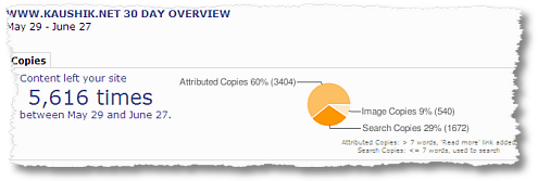
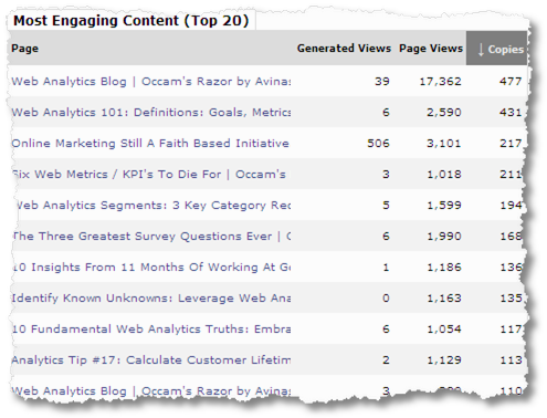
Tynt's promise is simple. Add a piece of javascript to your web page (do a View Source on this page to see it), and it will tell you how often your content is being copied.
Copied! Say it ain't so! :)
[Please click on the above image for a higher resolution version, including all the other metrics.]
In the last month data was copied off one of my posts 5,616 times, with most of it being content and some of it images.
But that's not all.
If you look at the higher resolution version (click above) you'll see it also reports other data like Visits Generated etc.
The way it works is that when someone copies a piece of content Tynt adds a little bit of additional text and a trackable code with a hash (#) at the end of the url from where content was copied.
Like so… the text that was copied from my blog is the first two lines… the Read More and link was added automatically by Tynt…

When people click on that link Tynt can report visits generated, page views, where the links were posted (in case there is a referrer) etc.
There is additional data like how many of your copies created links that were posted and then clicked on…
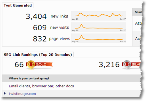
Gold are places were the copied text was pasted with the additional "Read more: http://…" text+link were also posted AND someone clicked on it.
You'll note that Tynt's selling point is connected to SEO. The idea that your copied text creates links back to you which in turn creates visits back to you, and per Tynt, better SEO goodness. You know links and page rank and what not!
I *personally* do not see much value in all that data. Two reasons:
1. Most likely the additional text+link will be posted as is only by someone who is quite careless and perhaps only on the least desirable sites. I mean if someone smart's going to copy they'll be clever enough to get rid of the link+text. :)
2. Search engines are complicated little beings. The days of just inbound links counting towards SEO goodness are long behind us.
So I am less enamored by Tynt data that focuses on all that.
I love the data you saw in the very first screenshot, and I absolutely love this…
[Please click on the above image for a higher resolution version, including all the other metrics.]
The first screenshot shows how often content is being copied and the above indicates the blog post / web page where the content is being copied from.
Why is this cool?
If you are a regular reader you'll notice that at the end of every blog post (before the start of the comments section) is a Topsy widget.

It measures how often a blog post is tweeted/retweeted. Goes viral. Higher the number the better, makes sense?
I also measure the # of Comments Per Post as a measure of how "engaging" / "valuable" people found the content to be. Looking at how often it was tweeted/retweeted is one more layer of information in understanding what subject / ideas in a post / things I write are well received by people and which are not.
But.
Both the above attempts measure two minorities.
1. The rarest of the rare who post a comment.
Context: I write twice a month. This blog has around 70k Visits a month, 39k Feed Subscribers and the average number of comments on each blog post is just 35. Minority perspective right?
2. The rarest of the rarest of the rare who are on social media. Who tweets after all. :)
The cool thing about Tynt is that it allows me to get some sense of "engagement" / "perceived value" / "Like" with the v a s t majority of people who will neither submit a comment nor write a tweet.
People who still use email. People who like something I wrote so much (or hate it so much) that they copy the text and paste it and forward it to others. Or copy the text and post it on their blogs (without attribution of course :)).
I like that a lot.
This entire interaction that was completely invisible to me is now a bit more visible. I can measure the "invisible virality" / "spread" by this big huge non-commenting, non-tweeting audience.
In the time period above I had written 4 posts (5,616 times copies). Check this out… It turns out the post with the fewest comments, just 25, and the fewest tweets, just 100…

…was copied an astonishing 506 times, when all other posts were copied in small double digits.
See what I mean… something I would have perhaps considered to be only a small success turns out was a huge hit with the blog's audience. I just would not have known that so far.
Here's another interesting application. . . Lots of people are measuring "influence" of a blogger (/ piece of content) using data from the "minority activity" (comments, retweets etc) and selling it as the complete truth. But how can you do that without some insight from the majority?
Tynt shares one very interesting piece to the puzzle that perhaps in the future fit some place where we can use it with all other context we have.
Invisible Virality. Cool right?
Applying Smarter Ideas to Measuring "Sentiment": Analyze Words.
Raise you hand if you are in the "If I am any more excited about doing sentiment analysis then I'll pee in my pants".
So many raised hands!
Here's the problem: Most solutions stink. Not just stink… dinosaur's breath after a meal stink.
We are algorithmically trying something that as yet does not lend itself to algorithmic measurement… "emotion". It is darn near impossible to cleanly buckets feelings and nuance into clean Positive, Negative, Neutral buckets.
We, computer programs, are simply not there yet. [Though I am absolutely confident that we will get there at some point.]
For now you are most likely wasting time (and money). Sorry.
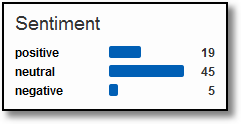 Here's the other problem…
Even if it works… I don't think it works. [What!]
Let's say you have a 100% perfect human read and 100% human categorized analysis on hundreds of thousands of rows of text. Clean into the three desired categories. Like in the image above.
Now pause for a second and think… what could you do with this?
You have aggregated data into three pieces and we all know aggregated data stinks at delivering insights!
That does not mean wanting to identify insights from lots and lots of text is not prudent. It is.
I like a much more nuanced approach.
Analyze Words applies one such nuanced approach to text analysis.
It uses the well established and long use LIWC (Linguistic Inquiry and Word Count) methodology to categorize all your delightful text (in this case your tweets).
Why the LIWC? Here's the idea behind the LIWC:
"The ways that individuals talk and write provide windows into their emotional and cognitive worlds."
Cool right?
You go to Analyze Words and you punch in your twitter id and bam (!) your "psychological" profile, or in this case mine…
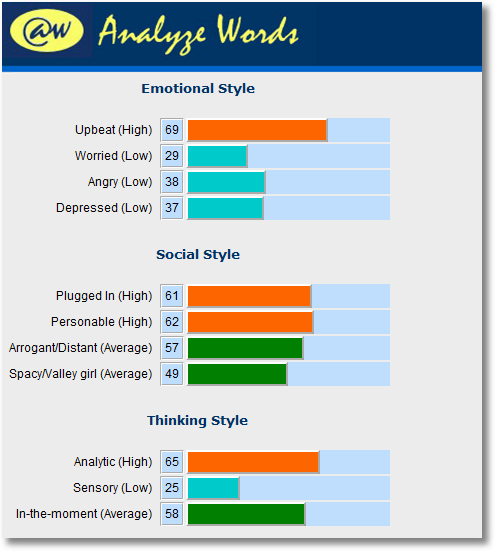
Nice eh?
No simplified over promise under deliver aggregates!
The three categories and 11 sub categories provide much much much more nuanced understanding of what your text is saying, in this case for your twitter profile.
Why is this cool?
In this case measuring "Personable": Engaged in other people's well-being and at peace with expressing your own uncertainty about the world. High Scores in personable use positive emotion words, ask questions, express their own ambivalence and reference others frequently.
Better than positive, negative, neutral right?
Or "Analytic": "If law school exams were a persona, they would rank real high in this category. Ample large words and phrases that include complex thinking styles (e.g. "if – but not …")."
Love it!
Two magnificent things about this approach (remember it's not the tool, its what you do with it :))…
1. It is very sophisticated in the approach it is applying. Nuance and segmentation rule the day. There is nothing, nothing, more sexy in the world of web analytics.
2. It is immensely actionable. You can quickly see areas where you are scoring well, where you are not and you can start to take action to fix things!
Of course you can do even more.
You know how you are doing… now compare it to your "competition" and find their strengths and weaknesses…
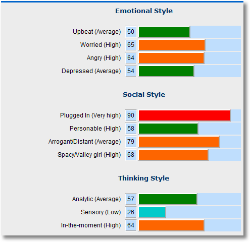
When you do competitive analysis, like above, find contrasts with your own profile, what your brand stands for in the world and their brand stands for.
Highlight differences where you brand strength is strong. Hopefully they'll discover where they stink and for the sake of humanity fix that.
Nice eh?
Analyze Words provides a glimpse of an approach that I hope others follow.
Rather than trying to find short cuts, where none exist, and provide aggregate data, where it just gets crapified, follow a well established methodology while leveraging segmentation and nuance.
We've applied it just for Twitter in the above case but you can easily see how you could apply it to call center data, tech support websites, forums, online survey open text voc answers and so much more.
Applying Simpler Ideas to Measuring "Sentiment": StatsIt.
StatsIt started off as a differentiated web analytics tool, but has morphed into a delightful social media monitoring tool.
[Update: Oct 18: StatsIt is evolving its solution. But in this section my hope is to focus less on the tool itself and more a type of analysis that we can use in our daily life.]
It's approach is to index blogs and tweets and delicious and twitter and youtube and on and on and analyze that data to find yummy actionable insights about your social media presence / activity.
Like all tools it gives you pretty charts…
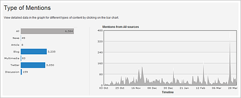
Sweet, now you know how much "activity" is happening. Give it to your boss, she'll be impressed. You on the other hand realize "activity" rarely has insights.
I want to focus on just one part of StatsIt that I adore because of how simple it is in its brilliance when it comes to finding insights from lots of text.
StatsIt has indexed a ton of content from all the social web activity. When you tell it your brand terms (or just your brand name, in my case "avinash kaushik") and it churns through that social web data to provide you with something awesome…. a tag cloud!
[Click on the image for a higher resolution version, along with a peek at other metrics.]
Why is this cool?
Mikko and his team have taken 1,000 words from the English language that are connected to emotion. Good emotion, bad emotion, ugly emotion.
They look at their social web data and in that they look at the words around your brand mention and finally identify the emotional words people are using in context of… you!
The tag cloud above shows the emotional words use around mentions of me for a month's worth of time.
Without having to read all the text I can at a glance now get a really good understanding of the tone and texture of activity around my presence. More importantly it does not take all that long to figure out what emotions should be there but aren't.
A very simple, effective and elegant solution to a complicated problem.
Oh and guess that happens when you click on one of the words in the tag cloud?
You are right… it takes you directly to the text from all the data that StatsIt has collected!
By clicking on the words you are essentially segmenting your data and drilling down to the text (tweets, blog posts) where you can learn more about what the person was saying when they express, say, "great" as an emotion. :)
Effective "sentiment analysis" baby!
Why can't we be this simple in other places?
We are always seeking complexity. Here are two ideas that popped into my head from the StatsIt's approach that might apply in other places.
We collect lots of open text from our online surveys right?
Rather than finding the perfect answer to what's expressed in the text, and of course getting it wrong, why don't the vendors show us a emotional tag cloud?
Can there be a better / easier / faster way to allow us to make sense of all that text, leverage as a segmentation tool and find insights every day?
Vendors! Come on!!
Another idea.
Reviews are important. Most ecommerce sites have them.
But why is it that we only see "quantitative" analysis of the reviews? 5 stars. 3.2 moons. 61% rotten tomatoes. Etc etc.
The richness of the review is only partly in the quantitative analysis of the rating. The real sweet nectar is in the words people write in reviews.
I recently gave a talk at eBay. So let's use that as an example.
You get quick quant rating on eBay that you typically use. But perhaps the real gold is here….
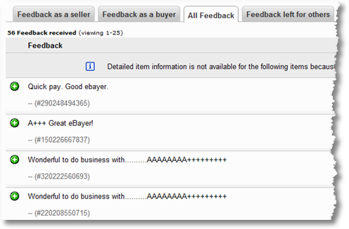
This seller, me, is 100% positively rated.
Now let's say that you want to buy a Sony digital camera that is listed by both me and Emer. We both have 100% positive ratings for our 60 or so prior eBay auctions.
How can you best decide if you should buy from me or Emer? You can't possibly read 120 reviews, or even scan them quickly.
Now would your life be much much easier if eBay choose to provide an "emotional tag cloud" for both Emer and Avinash?
Very quickly you could see that while we both have same quant ratings it turns out that my emotional cloud shows a neutral to positive feelings expressed while Emer's is outrageously positive.
Now is it easier to decide who to buy from?
As our dear friend Sarah Palin would say: You betcha!
So why does eBay not provide this simple emotional tag cloud?
Or for that matter Trip Advisor or Amazon or any site that hosts reviews and ratings?
Simplicity rocks. Especially when it's actionable.
Quick, Efficient, Effective Mobile Analytics: Percent Mobile.
It is always a really good idea in web analytics to understand how data is captured (case in point the delightful blog post on Competitive Intelligence data capture).
No where is this more true than when it comes to mobile analytics.
There are many methods of collecting data depending on the platform you are on, and if Steve Jobs gets upset he can totally shut you down with a mere update of his TOS! :)
I am not going to cover all that here today. For those of you who already have my second book Web Analytics 2.0 please jump to Page 250 to learn all about data collection options, platform limitations, challenges with campaign analysis and finally reports and KPI's you should measure for mobile.
In this blog post I want to share a lightweight wonderful mobile analytics platform called Percent Mobile.
Now most web analytics tools, like Google Analytics and WebTrends and others, will capture and report data for javascript enabled smart phones (like the iPhone, Android and some Nokia phones). Honestly that is all the traffic that is of commercial value, so even if you miss the rest it is not the hugest of deals.
But all these "big boys" have simply "added on" mobile analytics to their tools. The result is that they suffer from both a lack of imagination and, this is important, truly great databases when it comes to devices and carriers and other unique mobile information.
Not Percent Mobile.
They have two incredible benefits:
1. A really expansive and accurate database and detection mechanism when it comes to mobile platforms.
2. A really simple UI and reporting layer, even your mom will understand the data.
They also have four different methods of enabling data collection, I am using their standard javascript tag on this blog (do a View Source).
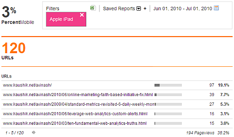
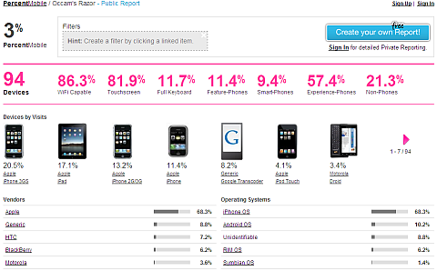
Here is what the resulting data looks like…
[Please click on the above image for a higher resolution version.]
No hunting and pecking to find the data, like you would in Google Analytics or Site Catalyst or CoreMetrics. A quick at a glance view of how much traffic is mobile, key stats about the devices, the devices themselves (go iPad!!), vendors and operating systems.
If you compare this to your web analytics tool you'll notice almost immediately how much better this data is compared to what the "big boys" are reporting.
Click on the image above and you'll see a bit more clearly other really sweet metrics. % of mobile devices accessing your site via WiFi. Phones with touch screens and full keyboards etc.
[Can you imagine how cool it would be to segment your mobile traffic for full keyboard phone vs none and see which convert better. Or does access via WiFi mean more content consumption than via 3G? Etc. So cool.]
That is not all… if you scroll a bit more you can get a country map view, the networks used to access your site (AT&T still #1 for me!) and countries etc.
Of course it would be hard for me to like any tool that does not allow segmentation. :) You simply drag and drop on to the box on top..
And what would an analytics tool be without the normal search, referrer and all that data we have so come to love (and hate!).

I particularly like the "Activity Types" box at the bottom left, I don't know why web analytics tools don't categorize referrers by default.
I am also surprised at the long tail of referrers. Yes Google is big but there are 91 other referrers for this segment. More mobile SEO!

Why is this cool?
It might seem odd that I would like a tool that would give me similar data that I can get out of WebTrends or Omniture or Xiti or whatever.
The first reason is that, as mentioned above, the data is actually much better because of the databases that power Percent Mobile.
The other thing is that getting this data causes less pain than pulling my two front teeth.
Finally I so do like supporting pretty tools, especially if they have good data!
The one thing Percent Mobile lacks is some way of measuring any outcomes. I can certainly dig to my "conversion pages" but it would be great if they just let me just input them into the tool and then they could measure outcomes for me (even if it is like the Goals process in GA).
But if you want a light weight easy to use free mobile analytics tool just throw Percent Mobile on your site and have fun. Go to www.percentmobile.com , click Sign Up (top right) and use the Invitation Code "Avinash" (no quotes).
Mobile rocks no?
Summary Of Our Lovely "Let's Keep Learning" Cruise.
It is important to point out that I am not affiliated in any way with any of these tools / companies. I am also not recommending overtly or covertly that you buy / use them. That is totally your call.
Of course I would not personally use them or write about them if I did not thing they had value. :)
My sincere hope is that you'll internalize:
1. How important your ongoing education is. DBS: Don't be stale!
2. What it is that each tool does that is so unique, what unique problem each solves.
3. Why it is important that you can separate the wheat from the chaff, notice how I quickly put aside most data from Tynt to focus on just what was important to me.
4. Where are new places in your business you can apply things you learn from analytics, like in my example of emotional tag clouds for Ebay or Amazon.
5. Why simple and effective is better than expensive and complicated (even if "perfect").
I hope you got that, more than names of interesting tools.
I cannot tell you how much fun it is to step outside the world of Omniture and Google Analytics and other traditional web analytics tools. It stretches your mind and sometimes you look at these new techniques and data and you notice you are smiling and feel so happy.
Try it, and have fun.
[In case you were curious at the moment I am playing with these incredibly cool tools: PostRank, Next Stage Sentiment Analysis, SEO Effect, and Colligent. Each in its own way does something magical and quite unlike anyone else.]
Ok your turn now.
What do you think of the work that Tynt, Analyze Words, StatsIt & Percent Mobile do? Have you tried any of 'em? What obvious flaws did I overlook? Are there other tools you are using in the Viral, Social, Sentiment, Mobile space that you really love? If so would you please post them in comments?
Please share your feedback / critique / ideas.
Thanks.
PS:
Couple other related posts you might find interesting:





July 12th, 2010 at 05:38
Hey Avinash, I really appreciate the train of thought here in this post. It's in our nature to be comfortable and find our niche – going out and trying new things is very difficult for a lot of us, so thank you for introducing us to these four tools!
Just wanted to throw in my 2 cents on the first two tools:
Tynt: This sounds like a tool that someone who has very sensitive content should get right away. If you're an author or a lawyer or a journalist (or blogger) and you value your content highly, you should definitely install Tynt. A perfect example of this "invisible interaction" was your last blog post either a week or 2 weeks ago. I didn't have time to comment on it but I did forward it to a colleague (this is something we often do here – copy / paste the content from a blog or press release and forward it to everyone).
Analyze Words: This is actually good for businesses. Depending on the business and who you want to reach on Twitter, your "tone of voice" could be a critical factor for one's success. Do you sell love bears and want to reach a happy-go-lucky audience on Twitter? You can use this tool to help you figure out how sweet and loving you are on Twitter.
July 12th, 2010 at 06:01
Hi! This article certainly gives me a wealth of new knowledge. Congrats for that by the way. I installed Tynt into my blog and look forward to the results and the effects. The only negative thing to date is that it adds to my page load time, but only slightly.
Take Care,
Peter McCartney
July 12th, 2010 at 07:09
Very cool post.
Refreshing to step out of the world of Web Analytics and experiment with tools that force us to think differently about measuring the online experience.
I am going to enjoy playing with several of these tools. The Tynt tool is very cool. Capturing copies just makes sense when you think about it and yet who would've thought this tool existed. I like the Analyze Words sentiment measurement and comparative analysis capabilities. Percent Mobile I've seen before and the only thing I'd like to see there is trending data. I will definitely peek at the other fun tools you listed as well.
Nice to see you get out and have a little fun every so often :)
July 12th, 2010 at 08:28
Interesting post. Doesn't sound like you have a very sanguine view of the social media sentiment analytics vendors. I've seen demo's from RadianSix and Sysomos and I didn't think they were that bad. What deficiencies leaped out at you that caused you to think that tools like these are so stinky! :)
For me, the most interesting thing about linguistic analysis of social media data isn't necessarily sentiment analysis but the tracking of shifting patterns of dissent and consensus. When I see a CNN anchor hand-picking tweets about BP and reading them on air, I almost want to throw my shoe at the TV! I want to know where the conversation is going, what consensuses are being built in the real-time hive-mind, and what alternative threads and memes are building up at a subliminal level. Social media is a shape-shifting media, and I'd like to see someone track the conversation at a more organic level.
July 12th, 2010 at 10:49
Another great post, Avinash! I really enjoyed the Analyze Words tool. What a handy way to glean insights from your Twitter profile.
A tool I've recently started using is the SEO Site Tools extension for Chrome. I volunteered to beta test after seeing a tweet from creator @CarterCole. Now it's one of my mainstays for SEO research.
Not only can you gain new insights, but you can also make new friends/connections by trying new tools.
On a side note, week one on the new job is great! To my surprise, my onboarding included a personal SEO training session delivered by none other than Market Motive's Todd Malicoat. You really can't beat that!
Finally, if commenters are rare and tweeters are even rarer, then you can consider me your Commenting/tweeting BFF.
July 12th, 2010 at 10:50
Thanks for giving this push. One tool that I have found useful lately is Twittersheep, which visualizes your followers' profiles as a word cloud. Mini-review here:
http://fosteronomo.tumblr.com/post/802744743/twittersheep-whos-following-you
Tweetstats also uses word clouds well, this time to visualize the content you're tweeting:
http://www.tweetstats.com
Any tool that helps draw actionable insights from the data hitting us in the face is a good thing!
July 12th, 2010 at 11:21
Hi Avinash! Love reading these reviews you do. As an analytics old-timer I gotta do my part to keep from getting stale.
I installed Tynt on my blog after you mentioned it at eMetrics San Jose a couple of months ago. After getting to know it I've concluded that I don't like it as much as you do. The really neat data – copies by content – is buried too deep in the reporting, and I can't compare it against other success metrics without exporting. Also, Tynt's heatmap function is currently disabled – and that's what I'd *really* like to see. Tell me what exactly my readers are copying.
So if someone from Tynt happens to read this, pretty please with sugar on top will you make the good data just a little easier to get at? I want to love your product, I really do.
July 12th, 2010 at 13:16
Avanish and others, thanks very much for your thoughts! I really appreciate hearing how people are finding value in Tynt. I will make sure our Product Management reads your article and we work on getting your 'core stats' to the surface most effectively.
@june – would love to know how you would like to get the data – we are very open to learning and growing.
@all – your thoughts on what is most valuable is very much in line with our recent learnings. Now that Tynt is being used on almost 600,000 sites, we are getting a much better view of what data people are finding valuable. We first put this tool out as a beta only one year ago and we have learned an incredible amount from our user base. Please do stay tuned for some very interesting developments in the near future, and feel free to contact us directly at support [at] tynt [dot] com.
July 12th, 2010 at 13:53
Hi Avinash.
Thank you for the kinds words about PercentMobile.
@ Anthony Centeno
Re: "…the only thing I'd like to see there is trending data."
It should just so happen that we launched trending today.
Read about it here…
Trendspotting with PercentMobile
http://mobileanalyticssimplified.com/post/802591243/trendspotting-with-percentmobile
July 12th, 2010 at 23:07
Some really cool tools to check out there Avinash.
I had to laugh at your eBay comment as I often use http://tagcrowd.com to help visualise comments. I'm sure it's not as good as the emotional analysis, but it can help you highlight words like "a bit late" or "damaged".
The mobile analysis looks great too and should ease the frustration with GAs handling of this segment.
July 12th, 2010 at 23:34
Hi Avinash,
Another great post! I loved Tynt. Explains why I got the read more when I tweeted your last post :)
I'm also in the process of creating a presentation on Social Media measurement, and this post will be of a great help.
Unfortunately, I could not try out Statsit. That would have been great.
July 13th, 2010 at 00:36
Can't agree more when it comes to sentiment analysis. The whole polarity hole is leading nowhere. One of my senior analyst likes to say "when you find yourself in a hole, stop digging". I'm hoping that the social media analytics industry does just that and starts to seriously look at different viable options to drive the value polarity analysis is supposedly driving.
As sentiment analysis (interpretation of human emotion) as a whole is a key component of social media analytics, it's not a bad idea at all to start a virtual round-table around where we can take it. Currently all vendors are already doing the same thing, so what's the worst that could happen from sharing openly?
Bottom line is that people are not that simple creatures. You can't take human experience and sum it up on a scale of negative-neutral-positive, no matter how accurate your technology. Anyone with psych101 on their pocket can tell you this. We're emotional beings, filled with fear and desire. Market research got it, Madison avenue got it, now it's time for the analytics industry to get it.
Thanks so much Avinash, the whole team is elated that you find the tool so useful and fun!
July 13th, 2010 at 05:48
Okay, I just added a bunch more sites to my Delicious. Thanks for this thorough analysis of really good analytics tools. :)
July 13th, 2010 at 15:24
These are great tools, i personally use clicktale which has the best of the bunch in my opinion. Its heatmaps are second to none.
July 13th, 2010 at 18:50
Hi Avinash,
I am new to learning analytics, not so new to life experience analytics. From what I am reading..you guys make sense in so many ways. Validation of what I see and tools to see more..man..that floats my boat. I want to listen for a while and be a student in analytics-minded environments. For now, I will say thank you for your unique writing ability, resource leads and especially the contagious upbeat spirit. So thanks.
July 13th, 2010 at 22:30
I run a number of quite content heavy sites and have always been curious if people are copying my content. I'll have to give Tynt a go and see what results I find.
I can't believe that some people don't remove the read more links!
July 14th, 2010 at 08:52
Thanks for sharing your views on these four tools. 'Analyze Words' seems too random but fun but the others look really useful resources.
July 15th, 2010 at 02:12
Hi Avinash,
Really enjoyed the blog because it has given me insight into tools I didn't know existed, so today is not a stale day:)
I like the idea of Tynt and will take a closer look – I've often wondered how you can validate the wider impact of content when only a small % of your audience is ever proactive in adding comments/retweeting/liking etc. Your train of thought makes good sense – don't be narrow in analysis, think creatively and look at new ways to gain insight before you take action.
Thanks
james
July 15th, 2010 at 09:07
Michael: It is less that Radian6 or Sysomos stink, it is that the problem itself is 1. very very complicated (understanding sentiment) and 2. the quest for three clean buckets is silly (given human nuance).
I encourage users of "sentiment analysis tools", including ones above, to apply them to your own real world data and then make decisions – rather than, in all cases analytics or otherwise, to go off demos / white papers / blog posts. :)
You and I are on the same page with CNN, no wonder a once mighty network is going down the toilet. My hope with Analyze Words was to less recommend a tool but to show how something different that shares more nuance is perhaps the way to go. I share your wish for a "real time hive mind" insight. I doubt it will come from something simplistic (because we are not!).
Peter: Tynt does add weight, more compared to other tools, but if you put the tag at the end of body then you'll be fine in the sense that the tag might take time to load but it won't interfere with your page rendering etc.
June: It would be wonderful to know what actually is being copied. My sense is that it will be like the "you can watch video replays of all the sessions on your website" type deals. Too much information and not enough squirrels to find insights from it. If Tynt can make it digestible perhaps it can be useful… the last thing I want is one more heat map that shows someone copied pretty much every part of the web page! :)
For now I think the fact that content was copied could clearly be a indication of "viral" (need a better word) and be one more signal for influence (along with tweets, comments). Narrow use but actionable.
Have you noticed my well hidden bias towards not wanting data if I can't actually use it efficiently? :)
Thanks!
Avinash.
July 16th, 2010 at 17:01
Thanks Avinash, I had never heard of Tynt before. Cheers for pointing me in the right direction
Joey
July 18th, 2010 at 09:14
Avinash, here's a scoop for you. A new brand of web analytics (real-time) SaaS has been emerged a week ago. If we are talking about behavioral targeting tools and dynamic content delivery functionality, the web analytics product PERSONYZE (at Personyze .com) is probably the one to watch this month. Bringing real-time analytics, custom reports, A/B testing, custom actions (popup, HTML, redirects, etc.) as a "premium" package at an affordable price (it seems). Looks pretty interesting software (oops, SaaS).
July 19th, 2010 at 19:21
[...]
Consistently on the search for the Gold (insights), Avinash explores 4 pretty cool tools for Web analytics, each offering a differing piece on the larger picture.
[...]
July 20th, 2010 at 01:48
I've been using Tynt for a few months now but I never quite understood what the gold count was for! Thanks for explaining that. And the way you used it to analyse the 'virality' of a post is great! Now it makes me wish Tynt would install a widget which shows it upfront on your website, like Tweetmeme and Topsy!
Had a play with Analyse Words and was good fun, although I think I have to look into the type of tweets I produce now…
Will have a play with some of the other tools too. Thanks!
July 21st, 2010 at 04:06
Wow. Comprehensive guide or what!
July 22nd, 2010 at 21:29
I really enjoyed reading your article. So much good information.
Thanks for sharing this..
-kathy
July 23rd, 2010 at 09:21
Hi Avinash,
I always look forward to your blog posts and like to get the new perspective you offer in each one of them. Needless to say I enjoyed reading through your current post as well.
I have a question, that I think you probably can answer better than anyone else. Why don't you discuss ways (more frequently) in which statistical methodologies can be applied to produce insights from web analytics data?
I think it would be great if you could publish some case studies which involved using some statistical techniques to dig deep and looking past the obvious in the data.
- Paul
July 27th, 2010 at 03:14
[...]
Source: Occam’s Razor by Avinash Kaushik (read the rest of the article to find out how Avinash knows how many people have shared his words of wisdom!) (In fact, read the rest of the article anyway and subscribe to his blog. You won’t be disappointed.) (Ok well maybe you’re the type to be disappointed but that’s not really my problem is it? Seriously, stop being a jerk.)
[...]
July 27th, 2010 at 09:51
Avinash,
Have you used or heard of Lexalytics? I just got an email from them and was checking out their demo. From a preliminary view it looks like an intriguing sentiment analysis option. Just wondered if you had any thoughts on this one.
BTW, I thought this was a fascinating article. I think it is very helpful to branch out from the standard web analytics tools and broaden my horizons.
Thanks!
Heather
July 27th, 2010 at 16:04
Heather: It is not difficult to try Lexalytics (or any other vendor) with a quick real life example to check how far they have solved the problem.
For fun I had Lexalytics analyze my latest post on web data analysis tips. The Sentiment Analysis can be downloaded using this link.
You can look through it to to see how accurate and / or actionable the analysis is.
I was personally more surprised at the "themes" it reported, left navigation. There were some pretty strong themes in that post. Checkout the Quotes as well.
This of course only partly a reflection on the tool. I have repeatedly stressed that the problem is far too complex for ANY vendor to make bold claims. : )
Avinash.
July 29th, 2010 at 05:26
Insightful as always. I was one of the people who copied + pasted your speech to the Canadians into an email and sent to my team with the headline "PRINT THIS AND READ IT NOW" – it was one of my all time favorite posts of yours because it was equally insightful to the non-analysts in my group.
I really enjoy reading your posts about new tools and the insights you can get from them – it's inspiring to see so many niche products coming out that build new insights on top of an established industry.
Looking forward to reading more, learning more and hopefully seeing you at the GA Summit in September!
August 2nd, 2010 at 23:50
I am always interested in web analytics and there is something to learn everyday in analytics. I liked the review on mobile analytics especially.
Nice sharing. Keep posting.
August 6th, 2010 at 00:43
Very interesting post. Look forward to reading more.
August 17th, 2010 at 09:27
[...]
StatsIt – Supposedly they are amazing, but their website is useless when it comes to finding really hard information. BUT, based on this review of it by (Avinash Kaushik): “It started off as a differentiated web analytics tool, but morphed into a social media monitoring tool. It’s approach is to index blogs, tweets, delicious, twitter, youtube, etc and analyze that data to find actionable insights about your social media presence / activity. It has indexed a ton of content from all the social web activity. When you tell it your brand terms (or just your brand name) it churns through that social web data to provide you with a tag cloud. To create the cloud, they have taken 1,000 words from the English language that are connected to emotion. Good emotion, bad emotion, ugly emotion. They look at their social web data and in that they look at the words around your brand mention and finally identify the emotional words people are using in context of.”
[...]
August 23rd, 2010 at 02:31
Hi Avinash,
As always, and important post.
Just to share, I actually had a similar idea going on in my head for ecommerce sites for a while now(referring to your ideas of showing sentiments as bases for purchase).
I was looking at integrating emotional words from what people are saying in reviews/comments to what your friends are saying (e.g. Facebook Connect). In that way you can have a better measure of sentiment x trust.
It just so happens that to have a simple feature like that you really need an expansive data set to recommend based on user input and site activity (time on page and bounce rate to hesitance, and what have you).
My two cents. Again, a great post.
Jurgen Estanislao
August 23rd, 2010 at 09:12
Jurgen: This is an excellent idea and it would not surprise me if someone is already working on implementing it.
I trust Yelp reviews when I can recognize my friend wrote it. I still prefer that my friends recommend a book than the number of reviews on amazon. I like going to restaurants my friends visit a lot. All social context and much more personal to me. I like recommendations on who to follow on twitter based on what I say on twitter, who I follow and the type of content I retweet the most. Etc etc.
To combine reviews / emotional context with the social graph is the way to go, and I bet we'll see it widely used on the web soon enough!
Thanks for sharing your feedback.
Avinash.
August 23rd, 2010 at 09:54
Hi Avinash,
Exactly how I see it. Social + Emotion + Personal is a pretty good beast to give birth to.
I'm actually working on it in small steps. Wish me luck!
Jurgen
September 2nd, 2010 at 08:17
[...]
If social media visitors are increasing viral effect, you can start to build a contribution model. With the increased insight, do you know perceive a greater value to your social media visitors?
Avinash Kaushik lists a few neat social media reporting tools in his Occam's Razor blog. My favourite is Tynt which measures content after it has left your site.
[...]
October 18th, 2010 at 20:05
You might want to re-review Statsit! Seems the site has morphed into something else again…and I can't tell just what.
December 29th, 2010 at 13:09
[...]
My personal favourite was a post inspired by Avinash Kaushik from Occam’s Razor which is an analysis of sentiment analysis because it got me thinking about language and the human layer and I could talk about it for hours. Just ask the Hill & Knowlton crew who have been unlucky enough to be subjected to my ramblings masked as “training”.
[...]