Tuesday, January 10, 2012

Revisiting the Occupy Movement: Geographies of Protest


As the Occupy Movement spread across the United States this fall, we here at Outside the Neatline documented some of the geospatially-related web content that was created in response to the protests. Recently, I came across an excellent geographic examination of the protests in a two part post on the Regional Geogblog entitled Geographies of Protest and Occupation: From Manama, Bahrain to Richmond, Virginia. The blog is maintained by Professor Donald Rallis from the Geography Department at the University of Mary Washington (my Alma mater!). In Part 1, Professor Rallis discusses the significance of occupation of a place as a form of protest in addition to the events of the Arab Spring in Bahrain while in Part 2 he focuses specifically on the Occupy Movement in the United States.

For Outside the Neatline's coverage of Occupy-related content, visit these posts:


Monday, January 9, 2012

CT ECO Website Maintenance (Jan 10-11, 2012)

Certain sections of the Connecticut Ecological Conditions Online (CT ECO) website  http://cteco.uconn.edu will be unavailable Jan 10-11, 2012 due to scheduled maintenance. The Simple Map Viewer, Aerial Photo Viewer, Advanced Map Viewer, and some of the Map Services for GIS users may not be available during this period. This outage will also impact some of MAGIC's map mash-ups that utilize imagery from CT ECO and as a result some imagery may not be available during this outage.


We apologize for any inconvenience this may cause and be sure to check the CT ECO website for the latest updates at: http://cteco.uconn.edu 

Wednesday, January 4, 2012

2006-2010 American Community Survey (ACS) 5 Year Data now available

The United States Census Bureau has released the 2006-2010 American Community Survey (ACS) 5 year estimates! This dataset includes updated socio-economic statistics covering every community in the nation, including all 169 towns in Connecticut. Included below are some examples of the data variables available from the 2006-2010 American Community Survey (ACS) 5 year estimates for Connecticut:

Median Household Income (2006-2010) by Town in Connecticut:
Click the map above to view interactive map


View Median Income Data by Town in Connecticut


Ratio of Income to Poverty Level for Families (under .5) (2006-2010) by Town in Connecticut:
Click the map above to view interactive map


View Ratio of Income to Poverty Level for Families Data by Town in Connecticut


How can I access the 2006-2010 ACS 5 year estimates data?
The American FactFinder provides access to the 2006-2010 ACS 5 year estimates data for Connecticut as well as the entire nation. From the American FactFinder users can search datasets, download datasets, and create interactive maps based on variables from the ACS.

At what geographic levels is the data available?
The ACS 5 year data is available at the national, state, congressional district, county, county subdivision (town), tract, and block group level. For those users interested in examining block group level data the margin of error values could be significant at the block group level so be sure to review the margin of error values closely as tract level data may provide less error.

Comparing ACS data to 2010 Census
For additional details on the American Community Survey and when/if comparisons of the data can be made to the 2010 census visit: http://www.census.gov/acs/www/guidance_for_data_users/comparing_data/

What if I have questions about using the ACS? 
Contact the Connecticut State Data Center at ctsdc@uconn.edu  and we will be happy to assist.

The Atlas of Economic Complexity

The Atlas of Economic Complexity examines the connections of the global economy.

The Atlas of Economic Complexity: Mapping Paths to Prosperity is a fascinating look at the global economy. The Center for International Development at Harvard University, The Harvard Kennedy School, and Macro Connections at MIT have collaborated to create a project that includes both a detailed report and a dynamic set of interactive visualizations regarding countries' varying economic complexity. The report includes an economic complexity index ranking in which Japan ranks first (the US is ranked 13th).
A map of Economic Complexity Index rankings from the Atlas of Economic Complexity: Mapping Paths to Prosperity.

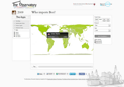
The aforementioned visualizations can be created at The Observatory of Economic Complexity, which allows you to generate a number of different economic charts and maps. For example, you can choose to show imports or exports, different products, and years. In addition, you can view charts as animations (from the years 1962-2009). Below are a few examples of these with the focus being on beer imports in the United States:

A map of beer imports around the world.
A Tree Map of beer imported to the United States.
A Stacked Area Chart of beer imported to the United States.


Tuesday, December 27, 2011

Redesigned Census.gov website now available

Do you use the U.S. Census website and have had difficulties locating data and resources? If so then be sure to check out the newly redesigned census.gov website which has greatly improved access to data, maps, and statistics from the U.S. Census Bureau! 
As the first step to making Census content more accessible, useful, and interesting for our users today the U.S. Census Bureau has redesigned Census.gov.  The goal of this redesign is to make it easier for users to find information and to increase public awareness of how the Census measures people, places, and the economy.
Here are some of the new features and tools users will experience:
  • A prominent dashboard showing off the Census Bureau’s economic indicators
  • A top dropdown menu for quick navigation to key topics
  • A new interactive map showing a mash up of economic and demographic statistics
  • A “Stat of the Day” highlighting Census Bureau statistics across all the data we collect
  • A mega footer with links categorized under familiar topics and highly trafficked pages
  • A feature for users to provide feedback


As the U.S. Census Bureau continues to transform census.gov, the public will gain greater accessibility to U.S. Census Bureau statistics through both their desktops and mobile devices. Users will see additional improvements in search, topic-based navigation, visualizations and digital content. 

Thursday, December 22, 2011

A Look at Childcare arrangements, LIVE on CSPAN's "Washington Journal" on 12/23/2011 at 9:15am

On Friday, Dec. 23, from 9:15 a.m. to 10 a.m, Lynda Laughlin, family demographer, US. Census Bureau's Fertility and Family Statistics Branch, will appear live on C-SPAN's "Washington Journal" to discuss child care arrangements in the 21st century.  Her presentation will include a rich mix of statistical visualizations and discussion, including a public call-in segment.  This part of a weekly Friday series called "America By the Numbers" that features the federal statistical agencies.


You are invited to tune in and watch the program.  C-SPAN is available live through the Internet at http://www.c-span.org/Series/Washington-Journal/.


For more information and to view the presentation graphs, please visit the following link, which will be live Friday morning (Dec 23, 2011): http://www.census.gov/newsroom/cspan/childcare.html

Friday, December 16, 2011

Brookings Maps Economic Recovery


Yesterday, The Brookings Institution, a Washington, D.C. based nonprofit policy organization, released a report that classifies the economic recovery of the 100 largest metropolitan areas in the country through the third quarter of 2011. The report classified each metro area into 5 categories based on four indicators: employment change, unemployment rate change, gross metropolitan product change, and housing price index change. The full list of metro areas with their classification is available here, but Brookings has also created a very cool interactive map, which is symbolized by economic recovery. Additionally, clicking on one of the map's metro areas reveals an economic recovery report for the respective metro area.

According to the report, the strongest 20 metros are:


  • Albuquerque, NM 
  • Bakersfield, CA
  • Boston-Cambridge-Quincy, MA-NH
  • Dallas-Fort Worth-Arlington, TX 
  • Des Moines-West Des Moines, IA 
  • Detroit-Warren-Livonia, MI 
  • Grand Rapids-Wyoming, MI 
  • Houston-Sugar Land-Baytown, TX
  • Lakeland-Winter Haven, FL 
  • McAllen-Edinburg-Mission, TX
  • New Orleans-Metairie-Kenner, LA 
  • North Port-Bradenton-Sarasota, FL 
  • Ogden-Clearfield, UT 
  • Phoenix-Mesa-Glendale, AZ 
  • Provo-Orem, UT 
  • Rochester, NY 
  • San Jose-Sunnyvale-Santa Clara, CA 
  • Toledo, OH 
  • Worcester, MA 
  • Youngstown-Warren-Boardman, OH-PA