In the 2012 President's Budget Request, the National Biological Information Infrastructure (NBII) is terminated. As a result, all resources, databases, tools, and applications within this web site will be removed on January 15, 2012. For more information, please refer to the NBII Program Termination page.
Prolonged drought lowers the normal moisture content of debris in forests and other wild lands, creating an overload of dry fuel in terrestrial ecosystems and increasing the potential for large, destructive wildfires. Prolonged dry spells tend to increase the intensity of forest fires as moisture content is rarely influenced by single precipitation events.
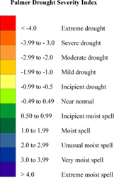
A popular measure of dryness is the Palmer Drought Severity Index, which factors temperature and rainfall information to estimate dryness for a localized area.
[Image: U.S. Geological Survey]
Using the Palmer index, normal conditions fall near zero, while "extreme drought" registers at minus 4 and "extremely moist spell" registers at positive 4.
Prolonged periods without rain stress plant communities, making them more susceptible to insects and disease and less competitive with invasive species. Dead and dying vegetation contributes further to the problem of excess dry fuel. Dry conditions also prevent use of prescribed fire, often used control invasive species.
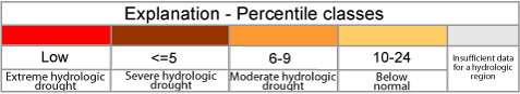
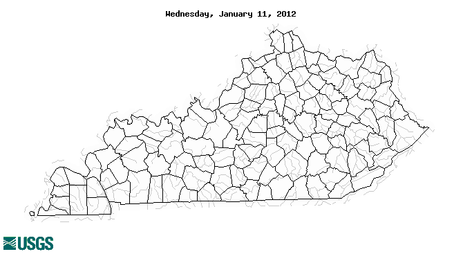
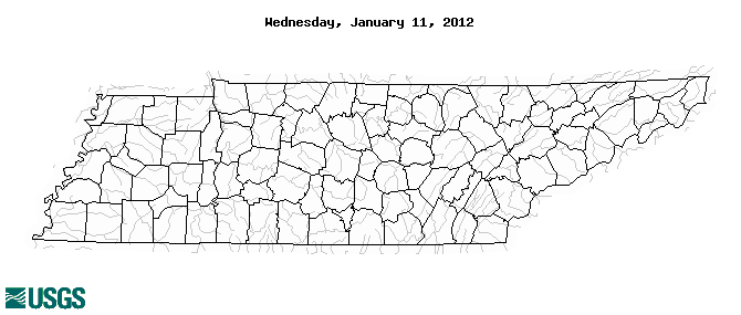
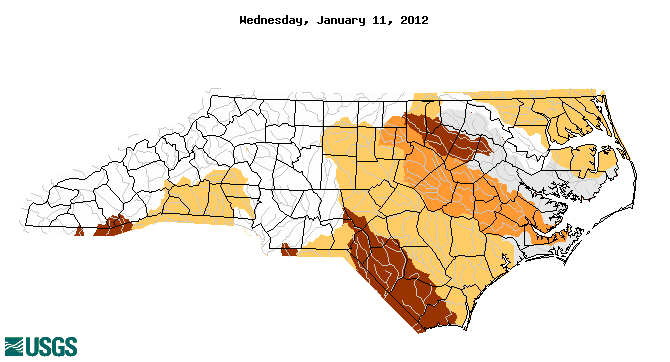
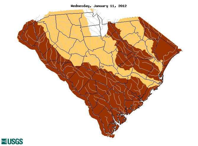
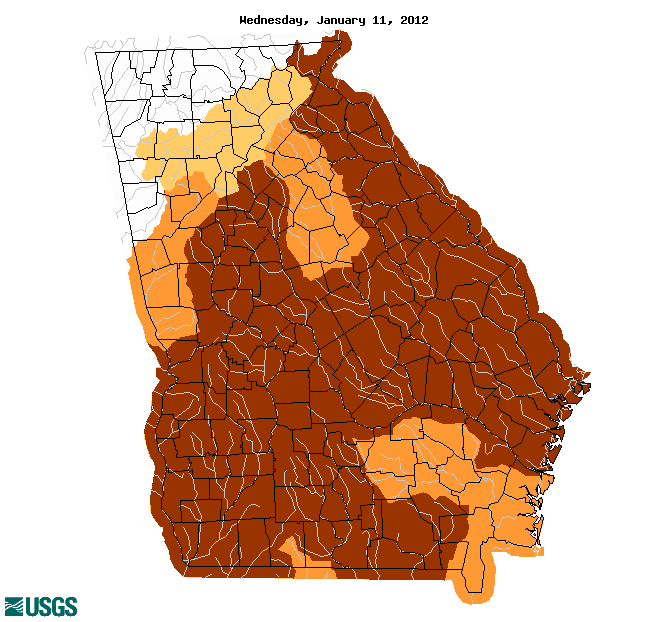
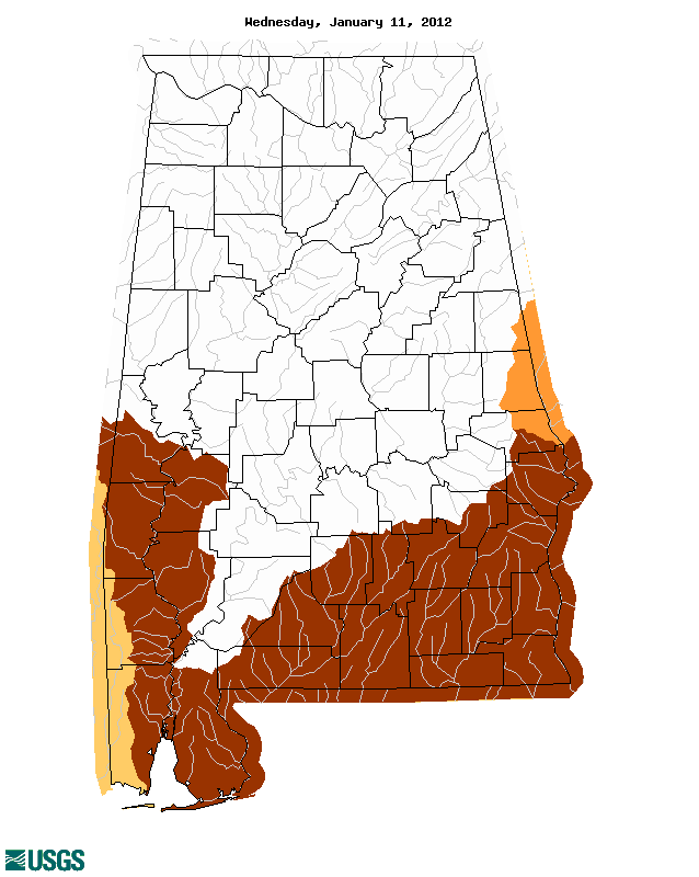
The maps below, served from the USGS Drought Watch site, illustrate the intensity of drought in seven Southeastern states. The colors on the map represent four categories of drought: extreme hydrologic drought, severe hydrologic drought, moderate hydrologic drought, and simply "below normal." The severity of drought is determined by a 7-day average streamflow conditions in hydrologic units of the state shown for the day of year.
The colors represent 7-day average streamflow percentiles based on historical streamflow for the day of the year, meaning the map shows conditions adjusted for what is considered normal for this time of the year. A legend explaining the categories associated with each color is provided below: