
Figure 1. Chart. Distribution of Participants’ Ages by Gender
May 24, 2006
Authors:
James Jenness & Jeremiah SingerPrepared for:
Federal Highway Administration
Washington, DC Prepared by:Prepared by:
Westat
Rockville, Maryland
Table of Contents
Executive Summary
1 Introduction
2 Method
2 Results
3 Discussion
Appendices
Acknowledgements
Endnotes
References
Detectable warnings are walking surfaces that are primarily intended to provide a tactile cue to pedestrians who are visually impaired. They are installed at locations such as the edge of a train platform or at the transition between the sidewalk and the street to warn pedestrians of the potential hazard that lies ahead. The tactile properties of detectable warnings result from a grid of small, truncated (flat-topped) domes across the warning surface. This pattern has been standardized by the U.S. Access Board and testing has shown that the pattern can be detected underfoot or by cane without causing a tripping hazard or obstructing wheelchairs. Despite the proven tactile benefits of detectable warnings, little research has been conducted to evaluate the visual detectability of various detectable warning materials. Detectable warnings that provide salient visual cues in addition to tactile cues may help many pedestrians with visual impairments to locate hazards or curb ramps from a greater distance than is possible using the tactile cues alone. Some pedestrians may use them to orient to a curb cut or ramp at the end of a crosswalk.
The objectives of this study were (1) to determine which detectable warning colors and patterns are visually detectable and conspicuous to pedestrians with visual impairments and (2) to provide recommendations related to color, pattern, and luminance contrast of detectable warnings for placement on sidewalks.
Fifty men and women ranging in age from 24 to 92 participated in this study. All participants had impaired but useful vision. Most were legally blind. All participants reported they had difficulty locating the boundary between sidewalks and streets.
Thirteen detectable warnings were tested. The set included ten uniform colors (white, simulated white concrete, simulated brown concrete, light gray, dark gray, bright federal yellow, pale yellow, bright red, orange-red, and black) and three black-and-white patterns. Each detectable warning was a .91 m (3 ft) wide by .61 m (2 ft) long composite panel designed for surface application. Participants viewed each detectable warning on four different horizontal backgrounds. Each background was 1.22 m (4 ft) wide by 2.44 m (8 ft) long and was constructed to simulate the appearance of a red brick sidewalk, a dark gray asphalt sidewalk, a white concrete sidewalk, and a brown concrete sidewalk. The study was conducted during midday hours with dry surfaces.
Participants viewed each combination of detectable warning and sidewalk individually. To determine detection distance, participants first viewed the sidewalk from 7.92 m (26 ft) away and, if they could not see the detectable warning from this distance, they began to walk closer until they were confident that a detectable warning was present. On some trials there was no detectable warning present. Once detectable distance had been measured, participants were asked to view the detectable warning from a distance of 2.44 m (8 ft) and to describe the color and/or pattern of the detectable warning. Finally, participants were asked to rate the conspicuity (attention-getting property) of the detectable warning on a five-point scale.
Participants viewed each combination of detectable warning and background color individually. To determine detection distance, participants first viewed the simulated sidewalk section from 7.92 m (26 ft) away and if they could not see the detectable warning from this distance, they began to walk closer until they were confident that a detectable warning was present. On some trials there was no detectable warning present. After detection distance had been measured, participants viewed the detectable warning from a distance of 2.44 m (8 ft) and described its color, and rated the conspicuity (attention-getting property) of the detectable warning on a five-point scale.
Detection distance results indicate that pedestrians with visual impairments were able to see most combinations of detectable warning and sidewalk from 2.44 m (8 ft) away, but were less likely to see them from 7.92 m (26 ft) away. Detectable warnings that were similar in color to the sidewalk were seen by few participants, indicating that visual cues provided by the truncated dome pattern itself are not sufficient to ensure visual detection. The color of the sidewalk strongly influenced how easily single-color detectable warnings could be seen; however, black-and-white patterned detectable warnings were visually detectable and conspicuous for most participants across all sidewalk types. The luminance contrast provided by the detectable warning and the sidewalk (or by the patterns) was an important factor for predicting the likelihood that a detectable warning would be seen. Where luminance contrast was 70 percent or greater, about 95 percent of participants were able to see the detectable warning from 2.44 m (8 ft) away. Detectable warnings that provided at least 60 percent contrast could be seen by about 92 percent of participants from 2.44 m (8 ft) away. Dark detectable warnings on a dark sidewalk were an exception. Although providing moderately high luminance contrast, these combinations were detected less often than would be predicted from their luminance contrast.
Detection distance results indicate that pedestrians with visual impairments were able to see most combinations of detectable warning and sidewalk from 2.44 m (8 ft) away, but were less likely to see them from 7.92 m (26 ft) away. Detectable warnings that were similar in color to the sidewalk were seen by few participants, indicating that visual cues provided by the truncated dome pattern itself are not sufficient to ensure visual detection. The color of the sidewalk strongly influenced how easily single-color detectable warnings could be seen, however, black-and-white patterned detectable warnings were visually detectable and conspicuous for most participants on all sidewalk colors tested. The luminance contrast provided by the detectable warning and the sidewalk (or by the patterns) was an important factor for predicting the likelihood that a detectable warning would be seen. Where luminance contrast was 70 percent or greater, about 95 percent of participants were able to see the detectable warning from 2.44 m (8 ft) away. Detectable warnings that provided at least 60 percent contrast could be seen by about 92 percent of participants from 2.44 m (8 ft) away. Dark detectable warnings on a dark sidewalk were an exception. Although providing moderately high luminance contrast, these combinations were detected less often than would be predicted from their luminance contrast. For dark single-color detectable warnings and black-and-white patterned detectable warnings a few participants commented that the detectable warning looked like something else (e.g. hole, metal grate).
Besides luminance contrast, regression analyses indicated that some other characteristics of detectable warnings were generally associated with high detection rates and high conspicuity ratings. These include color (reds and yellows rather than achromatic) and reflectance (lighter colors rather than darker colors). For the range of conditions tested, neither illumination level (per trial) nor sky conditions (percent cloud cover per session) affected detection and conspicuity of detectable warnings.
Based on the results of the study, the authors recommend the following:
Further visibility testing of detectable warnings should include a broader range of lighting conditions (dusk, dawn, artificial illumination), determination of optimal internal contrast patterns for two-color detectable warnings, and viewing detectable warnings in naturalistic roadway environments with unpredictable crossing locations, distractions, visual obstructions, wet surfaces, and so forth. Further research also should include pedestrians’ perceptions of different detectable warning colors (e.g. Is the detectable warning recognized as being safe to step on? Does the detectable warning convey the intended message?).
1.1 Objectives
1.2 Background
1.3 Previous Research
1.1 Objectives
The primary objectives of this project are to determine whether various detectable warning materials are visually detectable by pedestrians who have visual impairments and to provide recommendations related to color and luminance contrast of detectable warnings.
1.2 Background
Detectable warning surfaces are intended primarily to provide a tactile cue to pedestrians who are blind or have visual impairments. Major causes of visual impairments in the United States are described briefly in Appendix A. The majority (80%) of people who are legally blind retain some degree of visual function1, and these people, along with pedestrians who have less severe visual impairments, may benefit from detectable warnings, which are both visually and tactilely distinctive.
The tactile properties of detectable warning surfaces result from a grid pattern of raised, flat-topped, truncated domes that can be felt underfoot or detected by a long cane or a wheelchair without causing a tripping hazard. The size and spacing of the truncated domes have been clearly specified by the U.S. Access Board.2 3 However, guidance concerning the visual properties of detectable warning surfaces is much less specific. The U.S. Access Board states that “Detectable warning surfaces shall contrast visually with adjoining surfaces, either light-on-dark or dark-on-light.”4 The Public Rights-of-Way Access Advisory Committee has previously noted that there is a lack of human factors research with vision-impaired pedestrians.5 There is not a sufficient quantitative research basis to support any more specific guidance with respect to the visual properties of detectable warning surfaces, particularly color and contrast. An overview of Federal rule making and guidance on detectable warnings is given in Appendix B.
In this report, the terms “detectable warning” and “detectable warning surface” refer to the standard truncated dome surfaces described in the Americans with Disabilities Act Accessibility Guidelines (ADAAG) and described by the U.S. Access Board.6 7 8 9 10 Note that detectable warnings with truncated domes as used in the U.S. are only one of several types of tactile patterns used through the world as detectable warnings, and represent only a subset of the types of Tactile Ground Surface Indicators (TGSIs) that are being used as a navigational aid for pedestrians who are visually impaired. For example, various tactile pavements have been used in Japan since the 1960s, and in England there are currently seven different types of tactile paving patterns used.11 12 13 Persons interested in the practices of other countries may wish to consult Detectable Warnings: Synthesis of U.S. and International Practice, which is available from the U.S. Access Board.14
1.3.1 Need for Detectable Warnings at Curb Ramps
For pedestrians who have visual impairments, curbs used to be a reliable cue for detecting the boundary between the sidewalk and a street. However, now that curb ramps and other flush transitions are used at crosswalks to improve the accessibility of sidewalks for people who cannot negotiate curbs, the curb edge has become a less reliable navigational cue for many pedestrians. This is especially relevant for blind pedestrians traveling in unfamiliar areas. Bentzen and Barlow (1995) reported that blind pedestrians using a long cane failed to detect the edge of an intersecting street on 39% of 557 approaches to unfamiliar intersections, and that shallower ramps were more difficult to detect than steeper ramps. For curb ramps encountered with slopes of 4 degrees (1:14) or less, there was a 51% rate of entering the street rather than stopping on the sidewalk or ramp.
1.3.2 Detectable Warnings May Provide Visual Guidance
Pedestrians who are visually challenged often have difficulty locating crosswalks, properly aligning themselves to cross, determining when it is safe to cross, maintaining a straight path while crossing, and completing their crossing before perpendicular traffic approaches.15 For pedestrians who have some functional vision, detectable warnings that can be seen before they are detected by cane or under foot may provide useful information:
1.3.3 Visual Detection of Detectable Warning Surfaces
A search of the literature found reports on installation and durability of detectable warning surfaces (e.g., Ketola & Chia, 1994; Kaplan, 2004) and some studies that have evaluated detectable warning surfaces for detection under foot or by long cane (e.g., Peck & Bentzen, 1987; Bentzen, Nolin, Easton, Desmarais, & Mitchell, 1994; Tijerina, Jackson, & Tornow, 1994, 1995). In general, the participants selected for these detection studies have had little or no functional vision (usually light perception only) so that tactile and auditory detection could be evaluated without having the results confounded by visual detection. Only five reports were found which included visual assessments of detectable warning surfaces by people with visual impairments (Templer, Wineman, & Zimring, 1982; Bentzen, Nolin, & Easton, 1994; O’Leary, Lockwood, & Taylor, 1996; Bentzen & Myers, 1997; Kemp, 2003). Each of these reports is described in detail in Appendix C.
These studies varied widely in terms of the number of participants, types and number of detectable warning materials tested, procedures used, and the amount of detail provided in the report. Participants in these studies generally were recruited based on self reported visual ability. Three of the studies used six or fewer participants, and the other two studies had 24 and 27 participants. One of these was conducted outdoors under natural illumination, and the other was conducted indoors under artificial illumination. The size of the detectable warnings used varied widely between studies. Most of the studies reviewed do not adequately report on the lighting conditions and color and luminance contrast between detectable warning surfaces and surrounding surfaces. Clearly, some of the studies were meant only to be informal assessments of particular products rather than scientifically rigorous experiments.
Overall, yellow detectable warning surfaces (particularly federal yellow, also known as safety yellow) have been found to be highly visually detectable and, as expected, higher contrasts between the warning surface and the adjacent surface are more detectable than lower contrasts. Participants have generally rated federal yellow warning surfaces as being highly detectable. Although dark-on-light contrast pairs have not been tested as often as light-on-dark contrast pairs, there is some indication that they may be just as effective. Finally, there is some evidence that low reflectance of the lighter surface in a contrast pair may reduce visibility, even when luminance contrast is moderately high.
1.4 Participants
1.5 Materials
1.6 Testing Site and Conditions
1.7 Procedure
Systematic outdoor evaluations were performed on 13 different detectable warning colors/patterns on 4 different simulated sidewalk surfaces by 50 visually impaired participants who have visual impairments. The two main dependent measures were:
1.4 Participants
Fifty adults with low vision were recruited through contacts with local organizations for people who are blind or visually impaired. Information about the study was also distributed through email lists, flyers in medical offices and retirement communities, and through personal contacts of orientation and mobility specialists in the Washington, DC, area. Some participants were referred by other participants. Individuals were invited to participate based on their responses to a screener questionnaire. When people called to inquire about the study they were asked about the nature and severity of their visual impairments, their frequency of travel and difficulties experienced while walking, and the travel aids they use. Self-reported difficulty in detecting streets and curb ramps was a major criterion used to select participants for the study. Participants were compensated with $75 for their time and were reimbursed for local travel expenses.
Participants ranged in age from 24 to 92 years old, with a median age of 54. The distribution of participants’ ages by gender is shown in Figure 1. There were 31 women and 19 men in the sample. Each age group contained both men and women except for the youngest age group (20 – 29 years) and oldest age group (90-99) which each consisted of women only and the 70-79 years-old group which consisted of men only.
Participants ranged in age from 24 to 92 years old, with a median age of 54. The distribution of participants’ ages by gender is shown in Figure 1. There were 31 women and 19 men in the sample. Each age group contained both men and women except for the youngest age group (20 to 29) and oldest age group (90 to 99) which each consisted of women only and the 70 to 79 years-old group which consisted of men only. The most frequently reported travel aid was a long cane, which was used by 36 participants. Some participants reported that they use more than one kind of travel aid, choosing what they need based on the duration of the planned trip, their familiarity with the area where they will be traveling, and the anticipated lighting conditions. The use of travel aids during the study was permitted. Mobility aids such as support canes and walkers were also allowed. Eyeglasses and sunglasses were allowed, though viewing scopes such as monoculars were not allowed.
Nearly all of the selected participants were legally blind as a result of limited visual acuity, limited field of vision, or a combination of the two, but all participants had some useful vision (more than light perception). None of the participants had a driver’s license and all reported walking on sidewalks occasionally or frequently, either with or without travel aids. The number of participants who reported using travel aids at least occasionally is shown in Table 1. The most frequently reported travel aid was a long cane, which was used by 36 participants. Some participants reported that they use more than one kind of travel aid, choosing what they need based on the duration of the planned trip, their familiarity with the area where they will be traveling and the anticipated lighting conditions. The use of travel aids during the study was permitted. Mobility aids such as support canes and walkers were also allowed. Eyeglasses and sunglasses were allowed, though viewing scopes such as monoculars were not allowed.
Figure 1. Chart. Distribution of Participants’ Ages by Gender
Table 1. Self-reported Use of Travel Aids
Travel Aid |
Participants Reporting Use |
|---|---|
Long cane |
36 |
Dog guide |
4 |
Monocular/ telescope/ magnifying glasses |
3 |
Short cane / support cane |
6 |
Walker |
2 |
Wheel chair |
1 |
No travel aids used |
10 |
Participants’ visual impairments were diverse and in several cases vision was affected by multiple medical conditions. The complete list of participants’ self-reported conditions affecting their vision is given below in Table 2. The most commonly reported conditions were glaucoma, cataract, and macular degeneration.
Table 2. Self-reported Medical Conditions Affecting Vision
Medical Condition |
Participants Reporting Condition |
|---|---|
Glaucoma |
13 |
Cataract |
12 |
Macular degeneration / macular dystrophy |
10 |
Retinitis pigmentosa |
6 |
Optic neuritis / optic nerve atrophy |
6 |
Brain injury |
5 |
Diabetic retinopathy |
5 |
Retinopathy of prematurity |
4 |
Retinal detachment |
3 |
Albinism |
2 |
Corneal dystrophy / other corneal disease |
2 |
Myopic degeneration |
1 |
Inverse retinitis pigmentosa |
1 |
Uveitis |
1 |
Stargardt’s disease |
1 |
Giant cell arteritis |
1 |
1.5 Materials
Sidewalks. Four different colors of simulated sidewalk surfaces were used in this study. These included white (simulating new concrete), brown (simulating aged, dirty concrete), dark gray (simulating asphalt), and red (actual paving bricks). The four simulated sidewalk sections were constructed on low wooden platforms; each covered a 1.22 m (4 ft) wide x 2.44 m (8 ft) long level area on the ground. The white and brown “concrete” surfaces were simulated by applying several coats of paint and sand mixture to a sheet of OSB plywood (oriented strand board). The surface texture provided by the OSB plywood and paint/sand mixture approximated the surface texture of brushed concrete. Dark gray asphalt rolled roofing material was glued on OSB plywood to simulate dark gray asphalt pavement, and red colored concrete paving bricks were laid (without mortar joints) to simulate the brick sidewalk. The surface of each simulated sidewalk section was raised approximately 76 mm (3 in.) above the ground level. Chromaticity and luminous reflectance measurements of the simulated sidewalk surfaces used in this study are given in Table 3.
Detectable Warnings. Thirteen different detectable warnings were tested in this study. Ten were uniformly colored and three others had black-and-white patterns. Although two-color detectable warnings are not commonly used, we included a few high contrast patterns in this study to determine if patterns might be more effective than uniformly colored detectable warnings. Other colored patterns might have been tested but we chose to limit the number of detectable warnings used in the study to 13 so a participant could complete a full set of trials in a single two-hour session. The 10 uniformly colored detectable warnings are shown in Figure 2 with color samples. The three black-and-white patterned detectable warnings are shown in Figure 3, photographed against the red brick sidewalk.
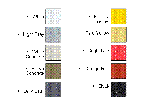
Figure 2. Photo. Uniformly Colored Detectable Warnings (Color Samples)
Black with White Border |
 |
|---|---|
Black/White Stripes |
 |
White with Black Border |
 |
Figure 3. Photo. Black-and-white Patterned Detectable Warnings
The detectable warnings were surface-mounted composite panels provided by ADA Armor-Tile. The panels were .89 m (35 in.) x .65 m (25.5 in.) including a 13 mm (0.5 in.) smooth tapered edge on all sides. The spacing and size of the truncated domes were compliant with Federal geometric specifications (see Appendix B). The detectable warnings also had very small bumps located between and on the truncated domes to provide texture for traction. Because this study was designed to examine the relative visibility of different detectable warning colors, materials from a single manufacturer were used so that the geometric characteristics of the truncated dome pattern would be constant for all of the different colors tested. Some of the colors selected for inclusion in the study were standard colors provided by the manufacturer, and some of the colors were created by painting the detectable warning panels. The relatively thin surface-mounted detectable warnings were chosen for use in this study because they could be lifted easily by a single experimenter. However, because they were not permanently mounted according to the manufacturer’s specifications, the detectable warnings had a tendency not to lie completely flat on the sidewalk. To overcome this problem, several thin metal plates were glued to the bottom of each detectable warning and magnets were embedded in the sidewalks, flush with the surface. This system served to hold the detectable warning panels flat against the sidewalk but allowed them to be quickly removed and replaced between different trials during the course of the study. When in place, the front edge of each detectable warning was positioned 1.22 m (4 ft) behind the front edge of the sidewalk and was centered horizontally on the sidewalk section.
Blanks. Blank panels were also created for this study. Blanks were made from thin sheets of painted plastic or asphalt roofing material approximately the same size as the detectable warnings. These blanks were the same color as the sidewalks and had no truncated domes. Blanks provided very little visual contrast against the sidewalk and were included in the study to ensure that participants could not simply assume that a detectable warning was present on every trial. Like the detectable warnings, the blanks cast small shadows along their front edges which ensured that participants could not simply use the presence of a thin shadow as a cue to determine that a detectable warning was present on the sidewalk. Blank panels were used with the white, brown, and asphalt sidewalks, but not with the brick sidewalk.
Chromaticity and Reflectance of Materials. Chromaticity and reflectance are physically measurable qualities that are related to the perceived color and lightness of surfaces. The chromaticity and reflectance of detectable warnings, sidewalks, and blank panel surfaces were measured in place (horizontal) at the testing site. Table 3 shows the chromaticity coordinates and reflectance factors of the materials used in this study. This set of chromaticity measurements was made between 10:00 a.m. and 11:00 a.m. under natural illumination (20% cloud cover) using a SpectraScan PR650 (PhotoResearch) spectrophotometer. The reflectance factors were measured on a different day using a Minolta CS-100 Chroma Meter. All measurements were made from the same direction that the surfaces were viewed by participants: at a downward angle of 45 degrees. Other details about the measurement procedures are given in Appendix D. Additional photometric measurements of real sidewalks at various locations in Rockville, Maryland confirmed that our simulated sidewalks had chromaticities and luminance reflectances that are plausible for actual paving materials.
Chromaticity and reflectance of the actual concrete sidewalks measured varied considerably depending on their age and dirtiness. For example, a new-looking, clean concrete sidewalk had a luminance reflectance of r = 0.49, while an older, much darker concrete sidewalk had a luminance reflectance of r = .09. Three asphalt sidewalks measured had luminance reflectance ranging from r = .06 to r = .10. Thus, from our limited measurements of real sidewalks, we conclude that the white simulated concrete sidewalk section used in the present study is similar to very light new concrete, and the simulated asphalt sidewalk is similar to new dark asphalt. The luminance reflectance of the brown simulated sidewalk is consistent with medium gray concrete sidewalks that we observed, although its appearance is more brownish. The red bricks used in the present study had similar luminance reflectance as bricks measured in existing sidewalks.
Table 3. Chromaticity and Reflectance of Materials
Material |
CIE1931 Chromaticity Coordinates |
Reflectance |
|---|---|---|
White detectable warning |
x = .333, y = .347 |
.74 |
Light Gray detectable warning |
x = .326, y = .341 |
.24 |
White “concrete” detectable warning |
x = .352, y = .364 |
.64 |
Brown “concrete” detectable warning |
x = .390, y = .386 |
.17 |
Dark Gray detectable warning |
x = .320, y = .331 |
.09 |
Federal Yellow detectable warning |
x = .511, y = .454 |
.46 |
Pale Yellow detectable warning |
x = .412, y = .414 |
.47 |
Bright Red detectable warning |
x = .587, y = .323 |
.11 |
Orange-Red detectable warning |
x = .533, y = .356 |
.13 |
Black detectable warning |
x = .324, y = .338 |
.02 |
White paint (used for border & stripe patterns) |
x = .330, y = .344 |
.82 |
Black paint (used for border pattern) |
x = .326, y = .340 |
.02 |
Brick sidewalk (for a typical brick) |
x = .417, y = .358 |
.15 |
Asphalt sidewalk |
x = .332, y = .346 |
.06 |
Asphalt “blank” panel |
x = .335, y = .349 |
.05 |
White sidewalk |
x = .351, y = .363 |
.57 |
White “blank” panel |
x = .351, y = .363 |
.60 |
Brown sidewalk |
x = .385, y = .381 |
.17 |
Brown “blank” panel |
x = .384, y = .381 |
.17 |
1.6 Testing Site and Conditions
The study was conducted on a flat, outdoor patio adjacent to Westat’s conference center in Rockville, MD. The area was clear of obstructions and was situated so that no shadows fell on the four sidewalk sections during the hours when testing was conducted. The four sidewalk sections were arranged side-by-side and a straight, unobstructed walking path was provided to each sidewalk. A scale drawing of the site is presented in Figure 4. Study sessions began between 10:00 a.m. and 1:30 p.m. to ensure consistent lighting. Sessions were conducted regardless of cloud conditions, but were canceled in the event of rain. Testing sessions took place between May and August 2005. When not in use, the sidewalk sections were covered to prevent damage from exposure to sunlight and precipitation, and detectable warning panels were stored indoors.

Figure 4. Diagram. Schematic View of Testing Site
1.7 Procedure
The study utilized a full factorial, repeated-measures design in which participants viewed each of the 13 detectable warnings against each of the 4 sidewalks for a total of 52 trials. Two “blank” trials were also inserted for each of the sidewalks (except the brick sidewalk) for a grand total of 58 trials. Participants completed all trials on a particular sidewalk before moving on to the next sidewalk. The order in which sidewalks were viewed was randomized for each participant, as was the order of the detectable warnings (and blank trials) viewed on each sidewalk. Participants were tested individually in sessions lasting 1.5 to 2.5 hours.
The purpose and general activities involved in the study were explained to participants during initial telephone screening. Consent forms were printed in a large font size and sent to participants via mail or e-mail (whichever was preferred).
1.7.1 Introduction and Vision Testing
Upon arrival at Westat, participants were guided to the vision testing room. Participants were escorted at all times by an experimenter who had received training from an orientation and mobility specialist. The experimenter first read the consent form aloud to participants who had not had the opportunity to read it themselves and then collected signed consent forms. Next, participants were asked to describe their visual condition, the functionality of their vision, and their use of mobility aids. Three separate vision tests were performed to assess participants’ visual acuity, contrast sensitivity, and color vision. For these tests, participants were allowed to view the charts binocularly and to use head or eye movements necessary to read as many letters or symbols as possible. Details on the vision testing procedures are given in Appendix E. No formal assessments of each participant’s visual fields were conducted due to time constrains, however based on self-reports, the study sample included participants with small, medium, and large visual field losses.
The experimenter guided participants to the outdoor testing site and familiarized them with the site layout. Participants were given a small sample piece of detectable warning material to see and feel, then were shown examples of a detectable warning and a blank on a sidewalk. The experimenter then described the study procedures and guided participants through a practice trial before beginning the study trials.
1.7.2 Visual Detection Distance
Each trial began with the participant standing 7.9 m (26 ft) from the front edge of the detectable warning. The 7.9 m (26 ft) viewing distance was chosen to approximate the width of a residential street. Participants began facing away from the sidewalk to allow a second experimenter to lay down a detectable warning (or blank). When the detectable warning was in place, the participant turned around and reported to the experimenter whether he/she was confident that there was a detectable warning on the target sidewalk. If the detectable warning was not seen from 7.9 m (26 ft) away, the participant was instructed to walk slowly toward the sidewalk and to stop immediately if he/she became confident that there was a detectable warning (and not a blank) present. If the participant came within 2.4 m (8 ft) of the detectable warning and could not confidently say that a detectable warning was present, the trial was ended.
1.7.3 Color Naming, Conspicuity Rating, and Other Comments
If the participant was able to see the detectable warning from at least 2.4 m (8 ft) away, the experimenter guided the participant to the 8-foot line to ask two more questions. First, the participant was asked what color or pattern they saw on the detectable warning. Second, the participant was asked to rate the likelihood that the detectable warning would attract his/her attention on that particular sidewalk (conspicuity). A rating scale of 1 to 5 was used where 1 meant (the detectable warning is very unlikely to attract my attention on this type of sidewalk) and 5 meant (the detectable warning is very likely to attract my attention on this type of sidewalk).
If the participant did not see the detectable warning from 2.4 m (8 ft), a conspicuity rating of zero was assigned by the experimenter. Although additional comments were not solicited, the experimenter also recorded any relevant comments that the participant provided about the detectable warnings, such as, “looks like a cement patch.”
2.1 Participants’ Vision
2.2 Lighting Conditions
2.3 Visual Detection
2.4 False Detections
2.5 Visual Detection Distance
2.6 Conspicuity Ratings
2.7 Comparing Visual Detection Rates and High Conspicuity Ratings for Detectable Warnings
2.8 Effects of Luminance Contrast on Visual Detection and Conspicuity of Detectable Warnings
2.9 Models to Predict Visual Detection and High Conspicuity Ratings
2.10 Other Factors that May Predict Visual Detection and High Conspicuity Ratings
2.11 Perceived Color of Detectable Warnings
2.12 Comments from Participants
2.1 Participants’ Vision
The distribution of acuity scores for participants in this study is shown in Figure 5. Normal visual acuity on this scale is 20/20, which is not shown because it would be plotted far to the right of the distribution. From the adjusted viewing distance of 1.22 m (4 ft), one participant was able to read the bottom line of the chart (smallest letters) which indicated that her acuity was 20/50 or better. Despite having relatively good acuity, this participant was retained in the study because she reported having a large visual field loss. Forty-two of the participants had visual acuities of 20/200 or less, including nine participants who were unable to read the top line (largest letter) of the acuity chart, indicating that their visual acuity was less than 20/1000.

Figure 5. Chart. Distribution of Participants’ Visual Acuity
Participants’ contrast sensitivity was tested with a Pelli-Robson Contrast Sensitivity chart. The letters on this chart are all large, but the contrast of letters decreases from left to right and from the top of the chart to the bottom. Participants viewed this chart from a distance of one meter. The chart was illuminated uniformly according to the instructions provided by the manufacturer. Figure 6 shows the distribution of participants’ contrast sensitivity scores. Note that the common logarithm of contrast sensitivity is plotted along the abscissa. A log contrast sensitivity score of zero indicates that the participant was able to read only the black letters on a white background at the full level of 100 percent contrast. The nominal value for normal log contrast sensitivity is 2.0, which corresponds to the ability to distinguish letters having only 1 percent contrast. All of the participants in this study had reduced contrast sensitivity. There were 15 participants who were unable to read even the highest contrast letters on the Pelli-Robson chart from a distance of one meter. This group is shown by the “N” label on the left side of the abscissa to indicate that their contrast sensitivity was not measurable with this test.

Figure 6. Chart. Distribution of Participants’ Contrast Sensitivity Measured With the Pelli-Robson Chart
The recently revised (Fourth Edition) of the H.R.R. Pseudoisochromatic Plates test (Richmond Products, Boca Raton, FL) was used to screen participants for red-green and blue-yellow abnormalities in color vision. Because most participants in this study were not able to read any symbols on the H.R.R. Pseudoisochromatic Plates test, no results for this test are reported (see Appendix E for a description of vision testing procedures).
2.2 Lighting Conditions
At the beginning of each testing session, experimenters visually assessed sky conditions and estimated the percent cloud cover. On each trial one measurement of horizontal illuminance was manually recorded from a Minolta T-1 Illuminance meter. The mean illuminance and standard deviation of illuminances for each participant’s trials are plotted in Figure 7. Data have been ordered from left to right by the estimated percent cloud cover that was present during the participant’s testing session. Note that the scale on the abscissa is categorical (not linear) to provide clear separation between data points. This figure shows that the fifty testing sessions varied in terms of percent cloud cover from 0 percent to 100 percent, and that mean illumination for different participants ranged from approximately 18,000 lux to 115,000 lux. Sessions with either no cloud cover (0%) or complete cloud cover (100%) tended to have low variability (smaller standard deviations) in illuminance across trials, while sessions with moderate cloud cover tended to have higher variability in horizontal illuminance across trials. As discussed below in the results section, neither illuminance level nor amount of cloud cover was significantly related to the probability of the participant seeing the detectable warning. Also, these two aspects of the lighting conditions were not significantly related to the probability of the participant giving a detectable warning a high conspicuity rating.

Figure 7. Graph. Horizontal Illuminance (Mean and Standard Deviation) for Each Participant’s Trials by the Estimated Percent Cloud Cover During the Testing Session
2.3 Visual Detection
For each sidewalk type, Table 4 shows the percentage of participants who were able to see each detectable warning at 2.44 m (8 ft) and at 7.92 m (26 ft). Although most of the detectable warnings tested in this study were seen by most participants at a distance of 2.44 m (8 ft), a few combinations of sidewalk type and detectable warning color were not seen by many participants. At greater distance, up to 7.92 m (26 ft), certain combinations of detectable warning color and sidewalk were more likely to be seen than others. Sidewalk color had an important influence on the number of participants who could see the single-color detectable warnings. Two-color (black-and-white) detectable warnings were seen by a high percentage of participants at all distances tested on all four sidewalk colors tested.
Table 4. Percentage of Participants (n = 50) Who Saw Each Detectable Warning at 2.4 m (8 ft) and 7.9 m (26 ft) for Each Sidewalk Type
Detectable Warning Colors |
Brick |
Asphalt |
White |
Brown |
||||
|---|---|---|---|---|---|---|---|---|
Percent seen at |
Percent seen at |
Percent seen at |
Percent seen at |
Percent seen at |
Percent seen at |
Percent seen at |
Percent seen at |
|
White |
96 |
86 |
98 |
88 |
66 |
28 |
98 |
86 |
Light Gray |
84 |
50 |
98 |
78 |
94 |
76 |
86 |
58 |
White Concrete |
94 |
80 |
98 |
88 |
36 |
10 |
100 |
82 |
Brown Concrete |
68 |
32 |
98 |
64 |
98 |
84 |
36 |
8 |
Dark Gray |
84 |
64 |
78 |
46 |
100 |
86 |
92 |
68 |
Federal Yellow |
94 |
78 |
98 |
88 |
88 |
62 |
98 |
80 |
Pale Yellow |
96 |
74 |
98 |
88 |
82 |
58 |
98 |
76 |
Bright Red |
84 |
62 |
92 |
66 |
100 |
86 |
94 |
68 |
Orange-Red |
76 |
56 |
92 |
68 |
98 |
84 |
86 |
66 |
Black |
98 |
68 |
78 |
40 |
96 |
82 |
96 |
68 |
Black with White border |
98 |
78 |
98 |
82 |
98 |
78 |
98 |
82 |
Black with White stripes |
96 |
86 |
100 |
86 |
98 |
86 |
96 |
84 |
White with Black border |
96 |
86 |
98 |
88 |
96 |
76 |
98 |
90 |
2.4 False Detections
On each of the white, brown, and asphalt sidewalks, each participant experienced two trials in which there was a flat blank panel on the sidewalk instead of a bumpy detectable warning. Out of 300 total blank trials, 11 (3.7 percent) resulted in “false alarms” or false detections where the participant reported seeing a detectable warning even though the target was a blank panel. Nearly half of the false detections were due to a single participant who reported seeing a detectable warning on 5 out of 6 of her blank trials. This participant’s results indicate that she responded appropriately to the actual detectable warnings despite the false detections on blank trials. If her data are set aside, the false alarm rate for the remaining group of 49 participants was 2 percent. The low false alarm rate is consistent with the instructions to participants to report that they could see a detectable warning when they were “confident” that there was a detectable warning on the sidewalk.
2.5 Visual Detection Distance
As described in the Method section, the maximum distance up to 7.92 m (26 ft) at which each participant could see each detectable warning was measured. These data were then analyzed at 1-foot intervals from 2.44 m (8 ft) to 7.92 m (26 ft) by counting the number of participants at each distance who were able to see the detectable warning. For this analysis, we assumed that participants who could see a particular detectable warning from a greater distance could also see it from closer distances. For example, if a participant first saw the detectable warning from a maximum distance of 4.3 m (14 feet), and saw the detectable warning when tested at the 2.44 m (8 ft) distance, then we assumed that the participant could also see the detectable warning at all intermediate distances between 2.44 m (8 ft) and 4.3 m (14 ft).
The results of this analysis are summarized in Figure 8 through Figure 20. In each of these figures, the percentage of participants (n = 50) who were able to see a particular detectable warning from distances between 2.44 m (8 ft) and 7.92 m (26 ft) is plotted at 1-foot intervals. For clarity of presentation, four different lines, corresponding to the four different sidewalk colors tested have been drawn to connect the data points. These lines show how the percentage of participants who were able to see the detectable warning changes with distance for the four different sidewalk colors tested. For any observed percentage value (P) plotted in Figure 8 through Figure 20, a 95-percent confidence interval for the true population percentage may be constructed by applying the formula:
95% confidence interval = [P-1.96 (SQRT(P*(1-P)/50), P+1.96 (SQRT(P*(1-P)/50)].
For the reader’s convenience, confidence intervals for several values of P are given in Table 5, however, to assure clarity of presentation, no confidence bounds are shown in Figures 8 through Figure 20.
As expected, the percentage of participants who were able to see the detectable warning increases with distance from 7.92 m (26 ft) to 2.44 m (8 ft). Some of the detectable warning colors tested had much higher rates of visual detection at both 2.44 m (8 ft) and at 7.92 m (26 ft) than other colors. In cases where the sidewalk color is similar to the detectable warning color, the percentage of participants who were able to see the detectable warning is reduced. In fact, the least detectable combinations were the white “concrete” detectable warning on the white sidewalk and the brown “concrete” detectable warning on the brown sidewalk. In these cases, the detectable warning color and the sidewalk color were nearly identical.
Table 5. Some 95-Percent Confidence Intervals For Percentages Shown in Figure 8 Through Figure 20
Percentage |
Lower bound |
Upper bound |
|---|---|---|
5% |
0% |
11% |
10% |
2% |
18% |
15% |
5% |
25% |
20% |
9% |
31% |
25% |
13% |
37% |
30% |
17% |
43% |
35% |
22% |
48% |
40% |
26% |
54% |
45% |
31% |
59% |
50% |
36% |
64% |
55% |
41% |
69% |
60% |
46% |
74% |
65% |
52% |
78% |
70% |
57% |
83% |
75% |
63% |
87% |
80% |
69% |
91% |
85% |
75% |
95% |
90% |
82% |
98% |
95% |
89% |
100% |
Detection distances for the 10 single-color detectable warnings are shown in Figure 8 through Figure 17. In these 10 figures, the 4 plotted lines tend to spread apart, indicating that the percentage of participants who can see these detectable warnings depends on the sidewalk type. However, in Figure 18 through Figure 20, which show data for the black-and-white patterned detectable warnings, the four plotted lines tend to run close together, indicating that the percentage of participants who were able to see these black-and-white patterned detectable warnings does not depend strongly on sidewalk type. Overall, the black-and-white patterned detectable warnings tended to be seen by more participants than most of the single color detectable warnings.

Figure 8. Graph. White Detectable Warning: Percentage of Participants Who Could See the Detectable Warning at Each Distance

Figure 9. Graph. Light Gray Detectable Warning: Percentage of Participants Who Could See The Detectable Warning at Each Distance

Figure 10. Graph. White Concrete Detectable Warning: Percentage of Participants Who Could See the Detectable Warning at Each Distance

Figure 11. Graph. Brown Concrete Detectable Warning: Percentage of Participants Who Could See the Detectable Warning at Each Distance

Figure 12. Graph. Dark Gray Detectable Warning: Percentage of Participants Who Could See the Detectable Warning at Each Distance

Figure 13. Graph. Federal Yellow Detectable Warning: Percentage of Participants Who Could See the Detectable Warning at Each Distance

Figure 14. Graph. Pale Yellow Detectable Warning: Percentage of Participants Who Could See the Detectable Warning at Each Distance

Figure 15. Graph. Bright Red Detectable Warning: Percentage of Participants Who Could See the Detectable Warning at Each Distance

Figure 16. Graph. Orange-Red Detectable Warning: Percentage of Participants Who Could See The Detectable Warning at Each Distance

Figure 17. Graph. Black Detectable Warning: Percentage of Participants Who Could See the Detectable Warning at Each Distance

Figure 18. Graph. Black with White Border Detectable Warning: Percentage of Participants Who Could See the Detectable Warning at Each Distance

Figure 19. Graph. Black-and-White Stripes Detectable Warning: Percentage of Participants Who Could See the Detectable Warning at Each Distance

Figure 20. Graph. White with Black Border Detectable Warning: Percentage of Participants Who Could See the Detectable Warning at Each Distance
2.5.1 Comparing Visual Detection Distances for Detectable Warnings
For practical purposes, someone trying to decide between two or more available detectable warning colors for a particular sidewalk application may want to know which of the colors could be seen by people with visual impairments from the greatest distance. As shown by the previous set of figures, visual detection depends on the color of the sidewalk as well as the color of the detectable warning. Thus, for a given sidewalk type, it is necessary both to know which of the detectable warning colors tested in this study could be seen at greater distances than other colors and to have a means to decide whether any observed differences in detection distance were statistically significant.
The data on maximum visual detection distance were constrained by the experimental procedure which permitted minimum and maximum viewing distances of 2.44 m (8 ft) and 7.92 m (26 ft). The data are strongly skewed, with many trials resulting in visual detection at a distance of 7.92 m (26 ft). Other trials resulted in detection at various distances between 2.44 m (8 ft) and 7.92 m (26 ft), and some trials did not result in detections. Although viewing distances closer than 2.44 m (8 ft) were not tested, the study team coded detection distance for trials with non-detections as zero feet. In order to compare the detection distances for the 13 detectable warnings, we performed a series of pairwise comparisons using a non-parametric statistic appropriate for repeated measures data. Using SAS statistical software, we computed the Wilcoxon Signed-Rank statistic for each of the 78 possible pairwise comparisons of the 13 detectable warnings on a given sidewalk. In order to control the probability of the statistical Type I error at .05 across the entire set of 78 comparisons, we used a criterion of α = .05 / 78 = .000641 for each pairwise comparison. This method for controlling Type I error is conservative. It controls the probability of claiming statistically significant differences between detectable warnings where no differences actually exist, however, this method may risk obscuring some interesting, and potentially real practical differences observed in this study. Therefore, in addition to reporting statistically significant differences in the conservative manner described above, we have also reported the direction of pairwise differences which would have been considered statistically significant if the two detectable warnings had been tested in isolation, rather than as part of a set of multiple comparisons. Thus, for this second less conservative statistical decision criterion we set a criterion of α = .05 for each pairwise comparison.
The results of the analyses are summarized in Table 6 through Table 9. Each of these tables corresponds with one of the four sidewalk types tested. The row and column headings refer to the detectable warning colors tested. The results of the pairwise comparison between detectable warnings listed in rows and those listed in columns are shown at the intersection of the appropriate row and column. The double “greater than” symbol (>>) indicates that the detectable warning color heading the row was seen from a significantly greater distance than the detectable warning color heading the column based on the conservative criterion where (p < .000641). The single “greater than” symbol (>) indicates that the detectable warning color heading the row was seen from a significantly greater distance than the detectable warning color heading the column based on the less conservative criterion where (p < .05). Similarly, the double “less than” symbol (<<) and single “less than” symbol (<) indicate that the detectable warning color heading the row was seen from significantly less distance than the detectable warning color heading the column based on the two criteria described above. The notation “n.s.” indicates that observed differences in detection distance were not statistically significant (p > = .05). For example, on the brick sidewalk the three black -and -white patterned detectable warnings were not significantly different from each other in terms of detection distance. Note that none of the significant differences designated by a single “greater than” or single “less than” symbol is statistically significant by the more conservative criterion.
The interaction between detectable warning color and sidewalk color is apparent from comparing the pattern of results across the four sidewalk types (Table 6 through Table 9). There are several cases where one detectable warning color may be seen from a greater distance than a second detectable warning color on a particular sidewalk type, but for a different sidewalk type, the second detectable warning color may be seen from a greater distance than the first. For example, the federal yellow detectable warning is seen from significantly greater distances than the dark gray detectable warning on all sidewalk types except for the white sidewalk, where the dark gray is seen from significantly greater distances than the federal yellow.
Table 6. Brick Sidewalk: Significant Differences in Visual Detection Distance for Detectable Warnings
|
White |
Light Gray |
White Concrete |
Brown Concrete |
Dark Gray |
Federal Yellow |
Pale Yellow |
Bright Red |
Orange Red |
Black |
Black with White Border |
Black/ |
|---|---|---|---|---|---|---|---|---|---|---|---|---|
Light Gray |
<< |
|||||||||||
White Concrete |
n.s. |
>> |
||||||||||
Brown Concrete |
<< |
<< |
<< |
|||||||||
Dark Gray |
<< |
> |
<< |
>> |
||||||||
Federal Yellow |
< |
>> |
n.s. |
>> |
>> |
|||||||
Pale Yellow |
< |
>> |
n.s. |
>> |
>> |
n.s. |
||||||
Bright Red |
<< |
n.s. |
<< |
>> |
n.s. |
<< |
<< |
|||||
Orange-Red |
<< |
n.s. |
<< |
>> |
< |
<< |
<< |
< |
||||
Black |
< |
>> |
< |
>> |
>> |
n.s. |
n.s. |
>> |
>> |
|||
Black with White Border |
n.s. |
>> |
n.s. |
>> |
>> |
n.s. |
> |
>> |
>> |
> |
||
Black/ |
n.s. |
>> |
n.s. |
>> |
>> |
n.s. |
> |
>> |
>> |
> |
n.s. |
|
White with Black Border |
n.s. |
>> |
n.s. |
>> |
>> |
> |
> |
>> |
>> |
> |
n.s. |
n.s. |
Row vs. Column differences are indicated by double or single greater than (>) or less than (<) symbols (n.s. = "not significant"). Statistically significant differences are based on the Wilcoxon Signed-Rank test (two-tailed) performed for each pair of detectable warnings. Double and single symbols indicate statistically significant differences where p < .000641 or p < .05 respectively. For each comparison shown, the row heading should be read before the column heading. For example, participants’ visual detection distances for the light gray detectable warning were significantly less than their visual detection distances for the white detectable warning.
Table 7. Asphalt Sidewalk: Significant Differences in Visual Detection Distance for Detectable Warnings
|
White |
Light Gray |
White Concrete |
Brown Concrete |
Dark Gray |
Federal Yellow |
Pale Yellow |
Bright Red |
Orange Red |
Black |
Black with White Border |
Black/ |
|---|---|---|---|---|---|---|---|---|---|---|---|---|
Light Gray |
< |
|||||||||||
White Concrete |
n.s. |
> |
||||||||||
Brown Concrete |
<< |
< |
<< |
|||||||||
Dark Gray |
<< |
<< |
<< |
<< |
||||||||
Federal Yellow |
n.s. |
> |
n.s. |
>> |
>> |
|||||||
Pale Yellow |
n.s. |
n.s. |
n.s. |
>> |
>> |
n.s. |
||||||
Bright Red |
<< |
< |
<< |
n.s. |
>> |
<< |
<< |
|||||
Orange-Red |
<< |
< |
<< |
n.s. |
>> |
<< |
<< |
n.s. |
||||
Black |
<< |
<< |
<< |
<< |
n.s. |
<< |
<< |
<< |
<< |
|||
Black with White Border |
< |
n.s. |
n.s. |
>> |
>> |
n.s. |
n.s. |
> |
>> |
>> |
||
Black/ |
n.s. |
> |
n.s. |
>> |
>> |
n.s. |
n.s. |
>> |
>> |
>> |
n.s. |
|
White with Black Border |
n.s. |
> |
n.s. |
>> |
>> |
n.s. |
n.s. |
>> |
>> |
>> |
n.s. |
n.s. |
Row vs. Column differences are indicated by double or single greater than (>) or less than (<) symbols (n.s. = "not significant"). Statistically significant differences are based on the Wilcoxon Signed-Rank test (two-tailed) performed for each pair of detectable warnings. Double and single symbols indicate statistically significant differences where p < .000641 or p < .05 respectively. For each comparison shown, the row heading should be read before the column heading. For example, participants’ visual detection distances for the brown detectable warning were significantly less than their visual detection distances for the white detectable warning.
Table 8. White Concrete Sidewalk: Significant Differences in Visual Detection Distance for Detectable Warnings
|
White |
Light Gray |
White Concrete |
Brown Concrete |
Dark Gray |
Federal Yellow |
Pale Yellow |
Bright Red |
Orange Red |
Black |
Black with White Border |
Black/ |
|---|---|---|---|---|---|---|---|---|---|---|---|---|
Light Gray |
>> |
|||||||||||
White Concrete |
<< |
<< |
||||||||||
Brown Concrete |
>> |
> |
>> |
|||||||||
Dark Gray |
>> |
> |
>> |
n.s. |
||||||||
Federal Yellow |
>> |
< |
>> |
<< |
<< |
|||||||
Pale Yellow |
>> |
<< |
>> |
<< |
<< |
< |
||||||
Bright Red |
>> |
>> |
>> |
n.s. |
n.s. |
>> |
>> |
|||||
Orange-Red |
>> |
> |
>> |
n.s. |
n.s. |
>> |
>> |
n.s. |
||||
Black |
>> |
> |
>> |
n.s. |
n.s. |
>> |
>> |
n.s. |
n.s. |
|||
Black with White Border |
>> |
n.s. |
>> |
n.s. |
< |
> |
>> |
< |
n.s. |
n.s. |
||
Black/ |
>> |
> |
>> |
n.s. |
n.s. |
>> |
>> |
n.s. |
n.s. |
n.s. |
n.s. |
|
White with Black Border |
>> |
n.s. |
>> |
< |
< |
> |
> |
< |
< |
< |
n.s. |
< |
Row vs. Column differences are indicated by double or single greater than (>) or less than (<) symbols (n.s. = "not significant"). Statistically significant differences are based on the Wilcoxon Signed-Rank test (two-tailed) performed for each pair of detectable warnings. Double and single symbols indicate statistically significant differences where p < .000641 or p < .05 respectively. For each comparison shown, the row heading should be read before the column heading. For example, participants’ visual detection distances for the light gray detectable warning were significantly greater than their visual detection distances for the white detectable warning.
Table 9. Brown Concrete Sidewalk: Significant Differences in Visual Detection Distance for Detectable Warnings
|
White |
Light Gray |
White Concrete |
Brown Concrete |
Dark Gray |
Federal Yellow |
Pale Yellow |
Bright Red |
Orange Red |
Black |
Black with White Border |
Black/ |
|---|---|---|---|---|---|---|---|---|---|---|---|---|
Light Gray |
<< |
|||||||||||
White Concrete |
n.s. |
>> |
||||||||||
Brown Concrete |
<< |
<< |
<< |
|||||||||
Dark Gray |
<< |
> |
<< |
>> |
||||||||
Federal Yellow |
< |
>> |
n.s. |
>> |
>> |
|||||||
Pale Yellow |
< |
>> |
n.s. |
>> |
>> |
n.s. |
||||||
Bright Red |
<< |
> |
<< |
>> |
n.s. |
< |
< |
|||||
Orange-Red |
<< |
n.s. |
<< |
>> |
< |
<< |
<< |
< |
||||
Black |
<< |
>> |
< |
>> |
> |
< |
< |
n.s. |
>> |
|||
Black with White Border |
n.s. |
>> |
n.s. |
>> |
>> |
n.s. |
n.s. |
> |
>> |
> |
||
Black/ |
n.s. |
>> |
n.s. |
>> |
>> |
n.s. |
n.s. |
> |
>> |
> |
n.s. |
|
White with Black Border |
n.s. |
>> |
n.s. |
>> |
>> |
> |
> |
>> |
>> |
>> |
n.s. |
n.s. |
Row vs. Column differences are indicated by double or single greater than (>) or less than (<) symbols (n.s. = "not significant"). Statistically significant differences are based on the Wilcoxon Signed-Rank test (two-tailed) performed for each pair of detectable warnings. Double and single symbols indicate statistically significant differences where p < .000641 or p < .05 respectively. For each comparison shown, the row heading should be read before the column heading. For example, participants’ visual detection distances for the light gray detectable warning were significantly less than their visual detection distances for the white detectable warning.
2.6 Conspicuity Ratings
Participants rated the conspicuity of each detectable warning that they could see on a numerical scale that ranged from 1 (very unlikely to attract my attention on this type of sidewalk) to 5 (very likely to attract my attention on this type of sidewalk). A rating of zero (or “X” in the figures below) was assigned by the experimenter to those detectable warnings that were not detected from the viewing distance of 2.44 m (8 ft). Figure 21 through Figure 33 show the distributions of conspicuity ratings provided by participants. Each figure includes four separate distributions and represents all 50 participants’ responses to a single detectable warning on one of the four sidewalk types. Thus, for each sidewalk, the sum of the heights of the bars is 100 percent. Distributions with many responses in the 4 or 5 categories indicate high conspicuity ratings and distributions, while many responses in categories X, 1, and 2 indicate low conspicuity ratings or an inability to see the detectable warning at all. Results for most detectable warnings varied between the different sidewalks. However, the three black-and-white patterned detectable warnings received consistently high conspicuity ratings on all four sidewalks.

Figure 21. Chart. White Detectable Warning: Conspicuity Ratings by Sidewalk Type

Figure 22. Chart. Light Gray Detectable Warning: Conspicuity Ratings by Sidewalk Type

Figure 23. Chart. White Concrete Detectable Warning:
Conspicuity Ratings by Sidewalk Type

Figure 24. Chart. Brown Concrete Detectable Warning: Conspicuity Ratings by Sidewalk Type

Figure 25. Chart. Dark Gray Detectable Warning: Conspicuity Ratings by Sidewalk Type

Figure 26. Chart. Federal Yellow Detectable Warning:
Conspicuity Ratings by Sidewalk Type

Figure 27. Chart. Pale Yellow Detectable Warning: Conspicuity Ratings by Sidewalk Type

Figure 28. Chart. Bright Red Detectable Warning: Conspicuity Ratings by Sidewalk Type

Figure 29. Chart. Orange-Red Detectable Warning: Conspicuity Ratings by Sidewalk Type

Figure 30. Chart. Black Detectable Warning: Conspicuity Ratings by Sidewalk Type

Figure 31. Chart. Black with White Border Detectable Warning: Conspicuity Ratings by Sidewalk Type

Figure 32. Chart. Black-and-White Stripes Detectable Warning: Conspicuity Ratings by Sidewalk Type

Figure 33. Chart. White with Black Border Detectable Warning: Conspicuity Ratings by Sidewalk Type
2.6.1 Comparing Conspicuity Ratings for Detectable Warnings
We compared conspicuity ratings for the set of detectable warnings using the same non-parametric statistical procedure that we used to compare detection distances (described in Section 2.5.1). The results of these analyses are summarized in Table 10 through Table 13. Each of these figures corresponds to one of the four sidewalk types tested. The row and column headings refer to the detectable warning colors tested. The results of the pairwise comparisons between detectable warnings listed in rows and those listed in columns are shown at the intersection of the appropriate row and column. The double “greater than” symbol (>>) indicates that the detectable warning color heading the row was rated significantly higher in conspicuity than the detectable warning color heading the column based on a conservative criterion where (p < .000641). The single “greater than” symbol (>) indicates that the detectable warning color heading the row received significantly greater conspicuity ratings than the detectable warning color heading the column based on a less conservative criterion where (p < .05). Similarly, the double “less than” symbol (<<) and single “less than” symbol (<) indicate that the detectable warning color heading the row received significantly lower conspicuity ratings than the detectable warning color heading the column based on the two statistical criteria described above. The notation “n.s.” indicates that observed differences in conspicuity ratings were not statistically significant (p > = .05).
The patterns of statistically significant differences for conspicuity ratings shown in Table 10 through Table 13 are similar, but not identical, to the patterns of statistically significant differences for detection distances shown in Table 6 through Table 9. As expected, detectable warnings that are more conspicuous are generally seen from greater distances. In some cases, two detectable warnings that do not differ significantly in detection distance on a particular sidewalk may differ significantly in conspicuity ratings on that sidewalk. In other cases, two detectable warnings that do not differ significantly in conspicuity ratings may differ significantly in detection distance.
For conspicuity ratings, 202 of the 312 pairwise comparisons summarized in Table 10 through Table 13 revealed statistically significant differences with the conservative decision criterion (p < .000641) and an additional 60 statistically significant differences are revealed by the less conservative criterion (p < .05). For the visual detection distance measure, only 164 of the 312 pairwise comparisons summarized in Table 6 through Table 9 revealed statistically significant differences (p < .000641) with an additional 42 significant differences revealed by the less conservative criterion (p < .05). These results suggest that in the present study conspicuity ratings were a more sensitive measure than visual detection distance for evaluating the visibility of detectable warnings. However, it is possible that the detection distance measure would have been more sensitive if viewing distances greater than 7.92 m (26 ft) (and less than 2.44 m (8 ft)) were included in the experimental protocol.
Table 10. Brick Sidewalk: Significant Differences in Conspicuity Ratings for Detectable Warnings
|
White |
Light Gray |
White Concrete |
Brown Concrete |
Dark Gray |
Federal Yellow |
Pale Yellow |
Bright Red |
Orange Red |
Black |
Black with White Border |
Black/ |
|---|---|---|---|---|---|---|---|---|---|---|---|---|
Light Gray |
<< |
|||||||||||
White Concrete |
n.s. |
>> |
||||||||||
Brown Concrete |
<< |
<< |
<< |
|||||||||
Dark Gray |
<< |
> |
<< |
>> |
||||||||
Federal Yellow |
n.s. |
>> |
n.s. |
>> |
>> |
|||||||
Pale Yellow |
<< |
>> |
< |
>> |
>> |
< |
||||||
Bright Red |
<< |
>> |
<< |
>> |
> |
<< |
< |
|||||
Orange-Red |
<< |
n.s. |
<< |
>> |
n.s. |
<< |
<< |
<< |
||||
Black |
< |
>> |
n.s. |
>> |
>> |
n.s. |
n.s. |
>> |
>> |
|||
Black with White Border |
n.s. |
>> |
n.s. |
>> |
>> |
n.s. |
>> |
>> |
>> |
> |
||
Black/ |
n.s. |
>> |
> |
>> |
>> |
> |
>> |
>> |
>> |
>> |
n.s. |
|
White with Black Border |
n.s. |
>> |
n.s. |
>> |
>> |
n.s. |
< |
>> |
>> |
n.s. |
n.s. |
< |
Row vs. Column differences are indicated by double or single greater than (>) or less than (<) symbols (n.s. = "not significant"). Statistically significant differences are based on the Wilcoxon Signed-Rank test (two-tailed) performed for each pair of detectable warnings. Double and single symbols indicate statistically significant differences where p < .000641 or p < .05 respectively. For each comparison shown, the row heading should be read before the column heading. For example, participants’ conspicuity ratings for the light gray detectable warning were significantly less than their ratings for the white detectable warning.
Table 11. Asphalt Sidewalk: Significant Differences in Conspicuity Ratings for Detectable Warnings
|
White |
Light Gray |
White Concrete |
Brown Concrete |
Dark Gray |
Federal Yellow |
Pale Yellow |
Bright Red |
Orange Red |
Black |
Black with White Border |
Black/ |
|---|---|---|---|---|---|---|---|---|---|---|---|---|
Light Gray |
<< |
|||||||||||
White Concrete |
< |
>> |
||||||||||
Brown Concrete |
<< |
<< |
<< |
|||||||||
Dark Gray |
<< |
<< |
<< |
<< |
||||||||
Federal Yellow |
n.s. |
>> |
> |
>> |
>> |
|||||||
Pale Yellow |
< |
>> |
n.s. |
>> |
>> |
< |
||||||
Bright Red |
<< |
n.s. |
< |
>> |
>> |
<< |
< |
|||||
Orange-Red |
<< |
n.s. |
<< |
> |
>> |
<< |
<< |
< |
||||
Black |
<< |
<< |
<< |
<< |
n.s. |
<< |
<< |
<< |
<< |
|||
Black with White Border |
< |
>> |
n.s. |
>> |
>> |
< |
n.s. |
n.s. |
>> |
>> |
||
Black/ |
n.s. |
>> |
n.s. |
>> |
>> |
n.s. |
n.s. |
> |
>> |
>> |
n.s. |
|
White with Black Border |
<< |
>> |
n.s. |
>> |
>> |
<< |
n.s. |
> |
>> |
>> |
n.s. |
n.s. |
Row vs. Column differences are indicated by double or single greater than (>) or less than (<) symbols (n.s. = "not significant"). Statistically significant differences are based on the Wilcoxon Signed-Rank test (two-tailed) performed for each pair of detectable warnings. Double and single symbols indicate statistically significant differences where p < .000641 or p < .05 respectively. For each comparison shown, the row heading should be read before the column heading. For example, participants’ conspicuity ratings for the light gray detectable warning were significantly less than their ratings for the white detectable warning.
Table 12. White Concrete Sidewalk: Significant Differences in Conspicuity Ratings for Detectable Warnings
|
White |
Light Gray |
White Concrete |
Brown Concrete |
Dark Gray |
Federal Yellow |
Pale Yellow |
Bright Red |
Orange Red |
Black |
Black with White Border |
Black/ |
|---|---|---|---|---|---|---|---|---|---|---|---|---|
Light Gray |
>> |
|||||||||||
White Concrete |
<< |
<< |
||||||||||
Brown Concrete |
>> |
>> |
>> |
|||||||||
Dark Gray |
>> |
>> |
>> |
>> |
||||||||
Federal Yellow |
>> |
n.s. |
>> |
n.s. |
< |
|||||||
Pale Yellow |
>> |
< |
>> |
<< |
<< |
<< |
||||||
Bright Red |
>> |
>> |
>> |
>> |
> |
>> |
>> |
|||||
Orange-Red |
>> |
>> |
>> |
>> |
n.s. |
>> |
>> |
n.s. |
||||
Black |
>> |
>> |
>> |
>> |
>> |
>> |
>> |
n.s. |
n.s. |
|||
Black with White Border |
>> |
>> |
>> |
>> |
n.s. |
> |
>> |
<< |
< |
<< |
||
Black/ |
>> |
>> |
>> |
>> |
n.s. |
>> |
>> |
n.s. |
n.s. |
n.s. |
> |
|
White with Black Border |
>> |
>> |
>> |
n.s. |
< |
n.s. |
>> |
<< |
< |
<< |
n.s. |
<< |
Row vs. Column differences are indicated by double or single greater than (>) or less than (<) symbols (n.s. = "not significant"). Statistically significant differences are based on the Wilcoxon Signed-Rank test (two-tailed) performed for each pair of detectable warnings. Double and single symbols indicate statistically significant differences where p < .000641 or p < .05 respectively. For each comparison shown, the row heading should be read before the column heading. For example, participants’ conspicuity ratings for the light gray detectable warning were significantly greater than their ratings for the white detectable warning.
Table 13. Brown Concrete Sidewalk: Significant Differences in Conspicuity Ratings for Detectable Warnings
|
White |
Light Gray |
White Concrete |
Brown Concrete |
Dark Gray |
Federal Yellow |
Pale Yellow |
Bright Red |
Orange Red |
Black |
Black with White Border |
Black/ |
|---|---|---|---|---|---|---|---|---|---|---|---|---|
Light Gray |
<< |
|||||||||||
White Concrete |
n.s. |
>> |
||||||||||
Brown Concrete |
<< |
<< |
<< |
|||||||||
Dark Gray |
<< |
> |
<< |
>> |
||||||||
Federal Yellow |
n.s. |
>> |
n.s. |
>> |
>> |
|||||||
Pale Yellow |
<< |
>> |
< |
>> |
>> |
< |
||||||
Bright Red |
<< |
>> |
< |
>> |
>> |
<< |
n.s. |
|||||
Orange-Red |
<< |
>> |
<< |
>> |
> |
<< |
<< |
<< |
||||
Black |
<< |
>> |
< |
>> |
>> |
<< |
n.s. |
n.s. |
>> |
|||
Black with White Border |
n.s. |
>> |
n.s. |
>> |
>> |
n.s. |
n.s. |
> |
>> |
> |
||
Black/ |
n.s. |
>> |
n.s. |
>> |
>> |
n.s. |
> |
>> |
>> |
>> |
n.s. |
|
White with Black Border |
n.s. |
>> |
n.s. |
>> |
>> |
n.s. |
> |
> |
>> |
>> |
n.s. |
n.s. |
Row vs. Column differences are indicated by double or single greater than (>) or less than (<) symbols (n.s. = "not significant"). Statistically significant differences are based on the Wilcoxon Signed-Rank test (two-tailed) performed for each pair of detectable warnings. Double and single symbols indicate statistically significant differences where p < .000641 or p < .05 respectively. For each comparison shown, the row heading should be read before the column heading. For example, participants’ conspicuity ratings for the light gray detectable warning were significantly less than their ratings for the white detectable warning.
2.7 Comparing Visual Detection Rates and High Conspicuity Ratings for Detectable Warnings
The percentages of participants giving high conspicuity ratings for each detectable warning by sidewalk combination are shown in Table 14. These data, together with data on percentages of participants who saw each detectable warning (from Table 4) are compared in Figure 34 through Figure 38.
Table 14. Percentage of Participants (n = 50) Who Rated Conspicuity High (4 or 5) for Each Detectable Warning and Sidewalk Pairing
Detectable Warning Colors |
Sidewalks |
|||
|---|---|---|---|---|
Brick |
Asphalt |
White |
Brown |
|
White |
70 |
86 |
2 |
80 |
Light Gray |
16 |
30 |
24 |
14 |
White Concrete |
60 |
74 |
0 |
70 |
Brown Concrete |
4 |
18 |
42 |
0 |
Dark Gray |
18 |
8 |
72 |
24 |
Federal Yellow |
74 |
92 |
50 |
82 |
Pale Yellow |
54 |
80 |
28 |
62 |
Bright Red |
38 |
60 |
84 |
52 |
Orange-Red |
20 |
34 |
76 |
34 |
Black |
66 |
2 |
88 |
54 |
Black with White border |
78 |
74 |
72 |
74 |
Black with White stripes |
82 |
84 |
80 |
82 |
White with Black border |
68 |
76 |
56 |
76 |
Figure 34 through Figure 37 show the percentage of participants who were able to see each detectable warning from 2.44 m (8 ft) and the percentage of participants who rated the detectable warning as having high conspicuity (giving a rating of 4 or 5). Figure 38 shows the data combined across all participants and all trials for the four sidewalk types. To the extent that the sample of participants in this study is representative of pedestrians with visual impairments, the data shown in Figure 34 through Figure 37 may be used to choose detectable warning colors that are most likely to be highly visually detectable for a particular sidewalk type. Note that when detectable warning color was similar to the sidewalk color, the number of people who would be served by the visual properties of the detectable warning decreased markedly. The black-and-white stripe pattern was seen by nearly all participants and was highly conspicuous on all four sidewalks tested.

Figure 34. Chart. Brick Sidewalk: Percent of Participants Who Saw Each Detectable Warning and Percent Who Rated It Highly Conspicuous

Figure 35. Chart. Asphalt Sidewalk: Percent of Participants Who Saw Each Detectable Warning and Percent Who Rated It Highly Conspicuous
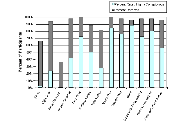
Figure 36. Chart. White Concrete Sidewalk: Percent of Participants Who Saw Each Detectable Warning and Percent Who Rated It Highly Conspicuous

Figure 37. Chart. Brown Concrete Sidewalk: Percent of Participants Who Saw Each Detectable Warning and Percent Who Rated It Highly Conspicuous

Figure 38. Chart. Data Combined Across All Four Sidewalk Types Tested: Percent of All Trials Where the Participant Saw the Detectable Warning and Percent of All Trials Where the Detectable Warning Was Rated Highly Conspicuous
2.8 Effects of Luminance Contrast on Visual Detection and Conspicuity of Detectable Warnings
Reflectance factors for each detectable warning and sidewalk were measured with a Minolta CS-100 Chroma meter and a calibrated white reflectance standard. Horizontal surfaces were measured at an angle of 45 degrees under midday natural illumination. Details on the measurement procedures and calculation of reflectance factors are provided in Appendix D. Contrast was calculated for each combination of detectable warning and sidewalk using the following formula:
Contrast = (R2 – R1) / R2 X 100%
Where:
R1 is the reflectance factor of the darker surface to be compared
R2 is the reflectance factor of the lighter surface to be compared
For the three black-and-white patterned detectable warnings contrast values were computed for the black versus white areas of the detectable warnings themselves (internal contrast). This was done because it was assumed that participants would respond primarily to the high contrast black-and-white elements of the detectable warnings whenever the contrast between the edge of the detectable warning and the sidewalk was lower.
Table 15 shows the reflectance and contrast values of the detectable warnings on each of the four sidewalks studied. The superscript letter following each percent luminance contrast value indicates whether the contrast was positive, negative, or internal. All of the values shown for the three patterned detectable warnings represent the internal contrast between the black-and-white pattern elements. Note that the internal contrast of the detectable warning patterns does not depend on the sidewalk on which it is placed.
Table 15. Reflectance Factors (R) and Percent Luminance Contrast of Detectable Warnings on Four Sidewalk Types
Detectable Warning Colors |
Sidewalks |
|||
|---|---|---|---|---|
Brick |
Asphalt |
White |
Brown |
|
White (R = .74) |
80% a |
92% a |
23% a |
76% a |
Light Gray (R = .24) |
38% a |
77% a |
58% b |
27% a |
White Concrete (R = .64) |
77% a |
91% a |
12% a |
73% a |
Brown Concrete(R = .17) |
12% a |
67% a |
70% b |
3% b |
Dark Gray (R = .09) |
41% b |
36% a |
84% b |
50% b |
Federal Yellow (R = .46) |
67% a |
88% a |
19% b |
62% a |
Pale Yellow (R = .47) |
68% a |
88% a |
16% b |
63% a |
Bright Red (R = .11) |
24% b |
51% a |
80% b |
35% b |
Orange-Red (R = .13) |
14% b |
56% a |
77% b |
27% b |
Black (R = .02) |
88% b |
68% b |
97% b |
90% b |
Black (R = .02) with White border (R = .82) |
98% c |
98% c |
98% c |
98% c |
Black (R = .02) with White stripes (R = .81) |
98% c |
98% c |
98% c |
98% c |
White (R = .84) with Black border (R = .02) |
98% c |
98% c |
98% c |
98% c |
a positive contrast (detectable warning lighter than sidewalk). |
||||
Data were analyzed to determine how luminance contrast was related to the number of participants who were able to see the detectable warning and to the number of participants who rated the detectable warning as having high conspicuity. Figure 39 shows the percentage of participants who saw each combination of detectable warning and sidewalk as a function of luminance contrast. At a viewing distance of 2.44 m (8 ft) from the detectable warning, there is a positive correlation (r = .75) between luminance contrast and the number of participants who saw each detectable warning. These data are shown on the figure by the filled diamond symbols and a solid trend line. Data obtained from a distance of 7.92 m (26 ft) are shown by the open symbols and dashed trend line. At 7.92 m (26 ft), there is also a positive correlation (r = .80) between contrast and number of participants who were able to see the detectable warning. Higher luminance contrast is associated with improved rates of visual detection at close range and from longer distances. Note that as contrast increases above 70 percent, the data for the 8-foot viewing distance reach a plateau with approximately 95 percent of participants seeing the detectable warning. At 7.92 m (26 ft), no more than 80 to 90 percent of the participants were able to see the detectable warnings, even at the highest contrast levels of 98 percent.
Contrast may be used to predict the number of participants who are able to see detectable warnings at a distance of 2.44 m (8 ft) and 7.92 m (26 ft). At 2.44 m (8 ft), the percentage of participants who are able to see the detectable warnings (PS8) is given by the following equation:
PS8 = .34 * (percent contrast) + 67.89.
From 7.92 m (26 ft), the percentage of participants who are able to see the detectable warnings (PS26) is given by the following equation:
PS26 = .52 * (percent contrast) + 36.42.
Note that the trend lines shown in Figure 39 do not provide very good fits to the data. There are several “outliers” for which these equations do not provide accurate predictions. Some of these outliers have been labeled. In particular, the simple linear models do not account for the very low rates of detection at the lowest contrast levels.

Figure 39. Graph. Percentage of Study Participants (n = 50) Who Could See the Detectable Warning by Luminance Contrast (Linear Models)
The goodness-of-fit for the linear models may be evaluated by the coefficient of determination, which for the 2.44 m (8 ft) distance is r2 = .56. For the 7.92 m (26 ft) distance, this value is r2 = .65. If the natural logarithm of luminance contrast is used to predict detection, the fit of the models improves substantially. In Figure 40, two logarithmic models have been fit to the data. The coefficients of determination (“r-square”) for these models are r2 = .76 for the 2.44 m (8 ft) data, and r2 = .73 for the 7.92 m (26 ft) data.
The model for predicting the percentage of participants seeing the detectable warning from a distance of 2.44 m (8-ft) (PS8) is:
PS8 = 16.18 * Ln(percent contrast) + 25.77.
The model for predicting the percentage of participants seeing the detectable warning from a distance of 26-feet (PS26) is:
PS26 = 22.39 * Ln(percent contrast) – 18.94.

Figure 40. Graph. Percentage of Study Participants (n = 50) Who Could See the Detectable Warning by Luminance Contrast (Logarithmic Models)
Figure 41 shows the percentage of participants who rated each combination of detectable warning and sidewalk highly conspicuous (rating of 4 or 5) as a function of luminance contrast. The figure shows a positive correlation (r = .80) between perceived conspicuity and luminance contrast. The figure also draws attention to some combinations of detectable warning and sidewalk that were rated either more or less conspicuous than others with similar luminance contrasts. The three most obvious “overachievers” include the federal yellow detectable warning on the white, brown, and asphalt sidewalks. On these sidewalks the federal yellow detectable warning received high conspicuity ratings from more participants than would be expected based on the contrast alone. The three most obvious “underachievers” include the asphalt sidewalk with the black, brown, and light gray detectable warnings. These three detectable warnings on the asphalt sidewalk were rated highly in conspicuity by fewer participants than would be expected based on their contrast.
The linear model used to fit the data for the percentage of participants giving high conspicuity ratings (PHC) is:
PHC = .77 * (percent contrast) + 1.84.
This model has a coefficient of determination equal to r2 = .64. A logarithmic model (not shown here) did not fit these data as well as the linear model (r2 = .55), so for all subsequent analyses, contrast was used instead of log contrast to predict high conspicuity ratings.

Figure 41. Graph. Percentage of Participants Who Rated Detectable Warnings Highly Conspicuous (Rating of 4 or 5) by Luminance Contrast
2.9 Models to Predict Visual Detection and High Conspicuity Ratings
We conducted several regression analyses on the data shown in Figure 40 and Figure 41 to determine if adding additional parameters would substantially increase the correspondence between the models and the data. Contrast (or log contrast), reflectance of the detectable warning, reflectance of the sidewalk, and a binary parameter which encoded patterned versus single-color detectable warnings were used. A second binary parameter was used in the models to encode colored (bright red, orange-red, federal yellow, pale yellow) versus achromatic (black, white, gray) detectable warnings. For these analyses, the brown detectable warning was included with the achromatic set. Note that for the patterned detectable warnings, reflectance of the white area was used in all analyses requiring a value for detectable warning reflectance. In a second series of analyses (not shown here) the reflectance of the black area of the patterns was defined as the value for detectable warning reflectance, but this did not substantially affect the coefficients for the model parameters. The three best-fitting and simplest models are described below.
The model to predict the percent of participants who could see the detectable warning from 8-feet (PS8) is shown below. Its coefficient of determination is r2 = .82.
PS8 = 17 * Ln(Contrast) + 20.3 + (7.3 if color is red or yellow).
The model to predict the percent of participants who could see the detectable warning from 26-feet (PS26) is shown below. Its coefficient of determination is r2 = .78.
PS26 = 23.4 * Ln(Contrast) – 26 + (9.6 if color is red or yellow).
The model to predict the percent of participants who judged the detectable warning to have high conspicuity (PHC) is shown below. Its coefficient of determination is r2 = .82.
PHC = .806 * (Contrast) + 19 * RDW – 16.7 + (26.6 if color is red or yellow).
Where:
Contrast = percent luminance contrast (0 – 100)
RDW = reflectance (0 – 1.0) of the detectable warning (for patterns, reflectance of white areas was used).
2.10 Other Factors that May Predict Visual Detection and High Conspicuity Ratings
The study team conducted several logistic regression analyses of the trial-by-trial data to determine whether lighting conditions may have influenced visual detection and conspicuity of detectable warnings. We examined the effects of cloud cover per session and illuminance per trial along with reflectance of the detectable warning, reflectance of the sidewalk, the effect of using a single-color versus a patterned detectable warning, and the effect of using an achromatic (black, white, gray) versus a colored (bright red, orange-red, federal yellow, pale yellow) detectable warning.
For these analyses, the brown detectable warning was grouped with the achromatic set. Also note that, for the analyses described below, the reflectance of the white part of the patterned detectable warnings was defined as the detectable warning reflectance. In other analyses (not shown here) we defined the reflectance of the black area of the two-color detectable warnings as the detectable warning reflectance. The coefficients for nearly all model parameters were similar no matter which area was used to define reflectance for the two-color detectable warnings. The only exceptions were the parameter estimates for the pattern versus no pattern variables in the 7.92 m (26 ft) detection model and in the conspicuity model described below. For these two models, the pattern versus no-pattern parameter estimates were sensitive to the way that the reflectance was defined for two-color detectable warnings. All other parameter estimates, including the parameter for detectable warning reflectance, were not sensitive to the area (white or black) used to define reflectance of two-color detectable warnings.
Three similar models were used to predict probability of seeing the detectable warning at 2.44 m (8 ft), the probability of seeing the detectable warning at 7.92 m (26 ft), and the probability of obtaining a high conspicuity rating (4 or 5). The data for these analyses were the outcomes of every trial on which a detectable warning was presented. Thus, the number of data points to be fit by each of the three logistic regression models was: 50 (participants) x 13 (detectable warnings) x 4 (sidewalks) = 2600. The logistic regression analyses were performed with SAS statistical software using the general linear model procedure (PROC GENMOD). The parameter estimation algorithm included an adjustment for repeated measures data clustered by participant.
The parameter estimates of the model for predicting the probability that a detectable warning would be seen from 2.44 m (8 ft) are shown in Table 16. It is clear from the parameter estimates that neither cloud cover nor illuminance help to predict whether a detectable warning would be seen from 2.44 m (8 ft) in this study. The logarithm of contrast, Ln(Contrast), and the parameter for achromatic versus colored have estimates significantly different from zero. Greater contrast
increases the probability of detection at 2.44 m (8 ft) and using an achromatic detectable warning decreases the probability of detection as compared to the red or yellow detectable warnings. The negative estimates for the two reflectance parameters and for the no-pattern parameter are not statistically significant.
Table 16. Results from Fitting a Logistic Regression Model to Predict Probability of Visual Detection at 2.44 m (8 ft)
Parameter |
Estimate |
Standard Error |
95% confidence limits |
Z |
P |
|---|---|---|---|---|---|
Intercept |
-1.974 |
1.015 |
(-3.96, .01) |
-1.94 |
.052 |
Ln(contrast) |
1.278 |
.161 |
(.96, 1.59) |
7.93 |
<.0001 |
Illumination |
.000 |
.000 |
(-.00, .00) |
.91 |
.361 |
Cloud cover |
.004 |
.006 |
(-.01, .02) |
.63 |
.527 |
Reflectance of detectable warning |
-.174 |
.351 |
(-.86, .51) |
-.50 |
.619 |
Reflectance of sidewalk |
-.258 |
.376 |
(-.99, .48) |
-.69 |
.492 |
No pattern |
-.618 |
.371 |
(-1.34, .11) |
-1.67 |
.095 |
Achromatic |
-.599 |
.156 |
(-.91, -.29) |
-3.84 |
.0001 |
A similar regression model was used to predict the probability that a detectable warning would be seen from a distance of 7.92 m (26 ft). These results are shown in Table 17. In this model, illumination, cloud cover, and reflectance of the sidewalk do not help to predict whether the detectable warning will be seen. The statistically significant parameter estimate for the logarithm of contrast (p < .0001) indicates that higher contrast predicts a higher probability of visual detection at 7.92 m (26 ft). The achromatic parameter estimate is also statistically significant (p < .0001) indicating that having a colored (red or yellow) as opposed to an achromatic detectable warning increases the probability of detection from 7.92 m (26 ft). The positive estimate for reflectance of the detectable warning is not statistically significant.
Table 17. Results from Fitting a Logistic Regression Model to Predict Probability of Visual Detection at 7.92 m (26 ft)
Parameter |
Estimate |
Standard Error |
95% confidence limits |
Z |
P |
|---|---|---|---|---|---|
Intercept |
-3.181 |
.917 |
(-4.98, -1.38) |
-3.47 |
.0005 |
Ln(contrast) |
1.126 |
.139 |
(.85, 1.39) |
8.09 |
<.0001 |
Illumination |
-.000 |
.000 |
(-.00, .00) |
-.36 |
.719 |
Cloud cover |
-.000 |
.007 |
(-.01, .01) |
-.01 |
.991 |
Reflectance of detectable warning |
.464 |
.250 |
(-.03, .95) |
1.86 |
.063 |
Reflectance of sidewalk |
.153 |
.263 |
(-.36, .67) |
0.58 |
.561 |
No pattern |
-.016 |
.131 |
(-.27, .24) |
-.12 |
.905 |
Achromatic |
-.594 |
.121 |
(-.83, -.36) |
-4.90 |
<.0001 |
The results of a similar logistic regression model used to predict the probability of high conspicuity ratings are shown in Table 18. For this model, contrast was used rather than the natural logarithm of contrast. Consistent with the results of the two detection models described above, illumination and cloud cover do not help to predict conspicuity. However, several of the other parameter estimates are statistically significant.
The statistically significant model parameters include contrast (p < .0001), reflectance of the detectable warning (p < .0001) and no pattern (p < .05). According to the parameter estimates, higher contrast, higher reflectance of the detectable warning, higher reflectance of the sidewalk, and no pattern each increase the probability that the detectable warning will receive a high conspicuity rating. Having an achromatic detectable warning significantly decreases the probability of obtaining a high conspicuity rating as compared to the red and yellow detectable warnings (p < .0001). The effect of pattern versus no pattern in this model depends strongly on whether reflectance data for the white or for the black elements of the patterned detectable warnings were defined as detectable warning reflectance. All other parameter estimates were robust to this change.
Table 18. Results from Fitting a Logistic Regression Model to Predict Probability of a High Conspicuity Rating (4 or 5)
Parameter |
Estimate |
Standard Error |
95% confidence limits |
Z |
P |
|---|---|---|---|---|---|
Intercept |
-2.733 |
.701 |
(-4.1, -1.4) |
-3.90 |
<.0001 |
Ln(contrast) |
.045 |
.004 |
(.04, .05) |
11.09 |
<.0001 |
Illumination |
-.000 |
.000 |
(-.00, .00) |
-.72 |
.472 |
Cloud cover |
.0005 |
.004 |
(-.01, .01) |
.12 |
.903 |
Reflectance of detectable warning |
1.185 |
.256 |
(.68, 1.69) |
4.64 |
<.0001 |
Reflectance of sidewalk |
.531 |
.233 |
(.08, .99) |
2.28 |
.023 |
No pattern |
.502 |
.246 |
(.02, .98) |
2.04 |
.042 |
Achromatic |
-1.456 |
.150 |
(-1.75, -1.16) |
-9.74 |
<.0001 |
2.11 Perceived Color of Detectable Warnings
The ability of people with visual impairments to correctly recognize the color of detectable warnings has important implications for both conspicuity and the potential for detectable warning color standardization. One possible reason to standardize detectable warning color is to have detectable warning color impart a specific meaning in the same way that the colors of various roadside signs have particular meanings. However, if color perception for pedestrians with visual impairments is not consistent across individuals or not stable among individuals or across lighting conditions, the “message” intended by the standardized color of a detectable warning may not be received by the intended recipients.
Participants were asked to describe the color of each detectable warning that they saw. These descriptions were made at a distance of 2.44 m (8 ft) from the detectable warning. Numerous color descriptions were given for each detectable warning and these descriptions often seemed to be influenced by the color of the sidewalk. For instance, the dark gray detectable warning was much more likely to be described as “black” on the white concrete sidewalk than it was on any other sidewalk. Presumably, this was because the high contrast provided by the white sidewalk made the detectable warning look darker by comparison. In most cases, participants provided color descriptions that were consistent with each other and with the visually unimpaired experimenters’ perceptions. However, for every detectable warning there were several unusual descriptions. The participants whose vision was most impaired were often the most likely to use color names not used by other participants. The complete set of color descriptions given by participants for each detectable warning and sidewalk combination is presented in Appendix F.
2.12 Comments from Participants
The experimenters did not solicit opinions or comments from participants regarding the detectable warnings outside of the data collection protocol. However, experimenters recorded comments whenever they were offered. Some participants commented frequently while others did not comment at all, so these comments should be considered individual opinions rather than group consensus. The complete list of comments is presented in Appendix G and major findings are summarized below.
The black-and-white stripes and the federal yellow detectable warnings received the most favorable comments. The black-and-white stripe detectable warning was often called “very attention-getting” and some participants called it their favorite detectable warning, but a few others noted that the pattern appears to have depth or looks like a metal grate. Some noted that the black stripes “disappear” when placed on the asphalt sidewalk. Many participants said that the federal yellow detectable warning was very likely to get their attention, but a few others were concerned that the contrast was insufficient on the white concrete sidewalk.
Some participants noted concerns about detectable warnings that might not be recognized as warnings or that might be mistaken for other things. Dark detectable warnings such as black, dark gray, and black with white border were sometimes thought to look like holes, asphalt patches, or shadows on the sidewalk. The light gray, dark gray, and white concrete detectable warnings were sometimes thought to look like concrete patches. The brown concrete and orange-red detectable warnings were sometimes thought to look like cardboard or rust.
The black-and-white patterned detectable warnings received mixed feedback on the white concrete sidewalk and the asphalt sidewalk. Although the internal contrast of these detectable warnings was typically sufficient to provide high visibility, some participants commented that the white sections of the detectable warnings blend into the white concrete sidewalk or did not help them to see the detectable warning. The same was said about the black sections of the detectable warnings on the asphalt sidewalk. These sentiments were most frequent with regard to detectable warnings whose borders were similar in reflectance to the sidewalk (e.g., white border/white concrete sidewalk; black border/black asphalt sidewalk). The black–and-white stripe pattern sometimes looked like a metal grate to two participants.
3.1 Key Findings
3.2 Study Limitations and Other Issues
3.3 Guidance on the Visual Properties of Detectable Warnings
3.1 Key Findings
3.2 Study Limitations and Other Issues
The present study was limited somewhat by the testing environment. Three out of four of the simulated sidewalk sections used as backgrounds for the detectable warnings were not actual paving materials, but were simulated from paint and sand mixtures, and from asphalt roofing material. The optical properties of actual paving materials (concrete, asphalt) may provide different visual cues than those provided by the simulated sidewalk surfaces. Reflectance and chromaticity of real sidewalks vary widely in their reflectance and chromaticity at different locations, and it was possible to represent only a limited range of this variation across the four simulated sidewalks produced for this study. We have provided reflectance and chromaticity measurements for all surfaces used in this study to aid in comparing the present results to those from other studies.
The procedures used in this study were designed to test only visual detection, conspicuity and color appearance of detectable warnings. Therefore, participants were never asked to step on any of the detectable warnings. It is possible that certain combinations of detectable warnings and sidewalk colors, although visually conspicuous may be mistaken for some walking hazard such as a change in elevation, metal grate, etc. A few of our participants’ comments recorded in Appendix G may reflect their perception of some detectable warnings as potential walking hazards. Further behavioral testing is needed to assess pedestrians’ willingness to step on detectable warnings with different colors and patterns.
Although there are several factors which can influence whether a pedestrian with low vision will see a detectable warning surface, among the most important are the size (distance) of the warning surface and the luminance contrast of the warning surface with adjacent surfaces. In this study participants were directed where to look to see detectable warnings and were always provided an unobstructed view without any environmental distractions. In real life, other mental demands and correct expectations about where to look and what to expect to see will also influence visual detection. Making all detectable warning installations as similar as possible (location, size, color) may help to match detectable warning characteristics to user expectations.
The image size of detectable warnings (in terms of visual angle subtended) increases as the pedestrian moves closer. For pedestrians with moderate or severe visual impairments, including low visual acuity, or substantial visual field loss, features of the environment which are smaller than several degrees of visual angle may not be detected. High contrast patterns used on detectable warnings in this study were helpful in maintaining high rates of detection on all sidewalk types tested. On the other hand, the pattern elements used may have been too small to be helpful for a few of the participants when they were 7.92 m (26 ft) away. If patterns are used on detectable warnings they should be at least as large as the four inch wide patterns used in this study.
Luminance contrast is important for predicting the number of pedestrians who will be able to see a detectable warning. If particular visibility problems are identified for uniformly colored detectable warning surfaces used adjacent to common paving materials, there may be a need to consider conspicuity enhancements for detectable warnings. Despite some results obtained indoors under artificial lighting which suggested that painted patterns can enhance the visibility of detectable warnings,16 we are aware of no other research that has examined how contrasting visual patterns within the detectable warning surface itself may increase visual detection. Also, we are not aware of any published research which has reported on enhancements to the visibility of detectable warning surfaces through modifications to the surrounding surface (such as painting a dark border around a yellow detectable warning surface to enhance its visibility against light colored concrete).
Visual contrast provided under a standard set of measurement conditions may change as a function of several environmental variables. For detectable warning surfaces installed outdoors, lighting conditions may change drastically throughout the course of the day (and night). Although this study found no effect of illumination level or cloud cover on the detection or conspicuity of detectable warnings, there is a need to determine how the visibility of detectable warning surfaces changes with more extreme changes in natural illumination and with various types and levels of artificial illumination (e.g., street lights). Nighttime illumination (from artificial sources) will have different spectral properties than daylight illumination and may result in less visual contrast between detectable warning surfaces and adjacent surfaces. Further research may be needed to confirm visibility of detectable warnings under low light levels and artificial illuminants.
Dry materials reflect light differently than wet materials and the luminance contrast and color contrast between the detectable warning and its surrounding surface may change when one or both surfaces are wet. Further research may be needed to confirm visibility of detectable warnings under wet conditions.
A final concern is that the colors of detectable warnings and sidewalks can change as the materials age. A particularly striking example of these changes has been related by Kirk:
[The detectable warning product] exhibited considerable fading over the two-year period.... Thus, while the product did not retain its original color, the contrast with adjacent surfaces was increased. This fading of the color, combined with aging of the concrete, actually produced a reversal of the contrast between the detectable warning and the surrounding concrete surface over the two years. When new, the detectable warning was a darker color surrounded by the relatively lighter new concrete; and after two years the detectable warning was a lighter color surrounded by a relatively darker concrete surface.17
The implication of this description is that, as the materials slowly changed color, causing the contrast reversal, there must have been a period of time when the luminance contrast was nearly zero between this detectable warning and sidewalk. Thus, in choosing the detectable warning color for a particular installation, the aging of the materials should be considered.
3.3 Guidance on the Visual Properties of Detectable Warnings
Based on the results of this study, the following recommendations were developed for the color and contrast of detectable warnings.
Appendix A: Pedestrians with Visual Impairments
Appendix B: Overview of Federal Regulations and Guidance for Detectable Warnings
Appendix C: Previous Research on the Visibility of Detectable Warning Surfaces
Appendix D: Photometric Measurements
Appendix E: Vision Tests
Appendix F: Color Names Used by Participants to Describe Detectable Warnings
Appendix G: Comments from Participants
Appendix A: Pedestrians with Visual Impairments
Detectable warning surfaces are meant primarily for pedestrians who are unable to see hazards such as intersections with streets. However, many pedestrians with visual impairments who sometimes have trouble seeing the transition between curb ramp and street have usable vision. This appendix discusses some of the major causes of visual impairments in the United States along with the mobility challenges faced by people with visual impairments.
Low Vision
Low vision is best understood as being along a continuum that is often dynamic because of changes in vision status as well as the effects of the environment (illumination, contrast). The most common vision measure, known as visual acuity, ranges from the standard of 20/20 (normal vision) to complete blindness (no light perception). Very low visual acuity is sometimes characterized clinically by the ability to “count fingers” or to see “hand waving” or “light projection” (ability to locate the direction of a light source). Standard measures of visual acuity refer to the ability to see small, high-contrast visual stimuli. Often people with visual impairments have especially reduced sensitivity for low contrast stimuli of many different sizes. Among practitioners, low vision is commonly thought of as best corrected visual acuity in the better eye of less than 20/70, although the definition given by the National Eye Institute (NEI) includes people with somewhat better acuity. Low vision is operationally defined by NEI as a best-corrected visual acuity of less than 20/40 in the better-seeing eye, excluding those who meet the definition for being legally blind (see below).
Approximately 75 percent of persons with low vision in the United States are elderly, and many of the conditions that cause low vision become increasingly common with age. For instance, while less than one percent of people between the ages of 60 and 69 have low vision, nearly 17 percent of people age 80 and older do.18
Legal Blindness
Legal blindness is defined in the U.S. as having best-corrected visual acuity of less than 20/200 in the better-seeing eye or an effective visual field of less than 20 degrees. Functionally, NEI defines low vision as “a visual impairment, not corrected by standard eyeglasses, contact lenses, medication, or surgery, that interferes with the ability to perform everyday activities.”
Approximately 2 percent of Americans age 40 and older have low vision and an additional 0.8 percent are legally blind.19 In 1994-95, approximately 1.3 million Americans reported legal blindness. Of these individuals it is estimated that 80 percent had some “useful vision” while the other 20 percent had only light perception or were totally blind (no light perception).20
People who are legally blind, while significantly impaired, may also be quite visually functional. For example, children with 20/200 visual acuity will typically read print, not Braille. Although persons with low vision and moderate levels of legal blindness have remaining functional vision, they also have a serious loss of vision that affects their visual independence. For example, common issues affecting mobility are problems identifying curbs or stairs and a fear of falling. Changes in illumination that require the eye to light adapt, also be a major problem.
Conditions that Cause Low Vision and Blindness
Low vision has a variety of causes. Among the most common in the United States are age-related macular degeneration (AMD), cataract, glaucoma, and diabetic retinopathy. The following sections summarize these four common conditions and a fifth condition, retinitis pigmentosa which causes blindness. Some implications of these conditions for the visual detection of detectable warnings are discussed. It is important to note that most conditions affecting the visual system occur in varying degrees of severity. Some become progressively more severe over time. Therefore, many people who have symptoms of, or have been diagnosed with any of the conditions below do not necessarily have low vision.
Macular degeneration
Macular degeneration is a dysfunction of the macular region of the retina that affects vision in the center of the visual field. Symptoms of macular degeneration include blurring, dimness, or a blind spot in the center of the visual field.21 Macular degeneration is incurable. It typically progresses slowly and can lead to low vision or blindness in its late stages. There are multiple types of macular degeneration, but the most common is age-related macular degeneration (AMD). More than 1.7 million people age 40 and older currently have late-stage AMD, representing about 1.5 percent of people in this age category.22 AMD rarely causes substantial vision loss among people below the age of 50, but becomes increasingly common, and often more severe, with increasing age. AMD has 2 forms, wet and dry, with dry accounting for approximately 95 percent of all cases. The wet form results in a sudden and dramatic loss of vision while the dry form is slow and gradual.
People with macular degeneration have varying effective fields of view. The affected area may be no more than a small spot in the center of vision or may affect most or all of the visual field. The vision loss within that field may range from slight blurring or dimness to complete lack of vision. A person with AMD will have difficulty with fine details and low contrast. In AMD, visual acuity can be reduced to approximately 20/400, but a person affected will not become complete blind from this condition.
To be visible to people with macular degeneration, detectable warnings must be visible to people who may only be able to use their peripheral vision. Peripheral vision is not as acute for seeing fine details as central, or foveal, vision. However, peripheral vision is sensitive to contrast, motion, and coarser (larger) features. People with macular degeneration may also benefit from adequate street lighting at night.
Glaucoma
Glaucoma is a degeneration of cells in the optic nerve that is generally associated with high fluid pressure within the eye. The condition typically develops slowly, beginning with a loss of vision in the periphery. The progression of glaucoma can be slowed or stopped with medical treatment, but vision loss prior to treatment cannot be repaired.23 About 2.2 million people age 40 and older have glaucoma, representing nearly 2 percent of people in this age category.24 Glaucoma is rare among people below the age of 50, but becomes more common with increasing age.
Glaucoma typically begins with a minor loss of vision in the periphery. As the condition progresses, the vision loss becomes more severe in the periphery and the visual field becomes smaller. If it is not treated, glaucoma can lead to “tunnel vision” and then ultimately to blindness. With early detection and treatment, however, the progression of glaucoma can usually be slowed or stopped after minimal peripheral loss of vision. In most cases of treated glaucoma, enough central, acute vision is preserved that these individuals do not have any special needs for detectable warning appearance. However, individuals with more progressed cases may have special needs for detectable warnings. For individuals who have lost most peripheral vision, it is important that detectable warnings be located where individuals are likely to focus. For individuals who have begun to lose vision in the center of the visual field, detectable warnings should have high contrast.
Diabetic retinopathy
Diabetic retinopathy is a condition affecting people with diabetes (Type I and Type II) in which blood vessels in the retina become damaged and can cause loss of vision. It is a leading cause of visual impairment among working-age Americans. Diabetic retinopathy is a progressive disease that may lead to total blindness. The U.S. Centers for Disease Control and Prevention (CDC) estimate that nearly 16 million people in the United States have diabetes, but that approximately one in three diabetics has not been diagnosed.25 About one in three diabetics age 18 and older have signs of diabetic retinopathy; this represents more than 5 million people, or 2.5 percent of this population.26 However, only about 1 in 12 people age 40 and older with diabetes has vision-threatening retinopathy.27 The likelihood of diabetic retinopathy increases over time from the onset of diabetes. Most people who have juvenile-onset diabetes are eventually affected by diabetic retinopathy.28 The onset and progression of diabetic retinopathy can be controlled, but not stopped, by controlling blood sugar, blood pressure, and through laser treatment.29
In its early stages, diabetic retinopathy can cause transient spots on the visual field. As it progresses, vision can become blurred and irregular blind spots can develop. These conditions can vary and sometimes improve over time. In its late stages, visibility may be reduced to light sensitivity and complete blindness may result. Although the majority of people with diabetic retinopathy do not have low vision, those who do may have special needs for the visibility of detectable warnings. People with blurred vision may benefit from detectable warnings that have good contrast against the surrounding area and that do not depend on small details or different colors used within the detectable warning. People with blind spots may have varying degrees of difficulty seeing in any part of the visual field and may benefit from large detectable warnings with high contrast.
Cataract
Cataract is a clouding, or opacity, of the eye’s lens that causes a blurring of the visual field. Although cataract can be present from birth in rare cases, the first symptoms typically do not occur until middle age or later. More than 20 million people age 40 and older have cataract in one or both eyes, representing about 17 percent of people in this age category.30 However, the condition develops slowly and is treatable with minor surgery (including lens replacement), so in the United States people with cataract may have somewhat impaired vision before surgery is performed, but usually regain good visual function following cataract removal.
Cataract causes a blurring of vision across the entire visual field. The effects are similar to those of myopia, except that unlike myopia, the lack of resolution is consistent regardless of the distance of the visual target from the eye. Cataract may also cause a dulling of color perception, and sensitivity to glare. It may affect one or both eyes. In its early stages the condition may not be noticeable, but if left untreated, it can ultimately lead to low vision or blindness. In order to be visible to people with cataract, detectable warnings must be large enough to appear as distinct objects and must also have high contrast against the pavement. Small borders around the detectable warning or different colors used within the detectable warning may not be detectable because the lack of resolution caused by cataract may cause fine details to blur into the surround. People with cataract may also benefit from adequate street lighting at night, although glare can be a problem.
Retinitis pigmentosa
Retinitis pigmentosa (RP) is group of several inherited diseases with common attributes. In RP degeneration of the retina leads to vision loss. It is a condition that affects about 100,000 Americans. There is no cure or proven treatment for RP. The rod photoreceptors typically begin to degenerate before the cones do, so night blindness is often the first symptom. As the disease progresses, vision deteriorates beginning in the mid-periphery and progressing to the center of the visual field and outward to the far periphery. Unlike most diseases affecting vision, the first signs typically appear between childhood and young adulthood and most people with RP are legally blind by the age of 40.31
The deterioration of night vision is often the first symptom of RP. Aids such as light-gathering scopes and flashlights can help in dark conditions. People with RP may also experience substantial glare in daylight and under artificial lighting. Specially filtered lenses can help to reduce glare. The progression of RP varies depending upon the particular form of the disorder. Typically vision is lost in the periphery and the visual field shrinks over time, causing tunnel vision and sometimes eventually blindness. Rarely, RP can progress such that central vision is affected first. This form is called “inverse RP.” In order to be visible to pedestrians with RP, detectable warnings must be visible under conditions of night blindness and daylight glare. Light, bright-colored detectable warning surfaces may be most visible at night. High contrast may be most effective to overcome problems with glare. Aside from these lighting issues, the progression of vision loss in RP is similar to that of glaucoma. In both conditions, vision loss begins in the periphery and progresses toward center, but acuity in the center of the remaining visual field typically remains sharp. RP, unlike glaucoma, cannot be treated, and is more likely than glaucoma to cause low vision.
Other causes of visual impairment
Visual impairment also can result from other conditions, such as traumatic eye or brain injury, Albinism, cancer of the eye (retinoblastoma, choroidal melanoma), retinopathy of prematurity, ocular histoplasmosis, and many other conditions affecting the eye, optic nerve, or visual centers in the brain. The variety of visual abilities among pedestrians is extremely diverse.
Color blindness
Color blindness, though typically not a low vision condition, affects the ability to discriminate colors, and can alter the conspicuity of visual signals such as detectable warnings which depend on color and luminance differences. In nearly all cases of inherited or acquired color vision deficiencies, the term “colorblind” is a misnomer because it suggests that affected individuals do not see colors. In fact, this is true for only a tiny fraction of individuals affected. Color blindness (color vision impairment) by itself rarely causes any navigational challenges for pedestrians. Color vision impairments may be inherited, in which case they are usually not associated with any other aspect of visual impairment, or they may be acquired as a result of exposure to toxic substances or certain drugs. Acquired color vision disturbances also may be caused by diseases of the eye or neural pathways, in which case there may or may not be other indications of visual impairment.
Inherited color vision deficiencies are quite common, affecting approximately eight percent of men in Europe and North America and approximately 0.4 percent of women. The difference in incidence between the sexes reflects the sex-linked inheritance pattern of the various forms of red-green deficiencies (i.e., “protan” and “deutan”), which are the most common. A third form, “tritan” defects have a different inheritance pattern and very low incidence. Tritanopia involves a loss of sensitivity to short wavelength light and characteristic color confusions between colors such as violet and yellow. There are two main forms of complete color blindness (achromatopsia) and these are very rare. The incidence is less than 1 in 30,000 for typical achromatopsia, which is characterized by poor visual acuity (20/200), and no evidence of functioning cone photoreceptors. Persons with atypical achromatopsia (incidence estimated at 1 in 10 million) retain normal visual acuity.32
The majority of individuals who have any of the inherited variant forms of color vision have essentially normal visual function. They have good visual acuity (perhaps corrected by lenses), they read without difficulty, they can avoid hazards in the environment using visual cues, and have no need for detectable warnings unless their vision system has been altered by injury or by a disease process. Combinations of colors which are distinctly different for most people may look similar or possibly even identical to a person with a color vision impairment. However, for most color combinations, a detectable warning surface will be seen as being distinctly different from the surrounding surface if there is sufficient luminance contrast between the two surfaces. Providing adequate luminance contrast between two surfaces is important to ensure that the surfaces can be distinguished by the greatest number of pedestrians who have atypical forms of color vision and other forms of visual impairment. Also, differences in pattern (domes), texture, and gloss of the warning surface and the adjacent pavement may affect the conspicuity of the detectable warning surface for those pedestrians who have color vision impairments.
How color vision impairments affect visibility of detectable warnings: Detectable warnings must provide visual contrast with their surround. This can be accomplished either by providing light-on-dark contrast (warning surface lighter than surround) or by providing dark-on-light contrast (warning surface darker than surround). The measurement of luminance contrast is based on a standard spectral sensitivity function for human observers (built into the sensitivity of photometers). Individuals who have visual impairments may have spectral sensitivity functions which differ somewhat from the standard spectral sensitivity function. This means that objective measurements of luminance (and luminance contrast) will not precisely characterize the visual difference between two surfaces which differ in color. For most types of visual impairment, providing a moderately high level of luminance contrast between two differently colored surfaces is still a good way to increase the probability of visual detection. However, there are some people who have relatively reduced sensitivity to light in one portion of the visual spectrum, and for these people, standard measures of luminance contrast may overestimate the perceptual difference between surfaces which strongly reflect light in the region of the spectrum where they have reduced sensitivity. People with a form of color vision call protanopia have a markedly reduced sensitivity to long wavelength light. Other people who have other forms of color vision such as tritanopia or deuteranopia have reduced sensitivity to short or middle wavelength light. Many elderly people who have yellowing of the lens or cataract also will have a reduced sensitivity to short wavelength light.
In the case of protanopes, luminance measurements will tend to overestimate the visibility of red surfaces, which will generally appear darker to them than to most people. When choosing the color of detectable warnings, it may be important to consider whether the detectable warning surface is intended to be seen as being lighter or darker than the sidewalk. Surfaces which reflect light predominately at long wavelengths (and appear red) and surfaces which reflect light predominately at short wavelengths (violet or blue) may work well if they are used as the darker surface in a contrasting pair, especially if they are paired with a paving material which reflects light well at all wavelengths such as concrete.33 Red and blue warning surfaces could be difficult to distinguish for some people if they are used as the lighter surface in a contrasting pair. Other useful advice for choosing color combinations suitable for people with partial sight and color deficiencies can be found on the website for Lighthouse International34 and elsewhere.35
Federal yellow, although highly visible to most people, may be seen as being very similar to white or light gray by people who are insensitive to short wavelength light. People who have tritan color defects are less sensitive to short wavelength light and make characteristic color confusions between yellow, white, and violet surfaces. They also may confuse certain blues and greens. Although tritanopia is a rare condition, a similar loss of short wavelength sensitivity may occur with certain acquired “blue” color vision defects.36 Also, a relative loss of short wavelength sensitivity (in addition to an overall decreased sensitivity to light) is very common with natural yellowing of the lens with age or with cataract formation. Many artificial illuminants (e.g. tungsten filament lamps) produce relatively little short wavelength light, making discrimination between white and yellow surfaces and between blue and black surfaces especially difficult for older adults at night.
Appendix B: Overview of Federal Regulations and Guidance for Detectable Warnings
The ADA Accessibility Guidelines for Buildings and Facilities (ADAAG) defines detectable warnings as “a standardized surface feature built in or applied to walking surfaces or other elements to warn visually impaired people of hazards on a circulation path.”37 Detectable warnings have a raised grid of small flat-top domes (truncated domes) which is the standard texture element required for use on curb ramps or at other flush transitions between sidewalks and streets where there may not be sufficient cues for a visually impaired pedestrian to be able to detect the transition. In the United States, detectable warnings have been used to mark mobility hazards such as the boundary between sidewalk and street, the edge of a train platform, or the edge of a reflecting pool. The history of federal rule-making concerning detectable warnings has been summarized by Chandler (2004). Key points include:
Those specifications for detectable warnings from ADAAG which are most important to the current project on the visibility of detectable warnings include:
“A curb ramp shall have a detectable warning[....] The detectable warning shall extend the full width and depth of the curb ramp.” (Note below that in the current Draft Guidelines for Accessible Public Rights-of-Way, the depth requirement has been reduced to 24 inches.)
The appendix to the ADAAG (A4.29) recommends that detectable warnings contrast visually with adjoining surfaces:
The material used to provide contrast should contrast by at least 70 percent. Contrast in percent is determined by:
Contrast = [(B1-B2)/B1] x 100
Where:
B1 is the light reflectance value of the lighter area
B2 is the light reflectance value of the darker area
Note that in any application both white and black are never absolute: thus, B1 never equals 100 and B2 is always greater than 0.
Specifications from the current set of Draft Guidelines for Accessible Public Rights-of-Way (November, 2005) include the following:
Dome size
Height of domes: 5 mm (0.2 inch)
Base diameter: 23 mm to 36 mm (0.9 to 1.4 inches)
Top diameter: 50% to 65% of the base diameter
Dome spacing
Pattern: Square grid pattern
Center-to-center: 41 mm to 61 mm (1.6 to 2.4 inches)
Base-to-base: 17 mm (0.65 inch) minimum, between closest domes in grid
Overall dimensions: The detectable warning surface containing the domes must be 61 cm (24 inches) in the direction of travel and as wide as the curb ramp (exclusive of flares).
Visual properties: Detectable warnings shall contrast visually with adjacent gutter, street or highway, or walkway surface, either light-on-dark, or dark-on-light. An additional advisory note says that: “Contrast may be provided on the full ramp surface but should not extend to the flared sides. Many pedestrians use the visual contrast at the toe of the ramp to locate the curb ramp opening from the other side of the street.”
The ADAAG requirement for 70 percent contrast is not contained in the current draft guidelines. Concern has been expressed that the requirement may be difficult to achieve with available paving materials, and there was no standard measurement procedure specified for determining if a detectable warning surface is in compliance with the 70 percent contrast requirement. The current draft guideline for visual contrast of detectable warning surfaces “to contrast visually with adjoining surfaces, either light-on-dark, or dark-on-light” is less specific than those in ADAAG, and not quantifiable.
Appendix C: Previous Research on the Visibility of Detectable Warning Surfaces
Templer, Wineman, and Zimring (1982)
Four participants with low vision completed a study on visual detection of detectable warning surfaces. The goal of this study was to identify painted marking patterns that might be useful to increase the visibility of detectable warnings.
On the first day of the study, the participants, using a long cane as a travel aid, walked over an indoor test course (brushed concrete surface) which incorporated a series of unpainted, 1.1 m (42 in.) x 1.1 m (42 in.) detectable warning surfaces. They were instructed to stop as soon as they detected each of the warning surfaces, and the distance from their forward foot to the warning surface was measured. The warning surfaces were approached from different distances between 2.1 m (7 ft.) and 7.5 m (24.5 ft.) Following the first day of testing, the detectable warning surfaces were painted with various colors and patterns. The paint colors used were red, orange, yellow, yellow-green, green, black, and white. Two different colors were used to create either a repeated stripe, or circle pattern on the warning surface. For all test panels, a .3 m (12 in.) wide band the color of asphalt was painted onto adjoining surfaces to simulate the effect of the warning surface abutting a roadway.
The participants returned on a second day and completed two more walks through the course (with painted warnings). The mean stopping distance on the second day was significantly further from the warnings, by approximately .41 m (16 in.), than the mean stopping distance on the first day, which indicates that the enhanced visual properties due to the paint patterns were effective in increasing detection of the warning surfaces. No significant differences were found between any of the different colors or patterns painted on the warnings. From the methods described, it isn’t clear whether the increase in visual detections of the painted warnings was due to the paint treatment on the panels themselves or to the (presumably dark) asphalt colored paint applied immediately adjacent to the warning surfaces. It is also possible that participants benefited on the second day from practice. No photometric measurements of any of the painted surfaces were reported.
Bentzen, Nolin, and Easton (1994)
This research assessed the visibility of ten pairs of detectable warning surfaces and platform surfaces for 24 persons with visual impairments. Participants were selected based on the following functional vision criteria (self-reported): They had sufficient vision to enable them to tell where a bright light was coming from (light projection); they were unable, or rarely able to read signs, even under optimal conditions; they were unable to reliably see platform edges in interior transit stations; and they were unable to reliably see where curb ramps end and streets begin.
The study was conducted indoors with artificial illumination of approximately 215 lux (20 fc) (it varied along the testing platform from 135 lux (12.5 fc) to 264 lux (24.5 fc). Fluorescent light sources were used. The three platform surfaces used were brushed concrete, coarse aggregate, and black Pirelli tile. Six different detectable warning materials were used. Five of these materials were described as having a yellowish appearance and one was described as grayish red. The color appearance of the warning materials under the conditions of the experiment was further specified by having two observers with normal color vision match each of the surfaces with a set of standard Pantone color chips under the illumination used in the study.
Among the ten pairs of platform surface and detectable warning surfaces, there was one combination for which participants stood on a relatively lighter platform surface and attempted to see a darker detectable warning (dark-on-light contrast). For the other nine pairs tested, participants stood on a relatively darker platform surface and attempted to see a lighter detectable warning (light-on-dark contrast).
The detectable warning surfaces were surrounded on three sides by a cardboard frame. This frame had a 2 ft. x 2 ft. cut out area which, on different trials, either revealed either a 2 ft. x 2 ft. square area of warning surface or it revealed a fabric foil. The fabric foil approximately matched the color of the adjoining platform surface. The participants’ task on each trial was to say whether they saw the detectable warning surface or not. On half of the trials, the participants viewed the warning surface, and on the other half of the trials they viewed a foil (covered warning surface). Participants viewed the detectable warning surfaces from distances of 1.22 m (4 ft) and 2.44 m (8 ft).
The reported performance measure was frequency of correct identification of the presence of a warning surface). Subjective measures included each participant’s choice of the three most visually detectable warning and surround pairs and the most detectable pair, as well as the least detectable pair.
There were no significant differences among any of the warning and surround pairs which had contrasts of 40 percent or greater. All of these were detected at rates greater than 90 percent which were not significantly different than 100 percent. Only the lowest contrast (25%) pair of brushed concrete platform and dark orange yellow (Pantone 141c) detectable warning was detected at a significantly less frequently than the others, at a rate of 86 percent.
The participants’ subjective judgments of which pairs had the “best visual contrast” showed a preference for federal yellow (Pantone 109u) warning on the coarse aggregate platform (62% contrast) or for the same warning surface on the brushed concrete platform (40% contrast). Other preferred pairs were Pantone Process yellow u warning on the coarse aggregate platform (70% contrast), and grayish red (Pantone 187u) warning on the brushed concrete platform (50% contrast, platform lighter), and light yellowish brown (Pantone 1245u) warning on the black Pirelli tile (75% contrast).
The two pairs chosen by the greatest number of participants to have the “worst” visual contrast, defined as “a surface participants would not like to see put down on the edge of a transit platform because it is either undetectable or unreliably detectable” were the grayish red (Pantone 187u) warning paired with the black Pirelli tile platform (67% contrast) and the dark orange yellow (Pantone 141c) warning paired with brushed concrete (25% contrast).
The authors emphasized that measured luminance contrast was not predictive of participants’ preferences for “best” and “worst” visual contrast, that federal yellow may be a good color to choose for a standardized warning surface, and that it may be important to ensure that the lighter surface in a contrast pair has sufficiently high reflectance.
Virginia Department of Transportation (O’Leary, Lockwood, & Taylor, 1996)
A group of 27 partially sighted pedestrians participated in this study of detectable warnings which was conducted outdoors on the grounds of the Virginia Rehabilitation Center for the Blind (Richmond, VA). Participants were characterized by their normal use of travel aids: 37 percent used no travel aids, 48 percent used canes, 4 percent used guide dogs, 18 percent used sighted guides and some used multiple travel aids. No information was given about time of day or lighting conditions under which the tests were conducted.
Seven different detectable warning materials were installed at various intervals along an existing straight, flat concrete sidewalk which bisected a grassy area. Each of the detectable warnings was 1.22 m (4 ft) deep and extended across the full 8-foot width of the sidewalk.
The seven surface materials tested included:
1) Precast exposed aggregate conforming to VDOT standards (No. 57 river gravel and natural sand).
2) Precast exposed aggregate using a smaller graduation of gravel (No. 7) and manufactured sand.
3) Precast dark gray (black) concrete with raised truncated domes.
4) Precast concrete with lateral raised corduroy pattern running parallel to the direction of travel.
5) Red pavers with raised truncated domes.
6) Yellow rubber Pathfinder tiles with raised truncated domes.
7) Yellow composite Pathfinder tiles with raised truncated domes.
Note that only four of the surfaces tested had raised truncated domes conforming to ADAAG.
The surfaces that provided more color contrast were detectable from farther away than the two aggregate surfaces which were rated as hard or very hard to detect. The authors also noted that, “Although the corduroy [surface] did not provide much color contrast, partially sighted individuals readily saw the distinctive ribbed pattern (74 percent said they detected the corduroy surface by sight).” Thus, it is possible that the colored truncated domes used in this study were more visually detectable than course aggregate surfaces due to their raised surface characteristics in addition to differences in color and luminance contrast with the surround.
Table C1 below has been modified from data reported by O’Leary, Lockwood, and Taylor (1996) in their Table 1. The table shows the percentage (and cumulative percentage) of participants who first detected the warning surface at the distance given in the left column. Although it is not certain whether detection was accomplished through vision at distances less than 2.5 m (8.2 ft), it is very likely that vision was used to detect the warnings at distances greater than 2.5 m, therefore the cumulative percentages shown in bold type represent the percentage of participants who detected each surface visually. Note that although the yellow composite domes were detected visually by 63 percent of the participants, this surface was never detected at a distance greater than 5 m (16.4 ft). This is surprising, given that approximately 41 percent of the same participants detected yellow rubber domes at distances greater than 7.5 m (24.6 ft).
Table C1. Percentages and Cumulative Percentages of Visually Impaired Participants Who Detected Warning Surfaces from Various Distances (data from O’Leary, Lockwood, & Taylor, 1996)
Detection Distance
State Std. Exposed Aggregate
Small Graduation Exposed Aggregate
Concrete Corduroy Surface
Red Pavers With Domes
Yellow Rubber Domes
Yellow Composite Domes
Black Concrete Domes
>15m
14.8 (14.8)
14.8 (14.8)
22.2 (22.2)
0.0 (0.0)
3.7 (3.7)
0.0 (0.0)
25.9 (25.9)
10 – 14.99m
7.4 (22.2)
7.4 (22.2)
3.7 (25.9)
25.9 (25.9)
0.0 (3.7)
0.0 (0.0)
14.8 (40.7)
7.5 – 9.99m
0.0 (22.2)
3.7 (25.9)
3.7 (29.6)
3.7 (29.6)
37.0 (40.7)
0.0 (0.0)
0.0 (40.7)
5 – 7.49m
3.7 (25.9)
7.4 (33.3)
11.1 (40.7)
3.7 (33.3)
0.0 (40.7)
0.0 (0.0)
3.7 (44.4)
2.5 – 4.99m
7.4 (33.3)
0.0 (33.3)
11.1 (51.8)
11.1 (44.4)
11.1 (51.8)
63.0 (63.0)
14.8 (59.2)
Less than 2.5m or on surface
37.0 (70.3)
48.1 (81.4)
44.4 (96.2)
55.5 (100)
48.1 (100)
37.0 (100)
37.0 (96.2)
Did not detect
29.6
18.5
3.7
0.0
0.0
0.0
3.7
Sacramento Transit District (Bentzen & Myers, 1997)
A focus group on the visual detectability of warning surfaces by persons with low vision was conducted as part of a product evaluation for the Sacramento Transit District (Bentzen & Myers, 1997).
Six participants, ages 33 to 58, were recruited who had vision sufficient to see high contrasts, but insufficient to see RT tracks (light rail) under most lighting conditions. They all used the Sacramento RT system at least 1-5 times per week. The focus group participants evaluated four different installed detectable warning materials by viewing them while walking back and forth over them, viewing them from distances of 6.1 m (20 ft), 9.1 m (30 ft), and 12.2 m (40 ft), and then by viewing samples of the same four materials at close range in a well lit conference room. The tests were conducted outdoors on one day in December in the late afternoon (4:30 PM). The testing took place under an “unexpectedly low level of light” due to weather conditions of “light drizzle, increasing to rain during the testing session.” The testing platform was illuminated and wet, and the authors noted that, “In addition to the visual contrast attributable to differences in color, the warning surfaces differed in light reflectance attributable to glare off their wet surfaces. The particular materials evaluated were 6 m (20 ft) lengths (.6 m (24 in.) wide) of:
1) Armor Tile (federal yellow)
2) High Quality (federal yellow)
3) Interlock (bright yellow, “significantly duller” than the other three manufacturers’ federal yellow)
4) Detectable Warning Systems (federal yellow)
The material surrounding the detectable warning surfaces was pavers rather than concrete, but the color of the pavers was not reported. No measurements of luminance contrast or illumination were reported for this study.
Participants rated the Armor Tile and High Quality products as providing significantly greater visual contrast than the other two products, while the Detectable Warning Systems product was rated significantly higher then the Interlock product. The mean maximum distance at which the surfaces could be seen was approximately 6.7 m (22 ft) for the Interlock product. This was significantly less than the mean distances of 9.1 – 10 m (30 – 33 ft) for the other products, which did not differ significantly from each other.
These results indicate that some pedestrians whose self-reported visual function may not be sufficient to reliably detect a hazard (such as light rail tracks) may be able to see federal yellow detectable warnings from distances of at least 6.1 – 9.1 m (20 - 30 ft). If approaching the warning surfaces on foot, these pedestrians would likely be able to see the detectable warnings well before they stepped on them. Also, visibility of detectable warnings at distances of 6.1 – 9.1 m (20 - 30 ft) may be useful for guiding pedestrians to the destination curb while crossing a street.
Wisconsin Department of Transportation (Kemp, 2003)
A series of product trials of several detectable warning surface materials were conducted to assess ease of installation, durability, and other properties. Two color trials (informal assessments of visibility) were conducted, although few details concerning the methods are given in the report. Apparently, one person with a visual impairment participated in both trials, and one additional person participated in the second trial. The first participant had a reported visual acuity of 20/200. The second participant had visual function sufficiently poor that he was only able to detect one color sample (black) from a distance of 1.5 m (5 ft).
In the first trial, the participant viewed 22 samples of masonry blocks of various colors, a federal yellow tile and a black tile. No other details are given, except that the evaluation was done outside on a bright day. The yellow tile was distinguishable from 10 m (33 ft), but red masonry samples were distinguishable at 5.5 m (18 ft). It was noted that a gloss finish on the masonry samples made them easier to distinguish.
In the second trial, eight different detectable warning surface color samples (“Armortile,” Engineering Plastics) were evaluated by two people with visual impairments. The colors of the tiles were blue, rust, federal yellow, white, black, light gray, dark gray, and bright yellow. Maximum recognition distances were measured for each sample, and subjective ratings of contrast (4 point scale) were obtained. The second participant was unable to visually detect any of the tiles except for the black tile. The first participant recognized the white and federal yellow tiles from a distance of approximately 14 m (46 ft). The bright yellow tile was recognized at 8.5 (28 ft), the dark gray, black, rust, and blue tiles were recognized at 3 – 4.9 m (10-16 ft), and the light gray was not seen. The participant rated the white tile (rating = 1) as having the greatest contrast, followed by the bright yellow (2) and federal yellow (2), then rust (3) and blue (4). The other colors were not rated because they provided insufficient contrast.
Appendix D: Photometric Measurements
The purpose of this appendix is to provide essential details about the measurement procedures and definitions of luminance, reflectance, luminance contrast and illuminance that were used in this study and to provide guidance for those who wish to make similar field measurements of detectable warnings.
Measuring light requires some basic understanding of the terminology, technology, and methods of photometry. Photometry is the measurement and specification of light (visible radiant energy) based on the standardized spectral sensitivity of the human visual system. Modern photometers contain a detector which has been calibrated so that its relative sensitivity to different wavelengths of light matches the sensitivity of the visual system. Illuminance and luminance are two photometric quantities that can be measured easily with photometers. Illuminance is a measure of light falling on a surface (per unit area), and luminance is a measure of light coming from an object (per unit area). Luminance is related to the perceptual qualities of lightness (of a reflective surface) or brightness (of a light source).
Luminous reflectance (reflectance factor) is a photometric measurement of the proportion of light that is reflected from a surface in a particular direction relative to the amount of light that would be reflected from a perfectly diffusely reflecting surface. In the field it is possible to calculate reflectance factor of a detectable warning (RDW) by measuring the luminance of the detectable warning (LDW) and the luminance of a standard white plate (Lstandard) that has a known reflectance (Rstandard). Note that when making photometric measurements it is important to specify the geometry of the surfaces relative to the photometer and the light source. Figure D1 shows the measurement geometry used in the present study.
Once the luminance of the detectable warning and the luminance of the reflectance standard have been measured, the reflectance factor for the detectable warning is calculated by:
RDW = LDW / (Lstandard / Rstandard)
The same procedure can be used to calculate the reflectance factor of a sidewalk surface.
Natural illumination changes constantly (especially on partly cloudy days), therefore, when comparing two adjacent surfaces or obtaining measurements of a surface and a reflectance standard (white plate) in the field, it is necessary to make measurements in quick succession so that illumination changes will not affect the results. Averaging measurements can mitigate the effects of changing illumination. One technique is to make a measurement of Surface 1 then make a measurement of Surface 2 and then make a second measurement of Surface 1. The two measurements of Surface 1 should be averaged and compared to the measurement of Surface 2. This method substantially reduces the effects of changing illumination.
Once reflectance factors have been obtained for two adjacent surfaces (R1, R2), these may be used to calculate the luminance contrast between the two surfaces:
Luminance contrast (%) = [(R1 – R2) / R1] x 100.
Where: R1 is the reflectance factor of the lighter area and
R2 is the reflectance factor of the darker area.
In the present study, we used this definition for luminance contrast (given above) which is consistent with the 2002 version of Draft Guidelines for Accessible Public Rights-of-Way.
If a calibrated reflectance standard is not available, practical field measurements of luminance contrast may be obtained by directly comparing the luminance of the detectable warning with the luminance of the adjacent sidewalk. To reduce the effects of changing illumination, several measurements should be taken by quickly alternating between detectable warning and adjacent sidewalk surfaces. Luminance contrast can be calculated as follows:
Luminance contrast (%) = [(L1 – L2) / L1] x 100.
Where: L1 is the luminance of the lighter area and
L2 is the luminance of the darker area.
It should be noted that the two definitions of luminance contrast given above differ from the commonly used Weber contrast statistic (NASA, 2004). Weber contrast is normally used to characterize visual stimuli in well-defined viewing situations where a small area of particular interest is surrounded by a larger (uniform) background area. The Weber formula for luminance contrast is:
Luminance contrast (%) = [(L1 – L2) / L2] x 100.
Where: L1 is the luminance of the small target area and
L2 is the luminance of the large background area.
Luminance contrast also may be defined in several other ways depending on the application (NASA, 2004). Therefore, when comparing luminance contrast values, it is essential to know how luminance contrast has been calculated and how the measurements were obtained.
In the present study, all chromaticity and luminance measurements of the simulated sidewalk sections and detectable warnings were obtained during the middle of the day under natural illumination. Chromaticity measurements were made using a Photo Research (SpectraScan PR650) spectrophotometer with a one degree measurement area. Luminance contrast measurements and reflectance measurements were repeated on several different days using either a Minolta CS-100 Chroma Meter or a Minolta LS-100 Luminance meter. These devices also have a one degree measurement area. All measurements were made at an angle of 45 degrees relative to the horizontal test surface looking in the same direction that the participants viewed the detectable warnings during their testing sessions. The 45 degree measurement angle was chosen because it is commonly used in photometric work. Measurements were made with a circular one-degree field of view with the tripod-mounted detector set approximately 52 inches higher than the measured surface and at a horizontal distance of approximately 52 inches from the measured area. As a result, the detector was approximately 73 inches from the measured area. This geometry avoided the problem of shadows cast on the surface by the detector and approximated viewing conditions for a pedestrian standing a few feet away from the warning surface. Figure D1 outlines the setup of the detectable warning and the tripod-mounted detector.
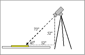
Figure D1. Diagram. Basic Setup of Detectable Warning and Tripod-Mounted Detector Set With Relevant Dimensions (not to scale)
In Figure D2, the left and right photographs show the detectable warning surface viewed from an angle of 45 degrees. In each photograph, a faint gray (transparent) circular spot has been superimposed on the photograph to illustrate the approximate size and position of the one-degree area measured. Note in the left photograph that the measuring spot is centered between truncated domes. This standard position was chosen to avoid the shadows and specular reflections (highlights) on the sides of the domes. In the photograph on the right, the measured area was centered on the white reflectance standard.
 |
 |
|---|
Figure D2. Photo. Approximate Size and Position of The One-Degree Circular Measuring Spot Between The Truncated Domes (left) and Superimposed on Reflectance Standard (right)
All of the detectable warning surfaces used in this study were new or freshly painted and very uniform. Therefore it was deemed unnecessary to make a large number of measurements from different areas. Measurements were taken from detectable warning panels of typical areas between the raised truncated domes. This was done to avoid shadows and areas of strong specular reflectance on the truncated domes. The composite detectable warning materials were fairly glossy, however no measurements of gloss were obtained. The white, black, and bright red paints used on some of the detectable warnings also had a glossy finish that closely resembled the gloss of the unpainted detectable warnings. Both the brown and white “concrete” detectable warnings (and corresponding sidewalks) had a matte surface created from flat-finish paint and sand mixtures.
A Minolta (model T-1) Illuminance Meter was used to measure ambient light (in lux) during study sessions. The analog voltage output signal from the illuminance meter was transmitted to a Fluke (model 123 ScopeMeter) digital voltmeter connected to a tablet PC. The time and horizontal illuminance readings were manually recorded on each trial, however, a simple software program running on the tablet PC also recorded horizontal illuminance readings and times at a rate of one reading per two seconds for the duration of each experimental session. The illuminance meter was positioned on a table immediately adjacent to the testing area where it was not affected by shadows cast by the participants.
Participants viewed a standard Snellen-type acuity chart with black letters on a white background. Following procedures suggested for low vision patients by Colenbrander and Fletcher (1992), the viewing distance for this test was reduced from twenty feet to four feet. This was done to provide a more accurate assessment of visual acuity in the low vision range. At the four-foot distance the eleven lines on the chart corresponded to visual acuities ranging between 20/50 and 20/1000. Participants were asked to read as many lines as possible, beginning with the top line and continuing down rows as the letters decreased in size. The experimenter recorded the lowest (smallest) line read correctly.
Participants were then asked to read letters on a Pelli-Robson contrast sensitivity chart. This chart was illuminated as uniformly as possible by a combination of tungsten and fluorescent light sources. The luminance of the white areas of the chart was measured with a Minolta LS-100 luminance meter in nine separate locations and ranged from 65 cd/m2 to 119 cd/m2, which is within the recommended acceptable limits. All letters on this chart were the same size and were presented on a white background. The first three letters on the chart were black, but each consecutive set of three letters provided less contrast than the previous set, until the letters eventually faded to white. Participants read this chart from a distance of 1 m (39 in). The experimenter recorded the last set of three letters from which the participant correctly identified at least two.
The recently revised (Fourth Edition) of the H.R.R. Pseudoisochromatic Plates test (Richmond Products, Boca Raton, FL) was used to screen participants for red-green and blue-yellow abnormalities in color vision. The book of test plates was viewed on a dedicated easel under simulated daylight illumination as recommended by the manufacturer. Although participants were allowed to bring their eyes within approximately six inches of the plate, only a few were able to read any of the color-coded symbols. If participants could not see the symbols embedded in the relatively high contrast demonstration plates, the test was aborted. Because most participants in this study were not able to read any symbols on the H.R.R. Pseudoisochromatic Plates test, no results for this test are reported.
Appendix F: Color Names Used by Participants to Describe Detectable Warnings
The complete list of color descriptions used by participants is given below. These are summarized for each of the 13 detectable warnings seen on each of the four sidewalks. The number of responses (n) refers to total number of descriptions provided. Participants who did not see the detectable warning gave no response. If participants provided multiple responses (e.g., “It’s either yellow or orange or red.”), the first two descriptions were recorded. If participants provided hybrid responses (e.g., “It’s a blue-gray.”), both colors were recorded. Furthermore, similar color descriptions (e.g., beige and tan; gray and light gray) were combined into single categories.
White Detectable Warning (N=187 responses)
Description |
Brick |
Asphalt |
White Concrete (n=35) |
Brown Concrete (n=51) |
|---|---|---|---|---|
White |
44 |
45 |
30 |
43 |
Gray |
3 |
3 |
4 |
2 |
Off-White, Cream |
1 |
1 |
1 |
3 |
White w/ Black border |
1 |
2 |
0 |
2 |
Yellow |
1 |
0 |
0 |
1 |
Light Gray Detectable Warning (N=222 responses)
Description |
Brick |
Asphalt |
White Concrete (n=59) |
Brown Concrete (n=56) |
|---|---|---|---|---|
Gray |
35 |
41 |
41 |
43 |
Blue |
11 |
10 |
12 |
14 |
Green |
1 |
1 |
3 |
1 |
White |
1 |
2 |
0 |
1 |
Brown, Beige, Tan |
0 |
3 |
2 |
5 |
Off-White, Cream |
0 |
2 |
0 |
0 |
Silver |
0 |
0 |
1 |
0 |
White Concrete Detectable Warning (N=184 responses)
Description |
Brick |
Asphalt |
White Concrete (n=20) |
Brown Concrete (n=57) |
|---|---|---|---|---|
White |
35 |
38 |
16 |
41 |
Off-White, Cream |
10 |
5 |
0 |
4 |
Gray |
4 |
6 |
2 |
4 |
Beige, Tan |
2 |
2 |
1 |
4 |
Yellow |
0 |
2 |
0 |
1 |
White w/ Black Border |
0 |
2 |
0 |
1 |
Green |
0 |
0 |
1 |
0 |
Light w/ Dark border |
0 |
0 |
0 |
1 |
White w/ Yellow stripe |
0 |
1 |
0 |
0 |
Light Silver |
0 |
0 |
0 |
1 |
Brown Concrete Detectable Warning (N=183 responses)
Description |
Brick |
Asphalt |
White Concrete (n=60) |
Brown Concrete (n=21) |
|---|---|---|---|---|
Brown, Beige, Tan |
23 |
30 |
32 |
16 |
Gray |
6 |
18 |
13 |
2 |
Green |
7 |
7 |
2 |
0 |
Black |
0 |
0 |
6 |
0 |
Brick Red |
1 |
3 |
0 |
1 |
Blue |
1 |
1 |
3 |
0 |
Off-White, Cream |
1 |
1 |
0 |
1 |
Red |
1 |
0 |
1 |
1 |
Orange |
1 |
1 |
0 |
0 |
Unknown |
0 |
0 |
2 |
0 |
Dark Gray Detectable Warning (N=217 responses)
Description |
Brick |
Asphalt |
White Concrete (n=63) |
Brown Concrete (n=58) |
|---|---|---|---|---|
Gray |
32 |
30 |
28 |
32 |
Black |
8 |
3 |
21 |
6 |
Blue |
8 |
9 |
9 |
15 |
Brown |
2 |
1 |
2 |
1 |
Green |
0 |
1 |
2 |
1 |
Unknown |
1 |
0 |
0 |
2 |
Yellow |
0 |
0 |
1 |
1 |
Clear |
0 |
1 |
0 |
0 |
Federal Yellow Detectable Warning (N=209 responses)
Description |
Brick |
Asphalt |
White Concrete (n=56) |
Brown Concrete (n=56) |
|---|---|---|---|---|
Yellow |
37 |
39 |
36 |
41 |
Orange |
5 |
7 |
5 |
2 |
White |
6 |
4 |
1 |
4 |
Beige, Tan |
0 |
1 |
1 |
3 |
Gray |
1 |
1 |
1 |
1 |
Red |
1 |
2 |
0 |
0 |
Off-White, Cream |
0 |
0 |
0 |
2 |
Black/White stripes |
0 |
1 |
0 |
1 |
Gold |
0 |
1 |
0 |
1 |
Green |
0 |
0 |
1 |
0 |
Blue |
0 |
0 |
1 |
0 |
Yellow w/ White stripe |
1 |
0 |
0 |
0 |
Blue/Yellow stripes |
0 |
0 |
0 |
1 |
Pale Yellow Detectable Warning (N=208 responses)
Description |
Brick |
Asphalt |
White Concrete (n=45) |
Brown Concrete (n=54) |
|---|---|---|---|---|
Yellow |
35 |
39 |
36 |
35 |
White |
7 |
6 |
2 |
7 |
Beige, Tan |
3 |
3 |
3 |
6 |
Gray |
3 |
4 |
0 |
3 |
Off-White, Cream |
3 |
2 |
1 |
2 |
Orange |
0 |
1 |
2 |
0 |
Blue |
0 |
0 |
1 |
0 |
Red |
0 |
0 |
1 |
0 |
Gray and White |
0 |
0 |
1 |
0 |
Unknown |
0 |
0 |
0 |
1 |
Yellow w White stripe |
1 |
0 |
0 |
0 |
Bright Red Detectable Warning (N=210 responses)
Description |
Brick |
Asphalt |
White Concrete (n=56) |
Brown Concrete (n=52) |
|---|---|---|---|---|
Red |
35 |
39 |
41 |
37 |
Orange |
7 |
11 |
1 |
6 |
Brown |
2 |
1 |
7 |
1 |
Gray |
0 |
3 |
2 |
5 |
Black |
1 |
0 |
4 |
0 |
Rust |
1 |
1 |
0 |
2 |
Pink |
0 |
1 |
1 |
0 |
Unknown stripes |
0 |
0 |
0 |
1 |
Orange-Red Detectable Warning (N=208 responses)
Description |
Brick |
Asphalt |
White Concrete (n=57) |
Brown Concrete (n=53) |
|---|---|---|---|---|
Red |
30 |
27 |
34 |
26 |
Orange |
13 |
20 |
11 |
12 |
Brown |
2 |
3 |
5 |
6 |
Gray |
0 |
1 |
3 |
2 |
Black |
0 |
0 |
4 |
1 |
Brick red |
0 |
1 |
0 |
1 |
Rust |
0 |
0 |
0 |
2 |
Green |
1 |
0 |
0 |
1 |
Blue |
0 |
0 |
0 |
1 |
Maroon |
0 |
0 |
0 |
1 |
Yellow |
0 |
1 |
0 |
0 |
Black Detectable Warning (N=194 responses)
Description |
Brick |
Asphalt |
White Concrete (n=52) |
Brown Concrete (n=51) |
|---|---|---|---|---|
Black |
41 |
36 |
41 |
44 |
Gray |
3 |
2 |
3 |
1 |
Blue |
1 |
0 |
1 |
2 |
Brown |
0 |
0 |
3 |
1 |
Green |
0 |
1 |
1 |
1 |
Black w. White border |
1 |
0 |
1 |
1 |
Unknown |
2 |
0 |
1 |
0 |
Silver |
0 |
1 |
0 |
1 |
Red |
0 |
1 |
0 |
0 |
Gray/White stripes |
1 |
0 |
0 |
0 |
Yellow |
1 |
0 |
0 |
0 |
Black w/ Red domes |
0 |
0 |
1 |
0 |
Black with White Border Detectable Warning (N=198 responses)
Description |
Brick |
Asphalt |
White Concrete (n=50) |
Brown Concrete (n=49) |
|---|---|---|---|---|
Black w/ White border |
38 |
38 |
29 |
40 |
Black |
0 |
0 |
13 |
1 |
Dark w/ Light border |
3 |
2 |
0 |
3 |
Hollow White Rectangle |
1 |
3 |
0 |
1 |
Unknown w/ White Border |
1 |
2 |
0 |
1 |
Gray |
1 |
2 |
0 |
0 |
Black-andWhite unknown pattern |
1 |
2 |
0 |
0 |
White w/ Black horizontal bar in middle |
1 |
1 |
0 |
1 |
Black w/ Gray border |
1 |
1 |
0 |
1 |
Brown |
0 |
0 |
2 |
0 |
Dark Gray w/ White Boarder |
2 |
0 |
0 |
0 |
Dark Gray w/ vertical stripes |
0 |
0 |
0 |
1 |
Gray w/ White horizontal line |
1 |
0 |
0 |
0 |
Black w/ shiny bars |
0 |
0 |
1 |
0 |
Blue |
0 |
0 |
1 |
0 |
Unknown |
0 |
0 |
1 |
0 |
White |
0 |
1 |
0 |
0 |
Black / White Stripes Detectable Warning (N=198 responses)
Description |
Brick |
Asphalt |
White Concrete (n=50) |
Brown Concrete (n=49) |
|---|---|---|---|---|
Black/White stripes |
43 |
35 |
40 |
40 |
Dark/Light stripes |
3 |
3 |
3 |
2 |
White stripes |
0 |
7 |
0 |
2 |
Black stripes |
0 |
0 |
4 |
0 |
White |
1 |
2 |
0 |
0 |
Black-and-white unknown pattern |
1 |
1 |
0 |
1 |
Gray stripes |
0 |
1 |
1 |
0 |
Black/Yellow stripes |
0 |
0 |
0 |
1 |
Blue/White stripes |
0 |
0 |
0 |
1 |
Blue/Yellow stripes |
0 |
0 |
0 |
1 |
Gray/Brown stripes |
0 |
0 |
0 |
1 |
Black |
0 |
0 |
1 |
0 |
Brown/White stripes |
0 |
0 |
1 |
0 |
Black w/ White border |
0 |
1 |
0 |
0 |
Green stripes |
0 |
1 |
0 |
0 |
White with Black Border Detectable Warning (N=196 responses)
Description |
Brick |
Asphalt |
White Concrete (n=48) |
Brown Concrete (n=50) |
|---|---|---|---|---|
White w/ Black border |
34 |
25 |
39 |
40 |
White |
6 |
19 |
0 |
5 |
Black-and-White |
2 |
1 |
2 |
0 |
Light w/ Dark border |
3 |
0 |
2 |
1 |
Off-White w/ Black border |
0 |
1 |
1 |
1 |
Gray |
1 |
2 |
0 |
0 |
Off-White, Cream |
1 |
0 |
0 |
1 |
Gray w/ Black border |
0 |
0 |
1 |
0 |
Gray w/ dark Gray border |
0 |
0 |
1 |
0 |
Hollow Black rectangle |
0 |
0 |
1 |
0 |
White w/ Brown border |
0 |
0 |
1 |
0 |
White w/ dark Gray border |
1 |
0 |
0 |
0 |
Brown/ White stripes |
0 |
0 |
0 |
1 |
Blue |
0 |
1 |
0 |
0 |
Brown |
0 |
0 |
0 |
1 |
Off-White w/ Blue border |
0 |
1 |
0 |
0 |
Appendix G: Comments from Participants
White Detectable Warning
…on Brick Sidewalk
• would get dirty quick
• "one of my favorites"
• looks larger than other detectable warning
• doesn’t look like warning
…on Asphalt Sidewalk
• better than white with black border
• "definitely would see"
• doesn’t look like warning
…on White Concrete Sidewalk
• wouldn't notice it if distracted
• "that's stupid"
…on Brown Concrete Sidewalk
• can see domes on this detectable warning
• larger than other detectable warnings
• looks larger than previous (off-white)
• doesn’t look like warningLight Gray Detectable Warning
…on Brick Sidewalk
• might not see on a sidewalk
• can't see domes
• looks like cement or metal
…on Asphalt Sidewalk
• looks like metal; would avoid it
• looks like cement patch
…on White Concrete Sidewalk
• looks like hole or difference pavement
• doesn’t look like warning
…on Brown Concrete Sidewalk
• looks like cement patchWhite Concrete Detectable Warning
…on Brick Sidewalk
• "not as bright as other (white)"
• doesn’t look like warning
…on Asphalt Sidewalk
• looks like a manhole cover
• looks larger than other detectable warning
…on White Concrete Sidewalk
• looks slightly lighter than background
• maybe something there, but not sure
• saw raised pattern, but not sure it's detectable warning
…on Brown Concrete Sidewalk
• unsure of colorsBrown Concrete Detectable Warning
…on Brick Sidewalk
• really poor detectable warning
• could be black
• looks like doormat; won't get attention
• looks like cardboard
…on Asphalt Sidewalk
• would only get attention at short distance
• would be bad at night
• doesn’t look like warning
…on White Concrete Sidewalk
• not confident about color
• looked gray from further away
• think there might be stripes
• would prefer darker color
• looks like cardboard
…on Brown Concrete Sidewalk
• "I think I might see stripes"
• thinks something there, but not sureDark Gray Detectable Warning
…on Brick Sidewalk
• looks like a shadow on the ground
• probably something there, but not sure
• looks like a patch
…on Asphalt Sidewalk
• domes look like pink indentations/holes
• blends with sidewalk
• looks large
• blends in, looks like cement patch
…on White Concrete Sidewalk
• looks like steel grate; would avoid it
• doesn’t look like warning
…on Brown Concrete Sidewalk
• looks like a shadow
• domes look like small holes
• could be doormat or something else
• "wouldn't stop me" from crossingFederal Yellow Detectable Warning
…on Brick Sidewalk
• probably best color here
• looked white from 7.92 m (26 ft)
• color sometimes means danger-would hesitate to step on it
• very attention-getting
• same as previous (dull) yellow
• can't see any bumps
• "perfect"
• good color, looks smaller than others
• "barely does anything for me"
• very good color
• "good one"
…on Asphalt Sidewalk
• looked white from 7.92 m (26 ft)
• "definitely use this one!"
• "one of my favorites"
• looks like curb paint
• "perfect"
• excellent
• looked pure white for far away
• "very good"
…on White Concrete Sidewalk
• color blends into sidewalk
• poor contrast
• "better"
• looks like it has a design on it
• looks all white
…on Brown Concrete Sidewalk
• color is good, but contrast is not great
• domes look like small holes
• "good"
• contrast isn't very good
• "my favorite," better than white
• this color "raises a flag"
• familiar color on curb rampsPale Yellow Detectable Warning
…on Brick Sidewalk
• looked white from 7.92 m (26 ft)
• lovely
• "ugly"
…on Asphalt Sidewalk
• good contrast, but not bright enough
• better than last one (Fed yellow)
• looks big
…on White Concrete Sidewalk
• might be a yellow detectable warning - not sure
• white sidewalk is visually overwhelming
• color is too dull
…on Brown Concrete Sidewalk
• looked white from 7.92 m (26 ft)
• not great contrast
• pretty color
• can't tell what pattern is
• "oddball color" gets attention
• not as good as other yellowBright Red Detectable Warning
…on Brick Sidewalk
• looks almost like detectable warning is clear
• blends too much with sidewalk
• needs bright light to see this one
…on Asphalt Sidewalk
• "not a good color for me"
• very nice
• terrible
• not sharp
• better than other red
• very intense color
• probably hard to see at night
…on White Concrete Sidewalk
• can see detectable warning bumps
• looks darker than last one (black)
• would be good at night
…on Brown Concrete Sidewalk
• hard to see from far away
• red and brown are too similar in color
• can't tell color
• looks big
• not as good as white
• probably hard to see at nightOrange-Red Detectable Warning
…on Brick Sidewalk
• don’t like this color
• darker than bricks, but blends too much
• blends in with sidewalk too much
…on Asphalt Sidewalk
• "I don’t see that color well"
• looks like dirt
…on White Concrete Sidewalk
• "seems like orange is best color"
…on Brown Concrete Sidewalk
• looks like an obstacle
• looks like rust or corrosion
• looks same as previous (bright) red
• blends into sidewalk
• probably hard to see at nightBlack Detectable Warning
…on Brick Sidewalk
• wouldn't recognize detectable warning as warning
• bad aesthetics - won't be accepted
• terrible contrast
• "barely detectable"
• not as good as stripes
• looks like a patch
• doesn’t look like warning
…on Asphalt Sidewalk
• domes look like small holes
• looks like steel grate; would avoid it
• looks like asphalt patch
…on White Concrete Sidewalk
• this is great
• bumps are very visible
• looks a little like green
• looks like steel grate; would avoid it
• looks small
• opposite colors work best
• doesn’t look like warning
…on Brown Concrete Sidewalk
• that's great
• looks like a hole in sidewalk
• detectable warning lacks meaning
• looks like a hole
• looks like pothole
• unpleasant to look at
• looks like a patch
• doesn’t look like warning
Black with White Border Detectable Warning
…on Brick Sidewalk
• looks like border surrounds a hole
• unsure of colors
• might see faint red color on black
• gets attention, but looks like obstacle
• can't tell what pattern is
• good and sharp
• would be good anywhere
• looks like a hole
…on Asphalt Sidewalk
• center looks like sidewalk itself
• the white part is all that gives warning
• thought saw something, but lost it
• unsure of colors
• can't tell what pattern is
• can't tell what pattern is
• might not see the white part when walking
• white will get dirty
• looks like black hole in center
• looks like other pavement markings
…on White Concrete Sidewalk
• detectable warning looks smaller than others
• border doesn’t help
• didn’t see white from 26 ft
• less intrusive (smaller) than other detectable warning
• looks like steel grate; would avoid it
• looks small
• reversed color pattern would be better
• would be better without white border
• looks like a hole
• border is hard to see
…on Brown Concrete Sidewalk
• border provides good contrast
• black doesn't help
• unsure of colors
• domes look like small holes
• can't tell what pattern is
• reversed color pattern would be better
• very detectable
• looks like hole in middleBlack with White Stripes Detectable Warning
…on Brick Sidewalk
• good one - def. good from long distance
• seems to have depth; looks like metal grate - might walk around it
• black detracts from the effectiveness
• would be better with white stripes on outside
• bad aesthetics - won't be accepted
• narrow stripes give poor contrast
• unsure of colors; detectable warning lacks meaning
• looks like a steel grate; walk around it
• "my favorite"
• "my favorite"
• very alerting
• stripes are familiar-looking
• stripes are good
• "very good one"
…on Asphalt Sidewalk
• can't actually see black stripes (looks like sidewalk itself)
• don’t like this as much on asphalt
• very distinct
• consistency of contrast is good
• can't really see black stripes
• takes a long time to figure out pattern
• unsure of colors
• white stands out
• only white stripes help
• very nice
• looks like a speed bump
• black stripes not very visible
• obviously not the norm
• "that's great"
…on White Concrete Sidewalk
• really stands out
• like this the best - it jumps out
• best of the detectable warnings"
• white stripes don't show up well
• looks bigger than previous detectable warning
• only sees black but knows white is there
• unsure of colors
• looks like steel grate; would avoid it
• stripes really stand out
• very good
• good that black is on outsides of detectable warning
• would be good in any lighting
• "favorite on any surface"
…on Brown Concrete Sidewalk
• "stands out like a pretty girl"
• likes this detectable warning most of all
• very distinct - especially white stripes
• bad aesthetics - won't be accepted
• dark stripes are only in the way
• unsure of colors; detectable warning lacks meaning
• "good one"
• probably not good in dark
• very sharp
• "my favorite"
• "my favorite"White with Black Border Detectable Warning
…on Brick Sidewalk
• can't really see border
• not as good a warning as stripes
• black border doesn’t help
• might get dirty
• didn’t see black from 26 ft
• unsure of colors
• can see bumps on black but not white
• "very detectable"
• can't tell what pattern is
• not as good as reverse color pattern
• better than reversed color pattern
…on Asphalt Sidewalk
• can't see border, but knows it's there b/c of size
• white is a "definite" color
• didn't see black from further away
• can't tell what pattern is
• looks small
• black doesn’t help
• looks small
• black border "is a waste"
• can't see border until very close
• black border is hard to see
…on White Concrete Sidewalk
• border is good, but center doesn’t help
• solids are better than patterns
• can't tell what pattern is
• not sure if there is a border
• black border is very good
…on Brown Concrete Sidewalk
• didn’t see black from 26 ft
• unsure of colors
• domes look like small holes
• can't tell what pattern is
• looks small
• "oddball color"
• smaller than other detectable warnings
• black border doesn’t get attention
The authors thank Joseph Moyer, Sheryl Miller, and Gabriel Rousseau for their important contributions to the management of the study. The authors acknowledge the contributions of the members of the study panel, who provided expert insight and guidance through the duration of the study:
• Guan Xu…….……… FHWA, Office of Safety
• Carl Anderson….…... FHWA, Office of Safety
• Lois Thibault……….. U.S. Access Board
• Marsha Mazz……….. U.S. Access Board
• Aries Arditi………… Lighthouse International
• Daniel Centa………... City of Pueblo, CO Department of Transportation
• James Kalchbrenner... Filtrona Extrusion
• Dona Sauerburger….. Orientation and Mobility Specialist
• Neil Lerner…………. Westat
Thanks also to Duane Geruschat from Johns Hopkins University’s Department of Ophthalmology for his expertise and to Rick Huey from Westat for his help constructing study materials and developing the illuminance recording software. The authors also thank Engineered Plastics, Inc. for providing the Armor-Tile detectable warning panels used in this study.
1 American Foundation for the Blind, “Glossary of Eye Conditions,” 2004. Retrieved December 9, 2004, from the American Foundation for the Blind website: http://www.afb.org/Section.asp?DocumentID=2139.
2 U.S. Access Board, Draft Guidelines for Accessible Public Rights-of-Way (Washington, DC: 2002). Retrieved January 3, 2005, from the U.S. Access Board website: http://access-board.gov/rowdraft.htm.
3 Draft Public Rights-of-Way Accessibility Guidelines, U.S. Access Board (Washington, DC: 2005). Retrieved December 1, 2005 from the U.S. Access Board website: http://www.access-board.gov/prowac/draft.htm.
4 Ibid.
5 Public Rights-of-Way Access Advisory Committee, U.S. Access Board, Building a True Community (Washington, DC: 2001).
6 U.S. Access Board, Americans with Disabilities Act (ADA) Accessibility Guidelines for Buildings And Facilities (Washington, DC: 1991). Retrieved January 3, 2005, from the U.S. Access Board website: http://www.access-board.gov/adaag/ADAAG.pdf.
7 U.S. Access Board, Draft Guidelines for Accessible Public Rights-of-Way (Washington, DC: 2002). Retrieved January 3, 2005, from the U.S. Access Board website: http://access-board.gov/rowdraft.htm.
8 U.S. Access Board, ADAAG Requirements for Detectable Warnings, (Washington, DC: 2003). Retrieved December 28, 2004, from the U.S. Access Board website: http://access-board.gov/adaag/dws/update.htm.
9 U.S. Access Board, Revised ADA and ABA Accessibility Guidelines (Washington, DC: 2004). Retrieved January 3, 2005, from the U.S. Access Board website: http://www.access-board.gov/ada-aba/final.pdf.
10 U.S. Access Board, Draft Public Rights-of-Way Accessibility Guidelines (Washington, DC: 2005). Retrieved December 1, 2005, from the U.S. Access Board website: http://www.access-board.gov/prowac/draft.htm.
11 Department for Transport, Guidance on The Use Of Tactile Paving Surfaces (London, UK: 1999). Retrieved October 5, 2004, from Department for Transport website: http://www.dft.gov.uk/stellent/groups/dft_mobility/documents/pdf/dft_mobility_pdf_503283.pdf.
12 Department for Transport, Inclusive Mobility: A Guide To Best Practice on Access to Pedestrian and Transport Infrastructure, (London, UK: 2002). Retrieved October 5, 2004, from Department for Transport website: http://www.dft.gov.uk/stellent/groups/dft_mobility/documents/pdf/dft_mobility_pdf_503282.pdf.
13 Dowson, A.J., “The Development of Surface Tactile Indicators,” Proceedings of the 7th International Conference on Concrete Block Paving (London, UK: 2003). Sun City, South Africa. Retrieved October 5, 2004, from Interpave website: http://www.paving.org.uk/pdf/036.pdf.
14 Bentzen, B.L., Barlow, J.M., & Tabor, L.S., U.S. Access Board, Detectable Warnings: Synthesis of U.S. and International Practice (Washington, DC: 2000).
15 Bentzen. B.L., Barlow, J.M., & Bond, T., “Pedestrians Who Are Blind at Unfamiliar Signalized Intersections: Research on Safety,” Proceedings of the Transportation Research Board 2004 Annual Meeting (Washington, DC: 2004).
16 Templer, J.A., Wineman, J.D., & Zimring, C.M, FHWA Office of R&D, Design Guidelines to Make Crossing Structures Accessible to The Physically Handicapped, DTF-H61-80-C-00131 (Washington, DC: 1982).
17 Oregon Department of Transportation, Research Unit, Kirk, A.R., Durability of Truncated Dome Warnings on Existing Curb Ramps, SPR 304-241 (Salem, OR: 2004). p. 13. Retrieved December 5, 2005, from http://egov.oregon.gov/ODOT/TD/TP_RES/.
18 The Eye Diseases Prevalence Research Group, “Causes and Prevalence of Visual Impairment Among Adults in The United States,” Archives of Ophthalmology, 2004, 122, 477-485.
19 Ibid.
20 American Foundation for the Blind, Glossary of Eye Conditions. Retrieved December 9, 2004, from the American Foundation for the Blind website: http://www.afb.org/Section.asp?DocumentID=2139.
21 Ibid.
22 Prevent Blindness America, Vision Problems in the U.S. (Chicago, IL: 2002). Retrieved January 3, 2005, from the National Eye Institute website: http://www.nei.nih.gov/eyedata/pdf/VPUS.pdf.
23 Ibid.
24 Ibid.
25 Ibid.
26 Ibid.
27 The Eye Diseases Prevalence Research Group, “The Prevalence of Diabetic Retinopathy Among Adults in The United States,” Archives of Ophthalmology, 2004, 122, 552-563.
28 Prevent Blindness America, Vision Problems in the U.S. (Chicago, IL: 2002). Retrieved January 3, 2005, from the National Eye Institute website: http://www.nei.nih.gov/eyedata/pdf/VPUS.pdf.
29 Ibid.
30 Ibid.
31 The Foundation Fighting Blindness, “What Is Retinitis Pigmentosa?” (Owings Mills, MD: 2004). Retrieved December 13, 2004 from The Foundation Fighting Blindness website: http://www.blindness.org/faq.asp?type=3#3.
32 Fletcher, R. & Voke, J., Defective Colour Vision: Fundamentals, Diagnosis and Management. (Bristol, England: Adam Hilger Ltd, 1985).
33 Wyszecki, G., & Stiles, W.S., Color Science: Concepts and Methods, Quantitative Data and Formulae, Second Edition (New York: John Wiley & Sons, 1982).
34 Arditi, A., Effective Color Contrast: Designing for People With Partial Sight And Color Deficiencies (New York, NY: 2002). Retrieved October 22, 2002, from Lighthouse International website: http://www.lighthouse.org/color_contrast.htm.
35 Bright, K., Cook, G., Howard, Y., Allen, T., & Harris, J., Colour Selection and The Visually Impaired – A Design Guide for Building Refurbishment (Reading, UK: 1995). Retrieved July 27, 2004, from University of Reading website: http://www.reading.ac.uk/ie/research/rainbow/rainbow.htm.
36 Pokorny, J., & Smith, V.C., “Eye Disease and Color Defects.” Vision Research, 1986, 26, 1573-1584.
37 U.S. Access Board, Americans with Disabilities Act (ADA) Accessibility Guidelines For Buildings And Facilities (Washington, DC: 1991). Retrieved January 3, 2005 from the U.S. Access Board website: http://www.access-board.gov/adaag/ADAAG.pdf.
Accessible Rights-Of-Way: A Design Guide (1999). Washington, DC: U.S. Architectural and Transportation Barriers Compliance Board. Retrieved October 7, 2004, from The Access Board website: http://www.access-board.gov/publications/PROW_Guide/pdf/PROWguide.pdf
American Foundation for the Blind (2004). Glossary of Eye Conditions. Retrieved December 9, 2004 from the American Foundation for the Blind website: http://www.afb.org/Section.asp?DocumentID=2139
Arditi, A. (2002). Effective color contrast: Designing for People With Partial Sight And Color Deficiencies. Retrieved October 22, 2002, from Lighthouse International website: http://www.lighthouse.org/color_contrast.htm
Axelson, P.W., Chesney, D.A., Galvan, D.V., Kirschbaum, J.B., Longmuir, P.E., Lyons, C., & Wong, K.M. (1999). Designing Sidewalks and Trails for Access: Part I Of II: Review of Existing Guidelines and Practices (Publication No. FHWA-HEPP-00-006). Washington, DC: U.S. Department of Transportation, Federal Highway Administration.
Bentzen, B.L. (1994). “Detectable Warnings In Transit Facilities: Safety and Negotiability.” U.S. Federal Transit Administration and Project ACTION of the National Easter Seal Society. Retrieved December 16, 2004 from Accessible Design for the Blind website: http://www.accessforblind.org/publications/ProjectAction/Detectable%20Warnings%20in%20Transit%20Facilities%20-%20Safety%20and%20Negotiability.pdf
Bentzen, B.L., & Barlow, J.M. (1995). “Impact of Curb Ramps on The Safety of Persons Who Are Blind.” Journal of Visual Impairment and Blindness, 89, 319-328.
Bentzen. B.L., Barlow, J.M., & Bond, T. (2004). “Pedestrians Who Are Blind at Unfamiliar Signalized Intersections: Research on Safety.” In Proceedings of the Transportation Research Board 2004 Annual Meeting.
Bentzen, B.L., Barlow, J.M., & Franck, L. (2000, September). “Addressing Barriers to Blind Pedestrians at Signalized Intersections.” ITE Journal, 32-35.
Bentzen, B.L., Barlow, J.M., & Tabor, L.S. (2000). Detectable Warnings: Synthesis of U.S. and International Practice. Washington, DC: U.S. Access Board.
Bentzen, B.L., Myers, L.A. (1997). “Appendix C. Human Factors Research,” in Evaluation of Detectable Warning Surfaces, Final Report. Menlo Park: CA: Crain & Associates.
Bentzen, B.L., Nolin, T.L., & Easton, R.D. (1994). Detectable Warning Surfaces: Color, Contrast, and Reflectance (Report No. FTA-MA-06-0201-94-3). Washington, DC: U.S. Department of Transportation, Federal Transit Administration.
Bentzen, B.L., Nolin, T.L., Easton, R.D., Desmarais, L., & Mitchell, P.A. (1994). Detectable Warning Surfaces: Detectability By Individuals With Visual Impairments, and Safety and Negotiability On Slopes for Persons With Physical Impairments. Report no. FTA-MA-06-0201-94-2. Washington, DC: U.S. Department of Transportation, Federal Transit Administration.
Bright, K., Cook, G., Howard, Y., Allen, T., & Harris, J. (1995). Colour Selection and The Visually Impaired – A Design Guide for Building Refurbishment. Retrieved July 27, 2004, from University of Reading website: http://www.reading.ac.uk/ie/research/rainbow/rainbow.htm.
Chandler, M. (2004). Testing Truncated Domes. Public Roads, 68 (2), 68-73.
Colenbrander, A., & Fletcher, D.C. (1992). “Low Vision Rehabilitation: Visual Acuity Measurement in the Low Vision Range.” Journal of Ophthalmic Nursing & Technology, 11(2), 62-69.
Cooper, B.A. (1999). “The Utility of Functional Colour Cues – Seniors’ Views.” Scandinavian Journal of Caring Sciences, 13(3), 186-192.
Cooper, B.A., Letts, L., & Rigby, P. (1993). “Exploring the Use of Color Cueing on Assistive Device In The Home: Six Case Studies.” Physical & Occupational Therapy in Geriatrics, 11(4), 47-59.
Crain & Associates (1997). Evaluation of Detectable Warning Surfaces. Prepared for the Sacramento Regional Transit District. Menlo Park, CA: Crain & Associates.
Department for Transport (1999). Guidance on The Use Of Tactile Paving Surfaces. Retrieved October 5, 2004, from Department for Transport (UK) website: http://www.dft.gov.uk/stellent/groups/dft_mobility/documents/pdf/dft_mobility_pdf_503283.pdf
Department for Transport (2002). Inclusive Mobility: A Guide To Best Practice on Access to Pedestrian and Transport Infrastructure. Retrieved October 5, 2004, from Department for Transport (UK) website: http://www.dft.gov.uk/stellent/groups/dft_mobility/documents/pdf/dft_mobility_pdf_503282.pdf
Dowson, A.J. (2003). “The Development of Surface Tactile Indicators.” In Proceedings of the 7th International Conference on Concrete Block Paving. Sun City, South Africa. Retrieved October 5, 2004, from Interpave website: http://www.paving.org.uk/pdf/036.pdf
The Eye Diseases Prevalence Research Group (2004a). “Causes and Prevalence of Visual Impairment Among Adults in The United States.” Archives of Ophthalmology, 122, 477-485.
The Eye Diseases Prevalence Research Group (2004b). “The Prevalence of Diabetic Retinopathy Among Adults in The United States.” Archives of Ophthalmology, 122, 552-563.
The Eye Diseases Prevalence Research Group (2004c). “Prevalence of Age-related Macular Degeneration in the United States.” Archives of Ophthalmology, 122, 564-572.
Fletcher, R. & Voke, J. (1985). Defective Colour Vision: Fundamentals, Diagnosis and Management. Bristol, England: Adam Hilger Ltd.
The Foundation Fighting Blindness (2004). “What Is Retinitis Pigmentosa?” Retrieved December 13, 2004 from The Foundation Fighting Blindness website: http://www.blindness.org/faq.asp?type=3#3
Grubb, D. (Ed.). (2000). Pedestrian Safety Handbook: A Handbook for Advocates Dedicated to Improving The Pedestrian Environment Guaranteeing People Who Are Blind or Visually Impaired Access to Intersection Identification and Traffic Control Information. Washington, DC: The American Council of the Blind. Retrieved October 5, 2004, from American Council of the Blind website: http://www.acb.org/pedestrian/phd2a.html
Judd, D. & Wyszecki, G. (1975). Color in Business, Science and Industry. (Third Edition). New York: John Wiley & Sons.
Kaplan, J. (2004). Report on Installation of Truncated Dome Products in Burlington, Vermont. Retrieved December 17, 2004 from the Vermont Agency of Transportation website: http://www.aot.state.vt.us/progdev/documents/ltf/truncateddomeinstallationreport/truncateddomeinstallationreport.pdf
Kemp, P. (2003). Truncated Warning Dome Systems for Handicap Access Ramps (Report no. WI-04-03). Madison, WI: Wisconsin Department of Transportation.
Ketola, H.N., & Chia, D. (1994). Detectable Warnings: Testing and Performance Evaluation at Transit Stations. Report no. FTA-MA-26-0031-94-1. Washington, DC: U.S. Department of Transportation, Federal Transit Administration.
Kirschbaum, J.B., Axelson, P.W., Longmuir, P.E., Mispagel, K.M., Stein, J.A., & Yamada, D.A. (2001). Designing Sidewalks and Trails for Access: Part II Of II: Best Practices Design Guide. Washington, DC: U.S. Department of Transportation, Federal Highway Administration. Retrieved October 7, 2004, from Federal Highway Administration website: http://www.fhwa.dot.gov/environment/sidewalk2/pdf.htm
Kirk, A.R. (2004). Durability of Truncated Dome Warnings on Existing Curb Ramps. Final Report SPR 304-241. Oregon Department of Transportation, Research Unit. Retrieved December 5, 2005 from http://egov.oregon.gov/ODOT/TD/TP_RES/
Kuyk, T., & Elliott, J.L. (1999). “Visual Factors and Mobility in Persons With Age-Related Macular Degeneration.” Journal of Rehabilitation Research and Development, 36, 303-312.
Kuyk T., Elliott, J.L., Biehl, J., & Fuhr, P.S. (1996). “Environmental Variables and Mobility Performance in Adults With Low Vision.” Journal of the American Optometric Association, 67(7), 403-409.
Kuyk, T., Elliott, J.L., Fuhr, P.S. (1998). “Visual Correlates of Mobility in Real World Settings in Older Adults With Low Vision.” Optometry and Vision Science, 75(7), 538-547.
Kuyk, T., Elliott, J.L., Wesley, J., Scilley, K., McIntosh, E., Mitchell, S., & Owsley, C. (2004). “Mobility Function in Older Veterans Improves After Blind Rehabilitation.” Journal of Rehabilitation Research & Development, 41, 337-346.
Leonard, R. (2002). Statistics on Vision Impairment: A Resource Manual. Arlene R. Gordon Research Institute of Lighthouse International. Retrieved December 3, 2004 from Lighthouse International website: http://www.lighthouse.org/researchstats.pdf
Lee, D.J., Gomez-Marin, O., Lam, B.L., Zheng, D., & Jane, D.M. (2004). “Trends in Visual Acuity Impairment in US Adults.” Archives of Ophthalmology, 122, 506-509.
National Aeronautics and Space Administration (2004). Luminance Contrast. Retrieved December 29, 2004 from website of Color Usage Research Lab, NASA Ames Research Center: http://colorusage.arc.nasa.gov/luminance_cont_3.php
O’Leary, A.A., Lockwood, P.B., & Taylor, R.V. (1996). “Evaluation of Detectable Warning Surfaces for Sidewalk Curb Ramps.” Transportation Research Record, 1538, 47-53.
Peck, A.F., & Bentzen, B.L. (1987). Tactile Warnings to Promote Safety in the Vicinity of Transit Platform Edges. Report no. UMTA-MA-06-0120-87-1. Washington, DC: U.S. Department of Transportation, Federal Transit Administration.
Pokorny, J., & Smith, V.C. (1986). “Eye Disease and Color Defects.” Vision Research, 26, 1573-1584.
Pokorny, J., Smith, V.C., & Verriest, G. (1979). “Congenital Color Defects.” In Pokorny, J., Smith, V.C., Verriest, G. & Pinckers, A.J.L.G., Eds. Congenital and Acquired Color Vision Defects. New York: Grune & Stratton.
Prevent Blindness America (2002). Vision Problems in the U.S. Retrieved January 3, 2005 from the National Eye Institute website: http://www.nei.nih.gov/eyedata/pdf/VPUS.pdf
Public Rights-of-Way Access Advisory Committee (2001). Building a True Community. Washington, DC: U.S. Access Board.
Roy, M.S., Klein, R., O’Colmain, B.J., Klein, B.E., Moss, S.E., & Kempen, J.H. (2004). “The Prevalence of Diabetic Retinopathy Among Adult Type 1 Diabetic Persons in The United States.” Archives of Ophthalmology, 122, 546-551.
Sentinella, J., Wells, P.., & Fowler, C. (2005). The Use Of Tactile Surfaces At Rail Stations: Final ReportOf . London: Rail Safety & Standards Board. Retrieved May 3, 2006, from Rail Safety & Standards Board website: http://www.rssb.co.uk/pdf/reports/research/t158%20the%20use%20of%20tactile%20surfaces%20at%20rail%20stations%20final%20report.pdf.
Templer, J.A., Wineman, J.D., & Zimring, C.M. (1982). Design Guidelines to Make Crossing Structures Accessible to The Physically Handicapped. FHWA Office of R&D, Report DTF-H61-80-C-00131.
Tijerina, L., Jackson, J.L., & Tornow, C.E. (1994). The Impact Of Transit Station Platform Edge Warning Surfaces on Persons With Visual Impairments and Persons With Mobility Impairments. Report prepared for Washington Metropolitan Area Transit Authority. Columbus, OH: Battelle.
Tijerina, L., Jackson, J.L., Tornow, C.E. (1995). The Detectability of 18-inch and 24-inch Flame Finish Granite Warning Surfaces For Use In Transit Stations. Report prepared for Washington Metropolitan Area Transit Authority. Columbus, OH: Battelle.
U.S. Access Board (1991). Americans with Disabilities Act (ADA) accessibility guidelines for buildings and facilities. Washington, DC: U.S. Access Board. Retrieved January 3, 2005 from the U.S. Access Board website: http://www.access-board.gov/adaag/ADAAG.pdf
U.S. Access Board (2002). Draft Guidelines for Accessible Public Rights-of-Way. Retrieved January 3, 2005 from the U.S. Access Board website: http://access-board.gov/rowdraft.htm
U.S. Access Board (2003). ADAAG Requirements for Detectable Warnings. Retrieved December 28, 2004 from the U.S. Access Board website: http://access-board.gov/adaag/dws/update.htm
U.S. Access Board (2004). Revised ADA and ABA Accessibility Guidelines. Washington, DC: : U.S. Access Board. Retrieved January 3, 2005 from the U.S. Access Board website: http://www.access-board.gov/ada-aba/final.pdf
U.S. Access Board (2005). Draft Public Rights-of-Way Accessibility Guidelines. Retrieved December 1, 2005 from the U.S. Access Board website: http://www.access-board.gov/prowac/draft.htm
Wyszecki, G., & Stiles, W.S. (1982). Color Science: Concepts and Methods, Quantitative Data and Formulae, Second Edition. New York: John Wiley & Sons.