


Perhaps, as a designer applying for a design-related job you can get away with a fancier set of fonts on your resume than most other job seekers. But that can be risky. For the most part, fonts for resumes should be your basic serif or sans serif body text fonts. Basic doesn't mean boring. Here's my take on the best fonts for resumes. If you've got something to add (especially from personal experience as the job seeker or the employer) share in the comments, below.
Must Reads
Browse Topic
Say the Word
Do you know your ear from your arm? Do you know how to bleed and how to get out of the gutter?
Word for Word
Top 4 Things to Make With Desktop Publishing
Things to give away or use as gifts such as greeting cards and calendars may seem obvious but you might be a little surprised by the home decorating potential of desktop publishing.
More Things to Make
Best Fonts for Resumes
Thursday January 10, 2013
Featured 2013 Calendar: Foraging For Food
Wednesday January 9, 2013
Who wouldn't like free food?
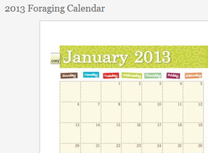
This set of monthly calendars you can print and post around the house, or perhaps give as a gift helps you know when to forage for figs, pecans, and wild edibles. About.com Frugal Living Guide Erin Huffstetler has a set of 12 monthly foraging calendars in color or black and white. Other similar calendars include best time to buy and what's in season.
What's Your #?
Tuesday January 8, 2013
It's been called pound (not to be confused with this pound) and hash. It looks a bit like a tic tac toe board. Take a closer look at the Shift+3 also known as the number sign.
Do you use # in front of numbers or do you prefer to let then stand alone or use № (numero sign) or some other prefix? Is it a matter of style or personal preference? In many fonts the # sign is rather boring. It often fails to capture the unique characteristics of certain fonts. It looks out of place. What's your take on the # sign?
Featured 2013 Calendar: Business Card Calendars
Monday January 7, 2013
Print a calendar on the back of your business card then circle the date of your next sale or other significant date for you and your customer or potential client. When the month ends, you have an excuse to hand out a new card with the new month. About.com Rubberstamping Guide Kate Pullen has these free 2013 Business Card Sized Calendars to get you started.
Did you know: In 2013 you can recycle old calendars from 2002, 1991, or even as far back as 1895 and still have the days and dates match up. Here are the years that repeat the 2013 dates.
Also see: Calendars for business.
Explore Desktop Publishing