Medicare.gov Responsive Redesign
Medicare.gov is the consumer website for Medicare beneficiaries, caregivers, and advocates. The site was originally going to be improved to implement a new content management system. Instead, we refined the plan after seeing an opportunity to rebuild Medicare.gov with responsive design.
Why We Did It
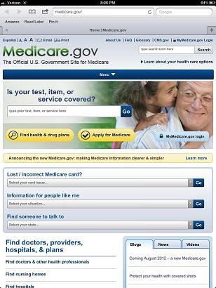
Our new goal for Medicare.gov was to ensure the site would work not only on desktop PCs but also on any smartphone or tablet. The idea was to anticipate the influx of increased mobile traffic based on the growing mobile adoption rates in the country and align to the Digital Government Strategy.
 |
| The new Medicare.gov for tablets |
We determined that responsive design was the best solution instead of building apps for different mobile devices. It allowed us to build a single HTML5/CSS3 page template framework that would simplify overall maintenance as well as improve user experience.
What We Did
We developed a responsive framework using open source frameworks. For the base of our responsive framework, we chose Bootstrap because of its simple and flexible use of HTML5, CSS3, and JavaScript. The templates were built on top of Bootstrap with custom media queries based on the different resolutions that we wanted to support.
Media queries detect the screen resolution and display different views based on browser resolution. The style sheet that was developed supports four different resolutions:
- 980 pixels and up for desktop and tablets
- 768 pixels for tablets in portrait mode
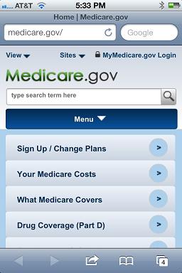
- 480 pixels for smartphones
- 320 pixels for smartphones
 |
| The new Medicare.gov for smartphones |
These different breakpoints were chosen because they are among the most common for tablet and mobile use. For the desktop view, we chose 980 pixels to support because of existing web applications that were unable to become responsive within the timeframe. These applications will be upgraded to responsive layouts at a future date.
We also coded the site with 508 compliance in mind. By using iterative 508 testing and development, we ensured that the site would work on any device and would also be accessible to people with disabilities.
Responsive design inherently poses problems with Internet Explorer 7 and 8 compatibility because of the lack of CSS3 support. While there are workarounds for this issue, like respond.js, the costs of responsive support for IE7 and IE8 outweighed the benefits. Since no mobile devices use IE7 or IE8, we decided to drop responsive support for those browsers. But you will still be able to view the website using Internet Explorer on a desktop PC.
How It Worked
The redesigned site will improve consumer’s access to the information they want about Medicare. The redesigned site and web content management system allow the content managers to easily add, remove or update content without having to worry about coding or testing.
What We Learned
- Mobile first isn’t the only way to design a site. It’s possible to take the full version and scale down, removing components that may be redundant or cumbersome on smaller displays while maintaining full functionality.
- While this resulted in more iterations of design mock-ups, it allowed us to take the most common tasks that people wanted on the full homepage and scale them down to be convenient and accessible on all devices.
- Sites can be designed to be responsive while maintaining Section 508 compliance if tested and developed with those factors in mind.
What's Next
We are next planning on redesigning our existing applications to be responsive. This will allow all the tools across the site to be accessible for all users.
See a full list of HHS Mobile Sites
See a full list of HHS Mobile Apps
- AIDS.gov
- AIDSinfo Mobile
- CDC
- DailyMed
- Drug Information Portal Mobile
- Medicare.gov
- Medline Plus
- My Dietary Supplements (MyDS)
- NCI
- NCI Breast Cancer Risk Assessment Tool
- PubMED Mobile
- TOXNET Mobile
- Water Emergency Response for Libraries
Mobile Apps
- BMI Calculator
- Brrrd Brawl App
- CDC Field Triage
- CDC Health-e-cards
- CDC Mobile iPad App
- Electronic Preventive Service Selector (ePSS)
- Embryo
- Facing AIDS
- Fetal Alcohol Spectrum Disorders
- FluView
- Health Hotlines
- HIV Testing and Care Services Locator
- HRSA Find a Health Center
- LactMed
- NCI @NIH Feelos and Young Investigators App
- NLM Native Voices
- QuitGuide
- QuitStart
- Radiation Emergency Medical Management (REMM)
- Reunite
- SAMHSA Treatment Locator (STL)
- WISER (Wireless Information System for Emergency Responders)
- WordWeather App


Your Ideas
10/1/2012 15:53 PM
10/1/2012 19:53
10/4/2012 11:34 AM