Section 5: ART Trends 1999–2008
Explanation of Figures 51–63. Click on titles or images to go back to Section 5.
Figure 51: Numbers of ART Cycles Performed, Live-Birth Deliveries, and Infants Born Using ART, 1999–2008.
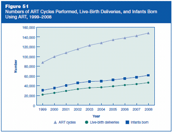
Figure 51 is a line graph with three lines representing the numbers of ART cycles performed, live-birth deliveries, and infants born using ART, by year from 1999 to 2008.
- 1999: 87,636 ART cycles, 21,746 live-births, 30,629 infants born
- 2000: 99,629 ART cycles, 25,228 live-births, 35,025 infants born
- 2001: 107,587 ART cycles, 29,344 live-births, 40,687 infants born
- 2002: 115,392 ART cycles, 33,141 live-births, 45,751 infants born
- 2003: 122,872 ART cycles, 35,785 live-births, 48,756 infants born
- 2004: 127,977 ART cycles, 36,760 live-births, 49,458 infants born
- 2005: 134,260 ART cycles, 38,910 live-births, 52,041 infants born
- 2006: 138,198 ART cycles, 41,343 live-births, 54,656 infants born
- 2007: 142,435 ART cycles, 43,412 live-births, 57,569 infants born
- 2008: 148,055 ART cycles, 46,326 live-births, 61,426 infants born
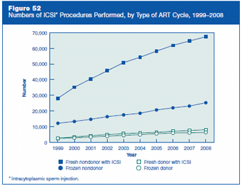
Figure 52 is a line graph with four lines representing the numbers of ICSI (intracytoplasmic sperm injection) procedures performed, by type of ART cycle, and by year from 1999 to 2008.
- 1999: Fresh nondonor with ICSI 28,090 cycles, Frozen nondonor 12,178 cycles, Fresh donor with ICSI 2,623 cycles, Frozen donor 2,605 cycles
- 2000: Fresh nondonor with ICSI 35,148 cycles, Frozen nondonor 13,312 cycles, Fresh donor with ICSI 3,467 cycles, Frozen donor 2,882 cycles
- 2001: Fresh nondonor with ICSI 40,432 cycles, Frozen nondonor 14,705 cycles, Fresh donor with ICSI 4,259 cycles, Frozen donor 3,426 cycles
- 2002: Fresh nondonor with ICSI 45,611 cycles, Frozen nondonor 16,383 cycles, Fresh donor with ICSI 4,919 cycles, Frozen donor 3,922 cycles
- 2003: Fresh nondonor with ICSI 50,872 cycles, Frozen nondonor 17,517 cycles, Fresh donor with ICSI 5,565 cycles, Frozen donor 4,464 cycles
- 2004: Fresh nondonor with ICSI 54,276 cycles, Frozen nondonor 18,560 cycles, Fresh donor with ICSI 5,947 cycles, Frozen donor 4,919 cycles
- 2005: Fresh nondonor with ICSI 58,193 cycles, Frozen nondonor 20,657 cycles, Fresh donor with ICSI 6,376 cycles, Frozen donor 5,541 cycles
- 2006: Fresh nondonor with ICSI 61,835 cycles, Frozen nondonor 22,023 cycles, Fresh donor with ICSI 7,039 cycles, Frozen donor 5,992 cycles
- 2007: Fresh nondonor with ICSI 64,629 cycles, Frozen nondonor 23,133 cycles, Fresh donor with ICSI 7,500 cycles, Frozen donor 6,130 cycles
- 2008: Fresh nondonor with ICSI 67,328 cycles, Frozen nondonor 25,261 cycles, Fresh donor with ICSI 8,088 cycles, Frozen donor 6,344 cycles
Figure 53: Percentages of Transfers That Resulted in Live Births, by Type of ART Cycle and ICSI, 1999–2008.
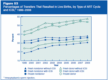
Figure 53 is a line graph with six lines representing the percentages of transfers that resulted in live births, by type of ART cycle and ICSI (intracytoplasmic sperm injection), and by year from 1999 to 2008.
- 1999: Fresh nondonor without ICSI 32.5%, Fresh nondonor with ICSI 30.1%, Frozen nondonor 18.6%, Fresh donor without ICSI 43.3%, Fresh donor with ICSI 39.5%, Frozen donor 24.0%
- 2000: Fresh nondonor without ICSI 33.2%, Fresh nondonor with ICSI 30.3%, Frozen nondonor 20.3%, Fresh donor without ICSI 45.4%, Fresh donor with ICSI 41.5%, Frozen donor 23.9%
- 2001: Fresh nondonor without ICSI 34.9%, Fresh nondonor with ICSI 32.3%, Frozen nondonor 23.4%, Fresh donor without ICSI 48.8%, Fresh donor with ICSI 45.5%, Frozen donor 27.3%
- 2002: Fresh nondonor without ICSI 36.5%, Fresh nondonor with ICSI 33.8%, Frozen nondonor 24.8%, Fresh donor without ICSI 52.9%, Fresh donor with ICSI 47.8%, Frozen donor 28.8%
- 2003: Fresh nondonor without ICSI 36.2%, Fresh nondonor with ICSI 33.9%, Frozen nondonor 27.0%, Fresh donor without ICSI 52.1%, Fresh donor with ICSI 49.9%, Frozen donor 30.1%
- 2004: Fresh nondonor without ICSI 35.9%, Fresh nondonor with ICSI 33.1%, Frozen nondonor 27.7%, Fresh donor without ICSI 53.3%, Fresh donor with ICSI 48.8%, Frozen donor 30.5%
- 2005: Fresh nondonor without ICSI 36.1%, Fresh nondonor with ICSI 33.5%, Frozen nondonor 28.0%, Fresh donor without ICSI 54.5%, Fresh donor with ICSI 51.0%, Frozen donor 30.9%
- 2006: Fresh nondonor without ICSI 37.2%, Fresh nondonor with ICSI 34.6%, Frozen nondonor 28.9%, Fresh donor without ICSI 55.6%, Fresh donor with ICSI 52.8%, Frozen donor 32.1%
- 2007: Fresh nondonor without ICSI 37.2%, Fresh nondonor with ICSI 35.4%, Frozen nondonor 29.9%, Fresh donor without ICSI 56.3%, Fresh donor with ICSI 54.7%, Frozen donor 31.9%
- 2008: Fresh nondonor without ICSI 38.0%, Fresh nondonor with ICSI 36.2%, Frozen nondonor 30.6%, Fresh donor without ICSI 57.7%, Fresh donor with ICSI 54.0%, Frozen donor 33.2%
Figure 54: Percentages of Transfers That Resulted in Singleton Live Births, by Type of ART Cycle and ICSI, 1999–2008.
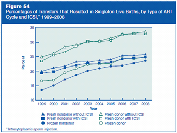
Figure 54 is a line graph with six lines representing the percentages of transfers that resulted in singleton live births, by type of ART cycle and ICSI (intracytoplasmic sperm injection), and by year from 1999 to 2008.
- 1999: Fresh nondonor without ICSI 20.0%, Fresh nondonor with ICSI 19.4%, Frozen nondonor 13.5%, Fresh donor without ICSI 24.9%, Fresh donor with ICSI 23.5%, Frozen donor 16.7%
- 2000: Fresh nondonor without ICSI 21.2%, Fresh nondonor with ICSI 19.9%, Frozen nondonor 15.1%, Fresh donor without ICSI 26.1%, Fresh donor with ICSI 25.6%, Frozen donor 16.9%
- 2001: Fresh nondonor without ICSI 21.7%, Fresh nondonor with ICSI 21.2%, Frozen nondonor 17.2%, Fresh donor without ICSI 28.4%, Fresh donor with ICSI 26.6%, Frozen donor 19.6%
- 2002: Fresh nondonor without ICSI 23.2%, Fresh nondonor with ICSI 22.1%, Frozen nondonor 18.7%, Fresh donor without ICSI 29.1%, Fresh donor with ICSI 28.5%, Frozen donor 20.9%
- 2003: Fresh nondonor without ICSI 23.2%, Fresh nondonor with ICSI 22.7%, Frozen nondonor 20.2%, Fresh donor without ICSI 30.2%, Fresh donor with ICSI 30.4%, Frozen donor 22.3%
- 2004: Fresh nondonor without ICSI 23.6%, Fresh nondonor with ICSI 22.6%, Frozen nondonor 21.0%, Fresh donor without ICSI 30.4%, Fresh donor with ICSI 30.2%, Frozen donor 22.5%
- 2005: Fresh nondonor without ICSI 24.0%, Fresh nondonor with ICSI 23.0%, Frozen nondonor 21.7%, Fresh donor without ICSI 31.5%, Fresh donor with ICSI 30.6%, Frozen donor 22.6%
- 2006: Fresh nondonor without ICSI 25.3%, Fresh nondonor with ICSI 24.2%, Frozen nondonor 21.9%, Fresh donor without ICSI 32.8%, Fresh donor with ICSI 32.7%, Frozen donor 24.3%
- 2007: Fresh nondonor without ICSI 25.4%, Fresh nondonor with ICSI 24.4%, Frozen nondonor 22.7%, Fresh donor without ICSI 33.1%, Fresh donor with ICSI 32.8%, Frozen donor 24.3%
- 2008: Fresh nondonor without ICSI 25.7%, Fresh nondonor with ICSI 24.8%, Frozen nondonor 23.6%, Fresh donor without ICSI 33.5%, Fresh donor with ICSI 32.9%, Frozen donor 24.8%
Figure 55: Percentages of Transfers That Resulted in Live Births for ART Cycles Using Fresh Nondonor Eggs or Embryos, by Age of Woman, 1999–2008.
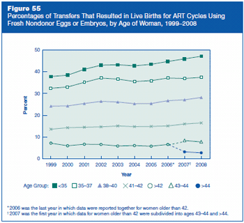
Figure 55 is a line graph with five lines representing percentages of transfers that resulted in live births for ART cycles using fresh nondonor eggs or embryos, by age of woman, and by year from 1999 to 2008.
- 1999: Age <35, 37.8%; Age 35–37, 32.4%; Age 38–40, 24.2%; Age 41–42, 13.6%; Age >42, 7.2%
- 2000: Age <35, 38.4%; Age 35–37, 33.0%; Age 38–40, 24.3%; Age 41–42, 14.3%; Age >42, 6.0%
- 2001: Age <35, 41.1%; Age 35–37, 35.1%; Age 38–40, 25.4%; Age 41–42, 14.5%; Age >42, 6.7%
- 2002: Age <35, 43.0%; Age 35–37, 37.1%; Age 38–40, 26.4%; Age 41–42, 14.7%; Age >42, 6.6%
- 2003: Age <35, 43.2%; Age 35–37, 36.6%; Age 38–40, 26.1%; Age 41–42, 15.1%; Age >42, 5.9%
- 2004: Age <35, 42.7%; Age 35–37, 35.5%; Age 38–40, 25.3%; Age 41–42, 14.8%; Age >42, 6.1%
- 2005: Age <35, 43.4%; Age 35–37, 35.9%; Age 38–40, 25.4%; Age 41–42, 14.9%; Age >42, 5.8%
- 2006: Age <35, 44.7%; Age 35–37, 37.1%; Age 38–40, 26.7%; Age 41–42, 15.1%; Age >42, 6.6%, Note: 2006 was the last year in which data were reported together for women older than 42.
- 2007: Age <35, 45.9%; Age 35–37, 36.9%; Age 38–40, 27.1%; Age 41–42, 16.0%; Age 43-44, 8.4%; Age >44, 3.2%, Note: 2007 was the first year in which data for women older than 42 were subdivided into ages 43–44 and >44.
- 2008: Age <35, 47.1%; Age 35–37, 37.4%; Age 38–40, 28.2%; Age 41–42, 16.5%; Age 43-44, 7.8%; Age >44, 2.8%
Figure 56: Percentages of Transfers That Resulted in Singleton Live Births for ART Cycles Using Fresh Nondonor Eggs or Embryos, by Age of Woman, 1999–2008.
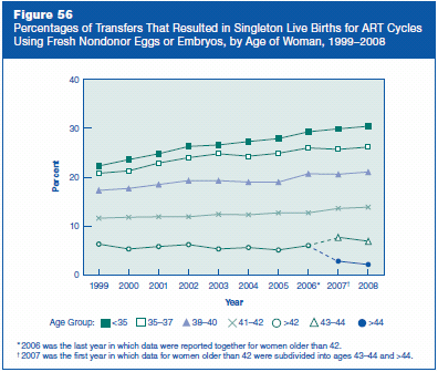
Figure 56 is a line graph with five lines representing percentages of transfers that resulted in singleton live births for ART cycles using fresh nondonor eggs or embryos, by age of woman, and by year from 1999 to 2008.
- 1999: Age <35, 22.3%; Age 35–37, 20.8%; Age 38–40, 17.3%; Age 41–42, 11.6%; Age >42, 6.3%
- 2000: Age <35, 23.6%; Age 35–37, 21.3%; Age 38–40, 17.7%; Age 41–42, 11.8%; Age >42, 5.3%
- 2001: Age <35, 24.8%; Age 35–37, 22.9%; Age 38–40, 18.5%; Age 41–42, 11.9%; Age >42, 5.8%
- 2002: Age <35, 26.3%; Age 35–37, 24.0%; Age 38–40, 19.3%; Age 41–42, 11.9%; Age >42, 6.2%
- 2003: Age <35, 26.6%; Age 35–37, 24.8%; Age 38–40, 19.3%; Age 41–42, 12.4%; Age >42, 5.3%
- 2004: Age <35, 27.3%; Age 35–37, 24.3%; Age 38–40, 19.0%; Age 41–42, 12.3%; Age >42, 5.6%
- 2005: Age <35, 27.9%; Age 35–37, 24.9%; Age 38–40, 19.0%; Age 41–42, 12.7%; Age >42, 5.1%
- 2006: Age <35, 29.3%; Age 35–37, 26.0%; Age 38–40, 20.7%; Age 41–42, 12.7%; Age >42, 6.0%, Note: 2006 was the last year in which data were reported together for women older than 42.
- 2007: Age <35, 29.9%; Age 35–37, 25.7%; Age 38–40, 20.6%; Age 41–42, 13.6%; Age 43-44, 7.7%; Age >44, 2.8%, Note: 2007 was the first year in which data for women older than 42 were subdivided into ages 43–44 and >44.
- 2008: Age <35, 30.4%; Age 35–37, 26.2%; Age 38–40, 21.1%; Age 41–42, 13.9%; Age 43-44, 6.8%; Age >44, 2.1%
Figure 57: Percentages of Fresh Nondonor Cycles That Involved the Transfer of One, Two, Three, or Four or More Embryos, 1999–2008.
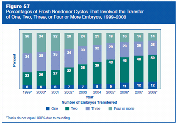
Figure 57 is a bar graph representing percentages of fresh nondonor cycles that involved the transfer of one, two, three, or four or more embryos, by year from 1999 to 2008.
- 1999: One, 6%; Two, 23%; Three, 34%; Four or more, 36% Note: Total does not equal 100% due to rounding.
- 2000: One, 6%; Two, 26%; Three, 35%; Four or more, 34% Note: Total does not equal 100% due to rounding.
- 2001: One, 6%; Two, 27%; Three, 35%; Four or more, 32%
- 2002: One, 7%; Two, 32%; Three, 34%; Four or more, 28% Note: Total does not equal 100% due to rounding.
- 2003: One, 7%; Two, 36%; Three, 33%; Four or more, 24%
- 2004: One, 8%; Two, 39%; Three, 32%; Four or more, 21%
- 2005: One, 9%; Two, 43%; Three, 29%; Four or more, 18% Note: Total does not equal 100% due to rounding.
- 2006: One, 11%; Two, 46%; Three, 28%; Four or more, 16% Note: Total does not equal 100% due to rounding.
- 2007: One, 12%; Two, 48%; Three, 26%; Four or more, 14%
- 2008: One, 12%; Two, 50%; Three, 25%; Four or more, 14% Note: Total does not equal 100% due to rounding.
Figure 58: Percentages of Fresh Nondonor Cycles That Involved the Transfer of One, Two, Three, or Four or More Embryos Among Women Who Were Younger Than 35 and Set Aside Extra Embryos for Future Use, 1999–2008.
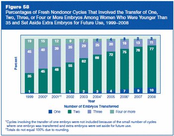
Figure 58 is a bar graph representing percentages of fresh nondonor cycles that involved the transfer of one, two, three, or four or more embryos among women who were younger than 35 and set aside extra embryos for future use, by year from 1999 to 2008. Note: For years 2000 and 2001, cycles involving the transfer of one embryo were not included because of the small number of cycles where one embryo was transferred and extra embryos were set aside for future use.
- 1999: One, 1%; Two, 35%; Three, 45%; Four or more, 19%
- 2000: Two, 45%; Three, 40%; Four or more, 15%
- 2001: Two, 48%; Three, 39%; Four or more, 12% Note: Total does not equal 100% due to rounding.
- 2002: One, 1%; Two, 55%; Three, 35%; Four or more, 9%
- 2003: One, 2%; Two, 62%; Three, 29%; Four or more, 7%
- 2004: One, 3%; Two, 68%; Three, 25%; Four or more, 5% Note: Total does not equal 100% due to rounding.
- 2005: One, 4%; Two, 72%; Three, 20%; Four or more, 4%
- 2006: One, 7%; Two, 75%; Three, 16%; Four or more, 3% Note: Total does not equal 100% due to rounding.
- 2007: One, 9%; Two, 76%; Three, 13%; Four or more, 2%
- 2008: One, 10%; Two, 77%; Three, 11%; Four or more, 2%
Figure 59: Percentages of Transfers That Resulted in Live Births Using Fresh Nondonor Eggs or Embryos, by Number of Embryos Transferred, 1999–2008.
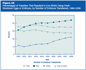
Figure 59 is a line graph with four lines representing percentages of transfers that resulted in live births using fresh nondonor eggs or embryos, by number of embryos transferred, and by year from 1999 to 2008.
- 1999: One, 11.5%; Two, 30.9%; Three, 35.4%; Four or more, 31.2%
- 2000: One, 9.8%; Two, 34.8%; Three, 34.9%; Four or more, 29.6%
- 2001: One, 11.3%; Two, 37.2%; Three, 36.7%; Four or more, 30.9%
- 2002: One, 12.8%; Two, 39.5%; Three, 37.7%; Four or more, 31.4%
- 2003: One, 13.2%; Two, 40.2%; Three, 36.9%; Four or more, 30.1%
- 2004: One, 13.7%; Two, 40.0%; Three, 35.4%; Four or more, 28.8%
- 2005: One, 16.7%; Two, 40.9%; Three, 34.3%; Four or more, 27.6%
- 2006: One, 18.8%; Two, 41.9%; Three, 35.1%; Four or more, 27.9%
- 2007: One, 20.8%; Two, 42.6%; Three, 34.8%; Four or more, 27.8%
- 2008: One, 22.0%; Two, 43.7%; Three, 34.7%; Four or more, 27.2%
Figure 60: Percentages of Transfers That Resulted in Live Births Among Women Who Were Younger Than 35 and Set Aside Extra Embryos for Future Use, by Number of Embryos Transferred, 1999–2008.
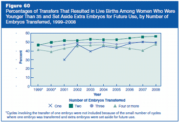
Figure 60 is a line graph with four lines representing percentages of transfers that resulted in live births among women who were younger than 35 and set aside extra embryos for future use, by number of embryos transferred, and by year from 1999 to 2008. Note: For years 1999 and 2000, cycles involving the transfer of one embryo were not included because of the small number of cycles where one embryo was transferred and extra embryos were set aside for future use.
- 1999: Two, 46.5%; Three, 47.3%; Four or more, 41.4%
- 2000: Two, 49.8%; Three, 44.8%; Four or more, 39.1%
- 2001: One, 30.0%; Two, 51.7%; Three, 46.9%; Four or more, 42.9%
- 2002: One, 47.4%; Two, 51.8%; Three, 49.5%; Four or more, 45.5%
- 2003: One, 39.5%; Two, 53.3%; Three, 49.2%; Four or more, 46.5%
- 2004: One, 45.3%; Two, 52.7%; Three, 49.8%; Four or more, 46.8%
- 2005: One, 43.3%; Two, 52.8%; Three, 47.5%; Four or more, 45.1%
- 2006: One, 48.5%; Two, 54.5%; Three, 49.6%; Four or more, 42.8%
- 2007: One, 50.2%; Two, 55.9%; Three, 50.1%; Four or more, 40.6%
- 2008: One, 49.4%; Two, 56.5%; Three, 49.6%; Four or more, 47.6%
Figure 61: Percentages of ART Cycles That Resulted in Multiple-Infant Live Births, by Type of ART Cycle, 1999–2008.
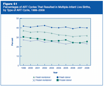
Figure 61 is a line graph with four lines representing percentages of ART cycles that resulted in multiple-infant live births, by type of ART cycle, and by year from 1999 to 2008.
- 1999: Fresh nondonor 37.0%, Frozen nondonor 27.1%, Fresh donor 41.8%, Frozen donor 30.4%
- 2000: Fresh nondonor 35.3%, Frozen nondonor 25.8%, Fresh donor 40.6%, Frozen donor 29.1%
- 2001: Fresh nondonor 35.8%, Frozen nondonor 26.8%, Fresh donor 41.7%, Frozen donor 28.4%
- 2002: Fresh nondonor 35.4%, Frozen nondonor 24.6%, Fresh donor 42.4%, Frozen donor 27.3%
- 2003: Fresh nondonor 34.2%, Frozen nondonor 25.3%, Fresh donor 40.3%, Frozen donor 26.0%
- 2004: Fresh nondonor 32.5%, Frozen nondonor 24.2%, Fresh donor 40.0%, Frozen donor 26.2%
- 2005: Fresh nondonor 32.0%, Frozen nondonor 22.7%, Fresh donor 40.8%, Frozen donor 27.1%
- 2006: Fresh nondonor 30.7%, Frozen nondonor 24.2%, Fresh donor 39.1%, Frozen donor 24.2%
- 2007: Fresh nondonor 31.3%, Frozen nondonor 24.1%, Fresh donor 40.3%, Frozen donor 23.9%
- 2008: Fresh nondonor 31.7%, Frozen nondonor 22.9%, Fresh donor 39.9%, Frozen donor 25.4%
Figure 62: Percentages of Multiple-Infant Live Births for ART Cycles Using Fresh Nondonor Eggs or Embryos, by Age of Woman, 1999–2008.
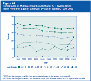
Figure 62 is a line graph with five lines representing percentages of multiple-infant live births for ART cycles using fresh nondonor eggs or embryos, by age of woman, and by year from 1999 to 2008.
- 1999: Age <35, 41.1%; Age 35–37, 35.8%; Age 38–40, 28.5%; Age 41–42, 14.5%; Age >42, 12.2%
- 2000: Age <35, 38.6%; Age 35–37, 35.3%; Age 38–40, 27.2%; Age 41–42, 17.6%; Age >42, 12.2%
- 2001: Age <35, 39.7%; Age 35–37, 34.7%; Age 38–40, 27.2%; Age 41–42, 17.9%; Age >42, 14.4%
- 2002: Age <35, 38.9%; Age 35–37, 35.4%; Age 38–40, 26.9%; Age 41–42, 18.6%; Age >42, 6.5%
- 2003: Age <35, 38.4%; Age 35–37, 32.1%; Age 38–40, 26.1%; Age 41–42, 17.4%; Age >42, 10.2%
- 2004: Age <35, 36.1%; Age 35–37, 31.5%; Age 38–40, 24.9%; Age 41–42, 16.8%; Age >42, 8.2%
- 2005: Age <35, 35.6%; Age 35–37, 30.9%; Age 38–40, 25.1%; Age 41–42, 14.5%; Age >42, 12.8%
- 2006: Age <35, 34.4%; Age 35–37, 29.8%; Age 38–40, 22.6%; Age 41–42, 15.4%; Age >42, 9.4%. Note: 2006 was the last year in which data were reported together for women older than 42.
- 2007: Age <35, 34.9%; Age 35–37, 30.4%; Age 38–40, 23.9%; Age 41–42, 15.4%; Age 43–44, 8.9; Age >44, 13%. Note: 2007 was the first year in which data for women older than 42 were subdivided into ages 43-44 and >44.
- 2008: Age <35, 35.4%; Age 35–37, 30.0%; Age 38–40, 25.2%; Age 41–42, 15.9%; Age 43–44, 11.3%; Age >44, 23.8%
Figure 63: Percentages of Transfers That Resulted in Live Births and Percentages of Multiple-Infant Live Births for ART Cycles Using Fresh Nondonor Eggs or Embryos, 1999–2008.
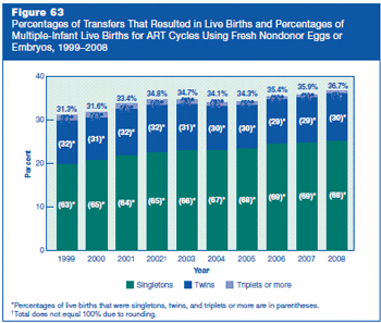
Figure 63 is a bar graph representing percentages of transfers that resulted in live births and percentages of multiple-infant live births for ART cycles using fresh nondonor eggs or embryos, by year from 1999 to 2008.
- 1999: Percentage of live births, 31.3%. Of these live births—63% were singletons, 32% were twins, and 5% were triplets or more.
- 2000: Percentage of live births, 31.6%. Of these live births—65% were singletons, 31% were twins, and 4% were triplets or more.
- 2001: Percentage of live births, 33.4%. Of these live births—64% were singletons, 32% were twins, and 4% were triplets or more.
- 2002: Percentage of live births, 34.8%. Of these live births—65% were singletons, 32% were twins, and 4% were triplets or more. Note: Total does not equal 100% due to rounding.
- 2003: Percentage of live births, 34.7%. Of these live births—66% were singletons, 31% were twins, and 3% were triplets or more.
- 2004: Percentage of live births, 34.1%. Of these live births—67% were singletons, 30% were twins, and 3% were triplets or more.
- 2005: Percentage of live births, 34.3%. Of these live births—68% were singletons, 30% were twins, and 2% were triplets or more.
- 2006: Percentage of live births, 35.4%. Of these live births—69% were singletons, 29% were twins, and 2% were triplets or more.
- 2007: Percentage of live births, 35.9%. Of these live births—69% were singletons, 29% were twins, and 2% were triplets or more.
- 2008: Percentage of live births, 36.7%. Of these live births—68% were singletons, 30% were twins, and 2% were triplets or more.
Contact Us:
- Centers for Disease Control and Prevention
1600 Clifton Rd
Atlanta, GA 30333 - 800-CDC-INFO
(800-232-4636)
TTY: (888) 232-6348 - New Hours of Operation
8am-8pm ET/Monday-Friday
Closed Holidays - cdcinfo@cdc.gov
