Every year, there seems to be a handful of maps that fascinate the masses and fire up the social media platforms. Listed here are some of the more fascinating maps and GIS data visualizations that caught the public's attention this year.
Wind Map
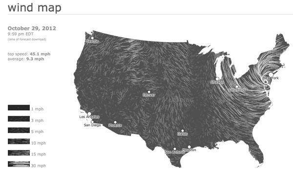
Pulling near real time surface wind data comes from the National Digital Forecast Database, this dynamic wind map is incredibly calming to view. The data is pulled once an hour. Hovering over any point brings up a pop-up with windspeed and coordinates. Clicking zooms in to see a more large scale animation of localized wind patterns. As the site mentions, the wind map was created as a personal art project so the information is limited. There is a legend to indicate the intensity of wind speeds and a few labels indicating the locations of major U.S. cities. The more solid and white the lines, the stronger the wind speed. The project is a creation of Fernanda Viégas and Martin Wattenberg of the site HINT.FM which hosts a range of data visualizations. The two lead Google's "Big Picture" visualization research group based in Cambridge, Massachusetts. The artists note on their site, "We invent new ways for people to think and talk about data" and this wind map certainly achieved that.
A visit to the Wind Map site as Hurricane Sandy bore down on the East Coast:

Wind Map Captures Hurricane Sandy.
United States of Starbucks
The intense proliferation of retail outlets like McDonalds and Starbucks also lends itself to data visualizations. Citing Stephen Von Worley's influence (he visualized all the McDonald's in the United States), James Davenport mapped out the locations of all the Starbucks in the U.S. By connecting all the points, Davenport came up with two maps (the first using a Delaunay triangulation, the second (below) uses a Voronoi diagram), with the end results echoing the population centers of the United States when mapped out. Davenport concluded his analysis by graphing out the proximity of a mapped Starbucks location to residents and found that 80% of the country's population lives within 20 miles of a standalone Starbucks (the analysis did not factor in Starbucks locations found within another store).

Voronoi diagram for every Starbucks location. Map by James Davenport.
Historical Hurricane Paths
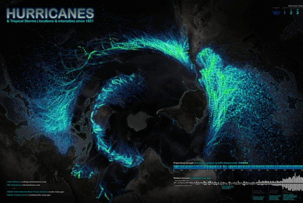
John Nelson of IDV Solutions mapped out historic hurricane and tropical storm paths. Using storm data from NOAA, Nelson mapped out known storm locations dating back to 1851. Using a polar projection (South Pole Stereographic with Antarctica in the middle of the map, the Americas to the right, Africa at the bottom, and Australia and Asia to the left), Nelson mapped out the intensity by color which created a visually appealing display (the darkest green is the highest intensity, light blue is the lowest intensity storm).

Map of hurricanes and tropical storms since 1851.
Population Density Map
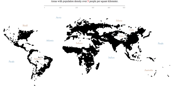
Derek Watkins, whose stream nomenclature map went viral last year, produced another intriguing map earlier this year showing a sliding scale population density of the world. Using 2010 data from CIESIN Gridded Population of the World, Watkins plotted out a series of maps showing the population density of the world based on people per kilometer. The sliding scale adjusts the people per kilometer in increments of 5. Other than a smattering of labels, the sliding scale map shows no geographic features. At the lowest density, the continents are clearly visible and but rapidly disappear with the exception of the regions of Asia as the population density increases towards 75 people/km.

Map of population density by Derek Watkins.
Essential Geography of the United States
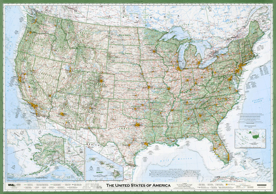
Although Dave Imus won Best of Show back in 2010 from the Cartography and Geographic Information Society (CaGIS) as part of its 2010 Annual Map Design Competition, it wasn't until a January 2, 2012 article in Slate that enthusiasm for his Essential Geography of the United States map exploded. The intensely detailed map of the United States features a wealth of information all carefully hand labeled.

The Essential Geography of the United States of America by Dave Imus.
European Time Lapse Video
Originally created by Frank E. Reed of Centennia Software, a couple of unknown East Europeans bootlegged the animation and set it to dramatic music by Hans Zimmer from the film Inception to create a video that went viral. The video features the changing borders of Europe from the year 1000 CE to the present. Centennia is a company whose feature product is a "map-based guide to the history of Europe and the Middle East from the beginning of the 11th century to the present. It is a dynamic, animated historical atlas including over 9,000 border changes".


One Response to “Six of this Year’s Most Riveting Maps” Leave a reply ›
European Time Lapse Video should have a year counter somewhere on it (for example, in the upper left corner, which luckily has the Atlantic Ocean there, and which as such has not changed the borders. I also believe that it would be beneficial to have the year counter set-able to pause at given intervals, preferably per viewers' desires (i.e., selectable). Otherwise, the map is fascinating.