
- Overview
- GIS at NCI
- Spatial Data Analysis
GIS at NCI
Spatial Data Analysis
NCI develops and extends methodology for spatial data analysis to improve the identification of patterns of cancer rates and trends and to highlight areas in need of cancer control interventions. Areas of active research include:
- Environmental exposure assessment
- Statistical modeling
- Outlier detection for cancer surveillance
- Cluster identification
Environmental Exposure Assessment
- GIS can provide information about potential environmental exposures that cannot be obtained through traditional epidemiologic methods.
- Study in south central Nebraska demonstrated use of satellite imagery to reconstruct historical crop patterns (Ward et al., Env Health Perspectives, 2000).
-
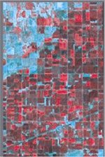
Landsat Imagery
Color infrared display
of bands 4,2,1 -
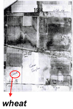
Farm Service Agency
Historical aerial photos
with crops noted -
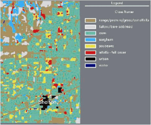
Classified Land Cover Map
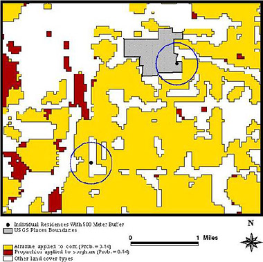
Example: Epidemiologic Study of Non-Hodgkin's Lymphoma (NHL)
In an epidemiologic study of non-Hodgkin's lymphoma, NCI:
- mapped residences, then assessed proximity of residences to specific crop;
- assigned probabilities of exposure based on available pesticide use data for each crop; and
- demonstrated that zones of potential exposure to agricultural pesticides and proximity measures can be determined for residences.
Statistical Modeling
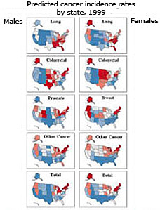
- Cancer incidence prediction project goal is to model data from NCI cancer registries (which cover 470 counties) to predict the number of cases in all states.
- Use hierarchical Poisson regression models to characterize associations between cancer incidence/mortality and sociodemographic/lifestyle factors by county.
- These factors explain spatial variation so well that no spatial correlation is needed in the model.
- Extensions of original models:
- Spatio-temporal prediction of cancer rates by state
- Predicted incidence is used to predict prevalence
- Predicted incidence is used to calculate % completeness of case ascertainment for each cancer registry
Covariate data available for all counties:
- cancer mortality rates
- sociodemographic factors (income, schooling, etc.)
- medical facilities
- cancer screening utilization
- smoking, obesity, no insurance
Output: Predicted Incidence Rates
-
Smoothed by County

-
Absolute Rates
-
Relative Rates

Pickle, Feuer, Edwards. U.S. Predicted Cancer Incidence, 1999: Complete maps by county
and state from spatial projection models. NIH Pub No 03-5435, 2003.
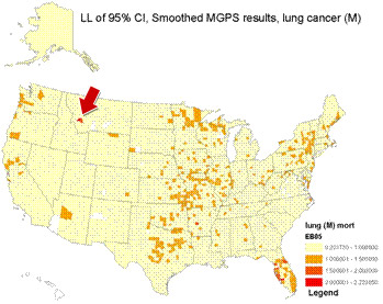
Outlier Detection for Cancer Surveillance
Lung cancer mortality rates
among white males, 1950-69
Observed rates:
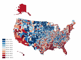
Smoothed rates (expected pattern):
- Can we detect significant outliers (unusual occurrences) of the # of new cancer cases?
- Applied an empirical Bayes data mining algorithm to test data (DuMouchel & Pregibon, Proc KDD, 2001; Lincoln Technologies, Inc)
- Method assumes Poisson distribution of # cases, estimates Relative Risk = observed/expected
- Lung cancer mortality, white males, 1950-69
- Smoothed map provided expected # cases per county
- Algorithm compared actual # cases to this expectation
-
Found known "hot spot" in MT, site of copper smelter (Lee & Fraumeni, JNCI, 1969)
Cluster Identification
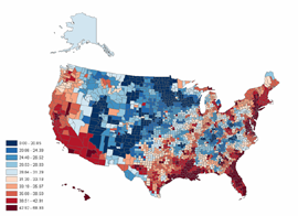
- Are apparent map clusters real or random noise?
- SaTScan software identifies most likely significant cluster over space, time or both
- Algorithm: spatial scan statistic for Poisson or Bernoulli event data, adjusts for population heterogeneity & covariates
- Originally identified circular clusters, new version scans for elliptical clusters, various shapes & angles
- Software: www.satscan.org
- Recently extended to clusters of survival rates
Developed by Martin Kulldorff: Stat in Med, 1995, 1996; Communications in Statistics, 1997; Am J Epidemiology, 1997; Am J Public Health, 1998.
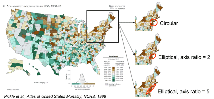
Examples of likely cluster of breast cancer mortality rates in the US [D]