
- Overview
- GIS at NCI
- Communicating Georeferenced Statistics
GIS at NCI
Communicating Georeferenced Statistics
State Cancer Profiles
The State Cancer Profiles website brings together data collected from public health surveillance systems in order to characterize the cancer burden in a standardized manner. It is hoped that health planners, policy makers and cancer information providers will be be able to use these descriptive cancer statistics to prioritize investements in cancer control.
- Goal: Focus cancer control efforts on places and persons who can most benefit.
- Audience: Health planners, policy makers, and advocates.
- Approach: Use interactive data visualization tools to explore the U.S. cancer burden.
Example: Linked Micromap Plots (LMPlots) go from Paper to the Web
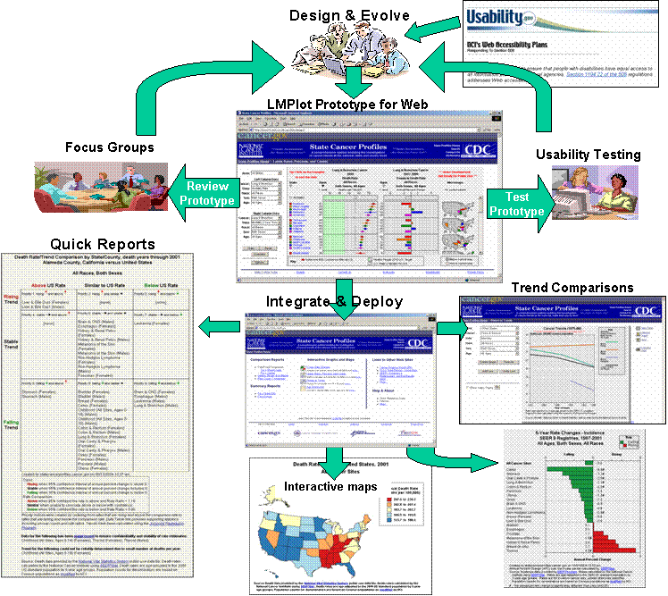
The process of getting LMPlots from paper to the website. [D]
B. Cancer Mortality Maps
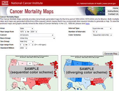
The Cancer Mortality Maps website provides dynamically generated maps for the time period 1950-2004 (1970-2004 only for Blacks). It also has archived maps and graphs from the publication, Atlas of Cancer Mortality in the U.S., 1950-94. Its features include:
- Dynamic, accessible graphs
- Interactive maps
- Downloadable data
-
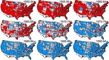
Cervix uteri cancer mortality, white females, 1950-94
-
Zooming capabilities
