End of Decade Corrections
The new intercensal population estimates provide an adjustment of previous population estimates based on the actual 2010 Census results. Since the previous population estimates were extrapolated from the 2000 Census, they were prone to increased error as the time from the actual 2000 Census increased. At the national level, the new estimates are not very different from the previous estimates. However, there are more significant differences at the state and county levels that may result in changes in previously published cancer rates.
Graphs Comparing New Population Estimates to Previous Estimates
To summarize the differences between the new estimates and the previous estimates, we have generated a set of time-series graphs for each of the 50 states, the District of Columbia, and the seven SEER registry areas that consist of a portion of a state. Due to difficulties in estimating net migration between censuses, there tends to be more of a difference in the estimates for the more mobile younger populations. Separate plots for ages less than 50 and ages 50 and over have been provided to show the potential differential impact on age adjusted rates depending on the age-profile of the cancer site.
The graphs show trends over time for area populations from the previous and new population estimates and compares them to the actual count from the 2010 Census. The estimates are for the population on July 1 of each year. The 2010 Census count is for the population on April 1, 2010.
On each graph, the years between 2000 and 2011 are on the x-axis and populations are on the y-axis. In order to better show differences in the data, populations on the y-axis do not begin at zero. There are four data sources on each graph: the previous vintage 2009 population estimates for 2000-2009, the new corrected intercensal year population estimates for 2000-2009, the new vintage 2011 population estimates for 2010-2011, and the actual count from the 2010 Census.
-
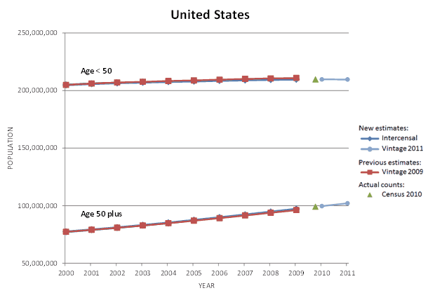
For the United States, the new estimates for age < 50 are about the same as the previous estimates. The new estimates for age 50 plus are about the same as the previous estimates.
-
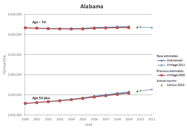
For Alabama, the new estimates for age < 50 are about the same as the previous estimates. The new estimates for age 50 plus are about the same as the previous estimates.
-
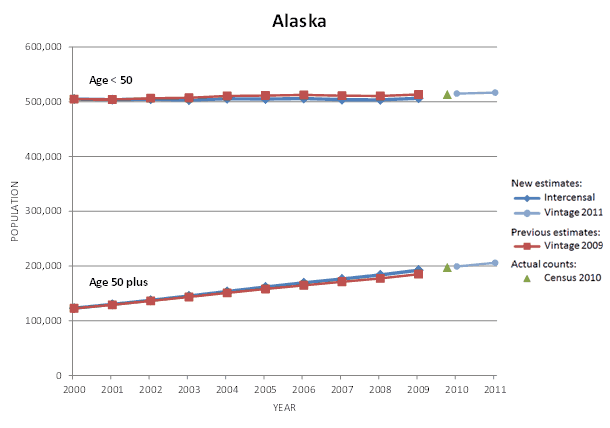
For Alaska, the new estimates for age < 50 are slightly lower than the previous estimates. The new estimates for age 50 plus are slightly higher than the previous estimates.
-
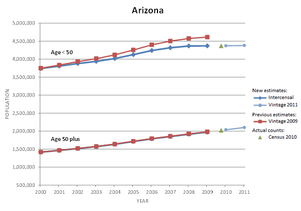
For Arizona, the new estimates for age < 50 are lower than the previous estimates. The new estimates for age 50 plus are about the same as the previous estimates.
-
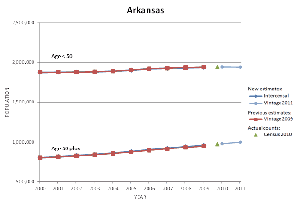
For Arkansas, the new estimates for age < 50 are about the same as the previous estimates. The new estimates for age 50 plus are about the same as the previous estimates.
-

For California, the new estimates for age < 50 are about the same as the previous estimates. The new estimates for age 50 plus are about the same as the previous estimates.
-
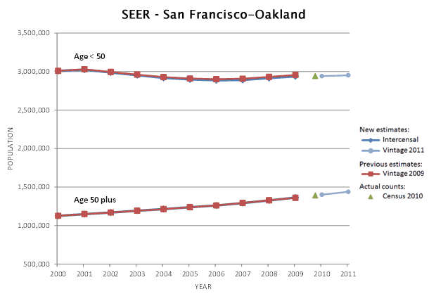
For the San Francisco-Oakland SEER area, the new estimates for age < 50 are about the same as the previous estimates. The new estimates for age 50 plus are about the same as the previous estimates.
-
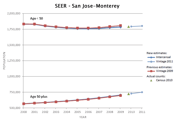
For the San Jose-Monterey SEER area, the new estimates for age < 50 are slightly lower than the previous estimates. The new estimates for age 50 plus are about the same as the previous estimates.
-
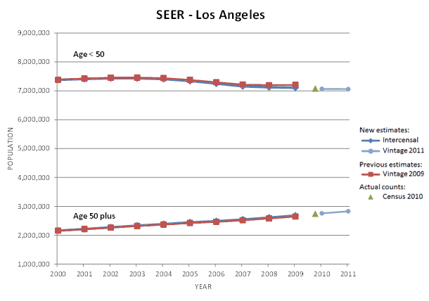
For the Los Angeles SEER area, the new estimates for age < 50 are slightly lower than the previous estimates. The new estimates for age 50 plus are about the same as the previous estimates.
-
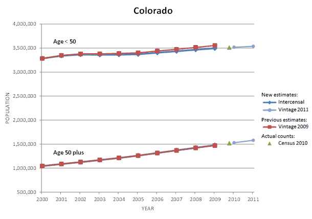
For Colorado, the new estimates for age < 50 are slightly lower than the previous estimates. The new estimates for age 50 plus are about the same as the previous estimates.
-
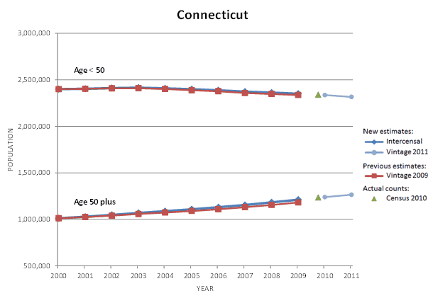
For Connecticut, the new estimates for age < 50 are about the same as the previous estimates. The new estimates for age 50 plus are slightly higher than the previous estimates.
-
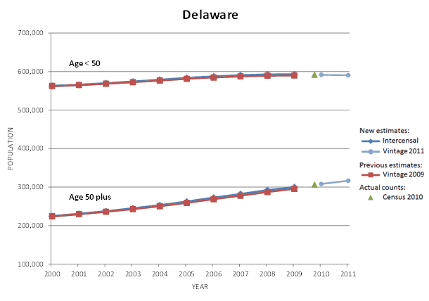
For Delaware, the new estimates for age < 50 are about the same as the previous estimates. The new estimates for age 50 plus are about the same as the previous estimates.
-
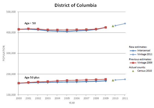
For the District of Columbia, the new estimates for age < 50 are slightly lower than the previous estimates. The new estimates for age 50 plus are slightly lower than the previous estimates.
-
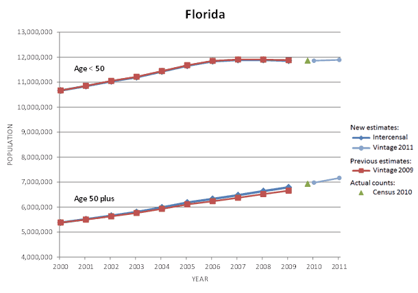
For Florida, the new estimates for age < 50 are about the same as the previous estimates. The new estimates for age 50 plus are slightly higher than the previous estimates.
-
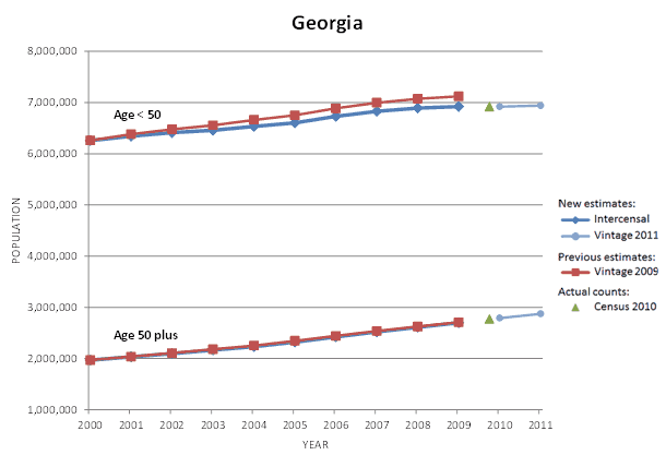
For Georgia, the new estimates for age < 50 are lower than the previous estimates. The new estimates for age 50 plus are about the same as the previous estimates.
-
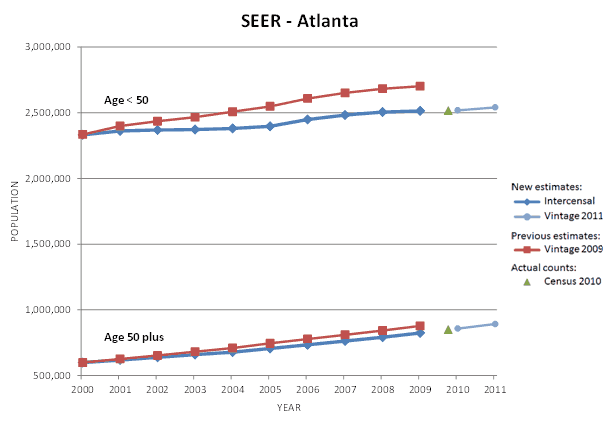
For the Atlanta SEER area, the new estimates for age < 50 are lower than the previous estimates. The new estimates for age 50 plus are slightly lower than the previous estimates.
-
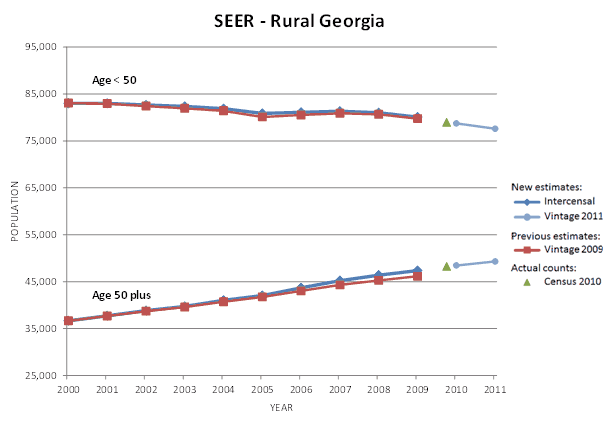
For the Rural Georgia SEER area, the new estimates for age < 50 are about the same as the previous estimates. The new estimates for age 50 plus are slightly higher than the previous estimates.
-
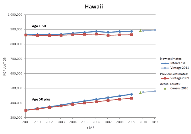
For Hawaii, the new estimates for age < 50 are higher than the previous estimates. The new estimates for age 50 plus are higher than the previous estimates.
-
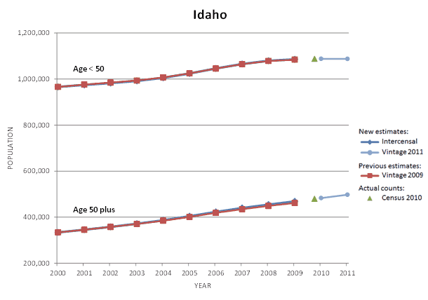
For Idaho, the new estimates for age < 50 are about the same as the previous estimates. The new estimates for age 50 plus are about the same as the previous estimates.
-
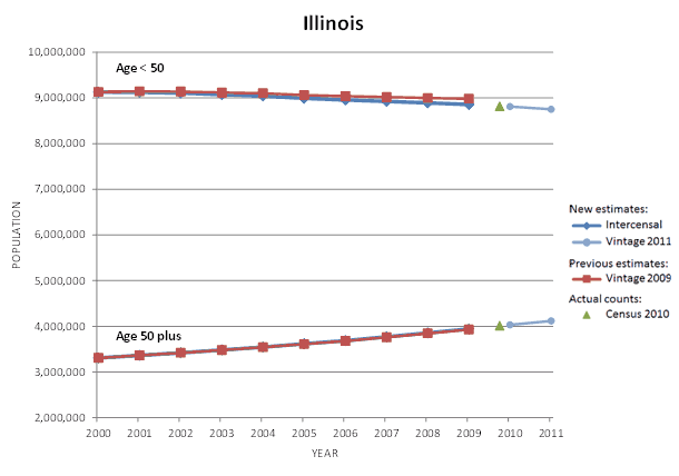
For Illinois, the new estimates for age < 50 are slightly lower than the previous estimates. The new estimates for age 50 plus are about the same as the previous estimates.
-
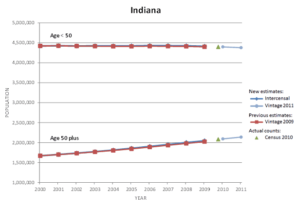
For Indiana, the new estimates for age < 50 are about the same as the previous estimates. The new estimates for age 50 plus are about the same as the previous estimates.
-
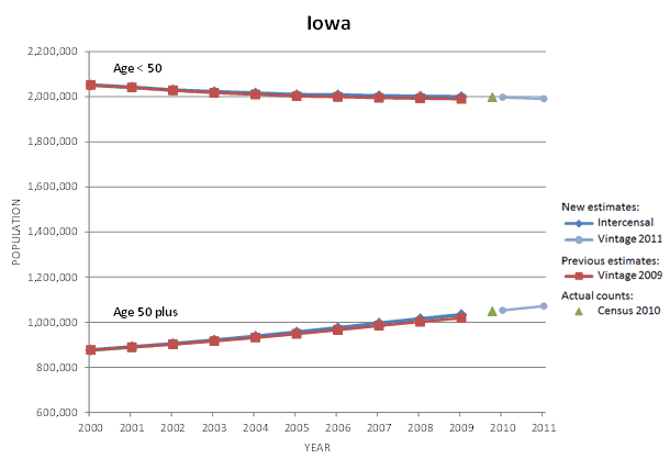
For Iowa, the new estimates for age < 50 are about the same as the previous estimates. The new estimates for age 50 plus are about the same as the previous estimates.
-
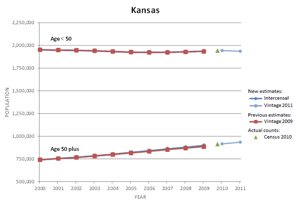
For Kansas, the new estimates for age < 50 are about the same as the previous estimates. The new estimates for age 50 plus are about the same as the previous estimates.
-
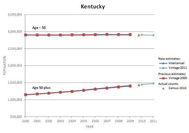
For Kentucky, the new estimates for age < 50 are about the same as the previous estimates. The new estimates for age 50 plus are about the same as the previous estimates.
-

For Louisiana, the new estimates for age < 50 are slightly higher than the previous estimates. The new estimates for age 50 plus are about the same as the previous estimates.
-
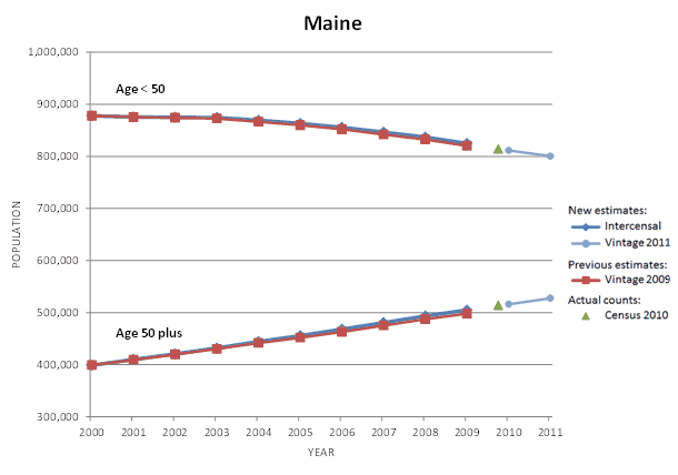
For Maine, the new estimates for age < 50 are about the same as the previous estimates. The new estimates for age 50 plus are about the same as the previous estimates.
-
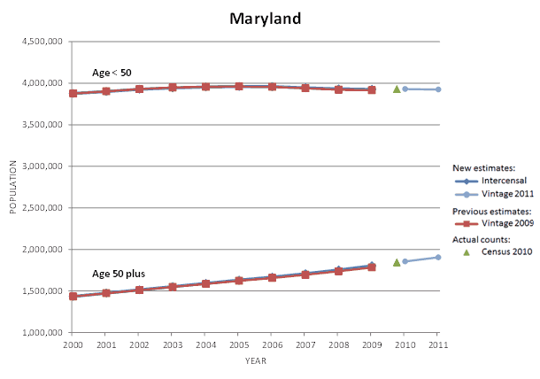
For Maryland, the new estimates for age < 50 are about the same as the previous estimates. The new estimates for age 50 plus are about the same as the previous estimates.
-
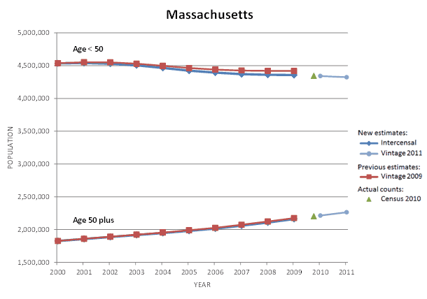
For Massachusetts, the new estimates for age < 50 are slightly lower than the previous estimates. The new estimates for age 50 plus are about the same as the previous estimates.
-

For Michigan, the new estimates for age < 50 are slightly lower than the previous estimates. The new estimates for age 50 plus are about the same as the previous estimates.
-
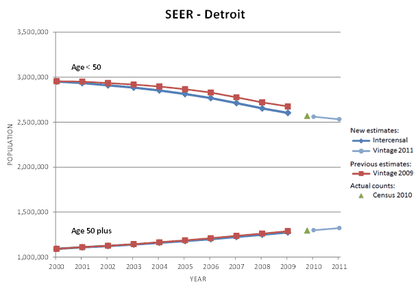
For the Detroit SEER area, the new estimates for age < 50 are lower than the previous estimates. The new estimates for age 50 plus are about the same as the previous estimates.
-
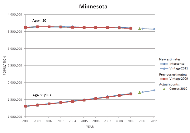
For Minnesota, the new estimates for age < 50 are about the same as the previous estimates. The new estimates for age 50 plus are about the same as the previous estimates.
-
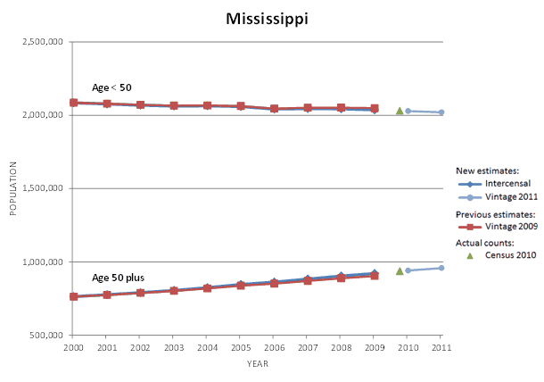
For Mississippi, the new estimates for age < 50 are about the same as the previous estimates. The new estimates for age 50 plus are about the same as the previous estimates.
-
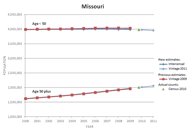
For Missouri, the new estimates for age < 50 are slightly lower than the previous estimates. The new estimates for age 50 plus are about the same as the previous estimates.
-
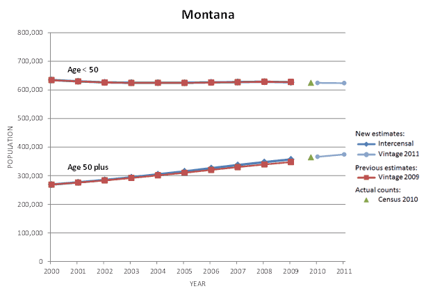
For Montana, the new estimates for age < 50 are about the same as the previous estimates. The new estimates for age 50 plus are slightly higher than the previous estimates.
-
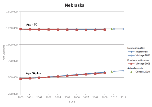
For Nebraska, the new estimates for age < 50 are about the same as the previous estimates. The new estimates for age 50 plus are about the same as the previous estimates.
-
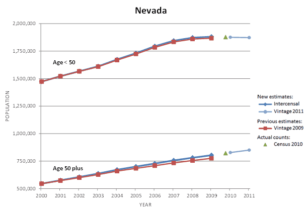
For Nevada, the new estimates for age < 50 are about the same as the previous estimates. The new estimates for age 50 plus are slightly higher than the previous estimates.
-
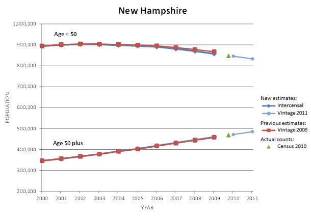
For New Hampshire, the new estimates for age < 50 are slightly lower than the previous estimates. The new estimates for age 50 plus are about the same as the previous estimates.
-
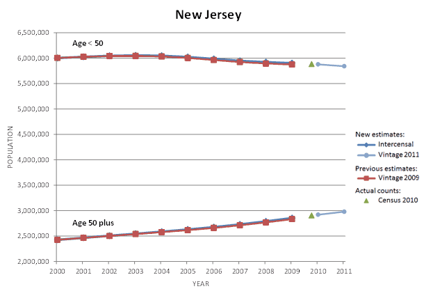
For New Jersey, the new estimates for age < 50 are about the same as the previous estimates. The new estimates for age 50 plus are about the same as the previous estimates.
-
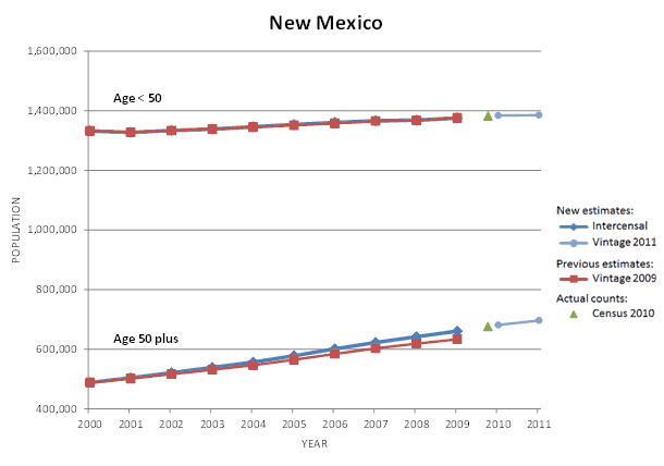
For New Mexico, the new estimates for age < 50 are about the same as the previous estimates. The new estimates for age 50 plus are slightly higher than the previous estimates.
-
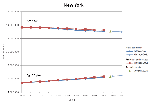
For New York, the new estimates for age < 50 are slightly lower than the previous estimates. The new estimates for age 50 plus are about the same as the previous estimates.
-

For North Carolina, the new estimates for age < 50 are about the same as the previous estimates. The new estimates for age 50 plus are slightly higher than the previous estimates.
-
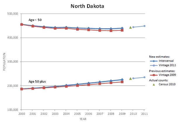
For North Dakota, the new estimates for age < 50 are slightly higher than the previous estimates. The new estimates for age 50 plus are slightly higher than the previous estimates.
-
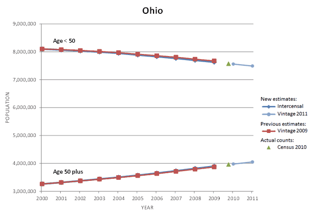
For Ohio, the new estimates for age < 50 are about the same as the previous estimates. The new estimates for age 50 plus are about the same as the previous estimates.
-

For Oklahoma, the new estimates for age < 50 are about the same as the previous estimates. The new estimates for age 50 plus are slightly higher than the previous estimates.
-
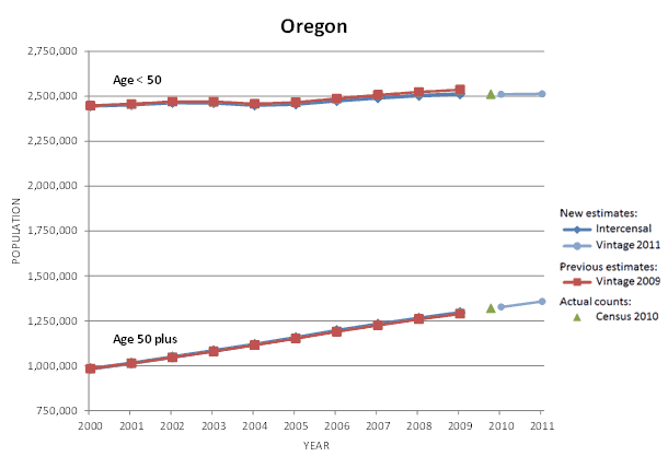
For Oregon, the new estimates for age < 50 are slightly lower than the previous estimates. The new estimates for age 50 plus are about the same as the previous estimates.
-
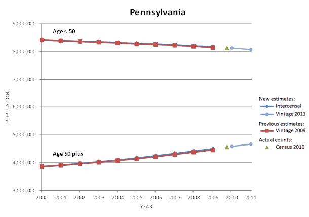
For Pennsylvania, the new estimates for age < 50 are about the same as the previous estimates. The new estimates for age 50 plus are about the same as the previous estimates.
-
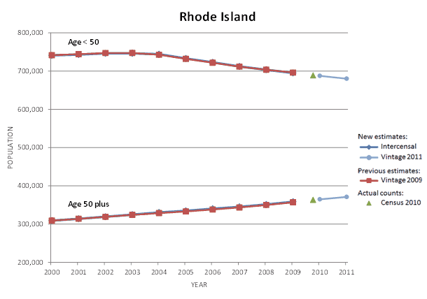
For Rhode Island, the new estimates for age < 50 are about the same as the previous estimates. The new estimates for age 50 plus are about the same as the previous estimates.
-
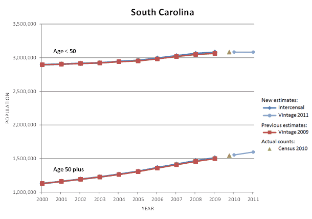
For South Carolina, the new estimates for age < 50 are about the same as the previous estimates. The new estimates for age 50 plus are about the same as the previous estimates.
-
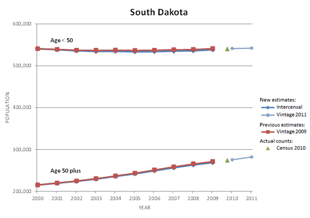
For South Dakota, the new estimates for age < 50 are about the same as the previous estimates. The new estimates for age 50 plus are about the same as the previous estimates.
-
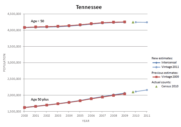
For Tennessee, the new estimates for age < 50 are about the same as the previous estimates. The new estimates for age 50 plus are about the same as the previous estimates.
-
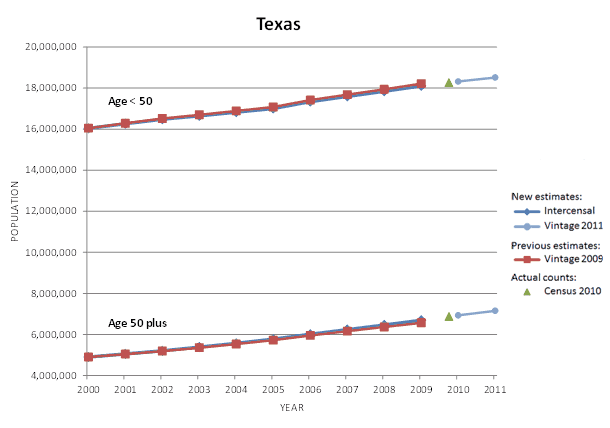
For Texas, the new estimates for age < 50 are about the same as the previous estimates. The new estimates for age 50 plus are about the same as the previous estimates.
-
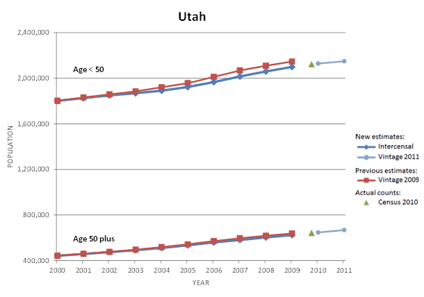
For Utah, the new estimates for age < 50 are slightly lower than the previous estimates. The new estimates for age 50 plus are about the same as the previous estimates.
-

For Vermont, the new estimates for age < 50 are about the same as the previous estimates. The new estimates for age 50 plus are about the same as the previous estimates.
-
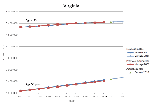
For Virginia, the new estimates for age < 50 are about the same as the previous estimates. The new estimates for age 50 plus are about the same as the previous estimates.
-
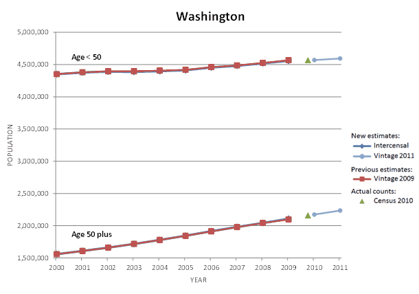
For Washington, the new estimates for age < 50 are about the same as the previous estimates. The new estimates for age 50 plus are about the same as the previous estimates.
-
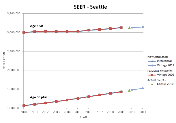
For the Seattle SEER area, the new estimates for age < 50 are about the same as the previous estimates. The new estimates for age 50 plus are about the same as the previous estimates.
-
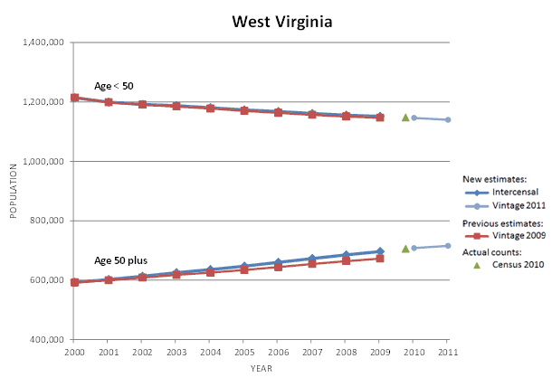
For West Virginia, the new estimates for age < 50 are about the same as the previous estimates. The new estimates for age 50 plus are slightly higher than the previous estimates.
-
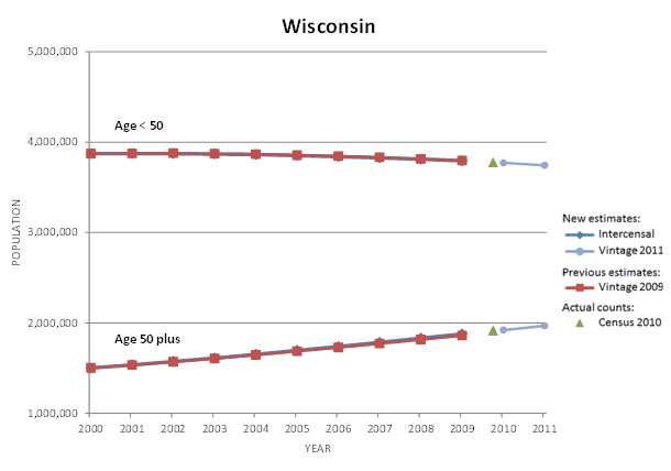
For Wisconsin, the new estimates for age < 50 are about the same as the previous estimates. The new estimates for age 50 plus are about the same as the previous estimates.
-
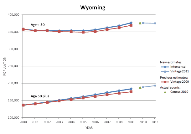
For Wyoming, the new estimates for age < 50 are slightly higher than the previous estimates. The new estimates for age 50 plus are slightly higher than the previous estimates.
