Making Your Website Senior Friendly
This tip sheet offers research-based guidelines that can help you create websites that work well for older adults, the fastest-growing group of Internet users. Besides sending and receiving email, older adults search the web for health, financial, and religious or spiritual information. They also use the Internet to shop, play games, perform genealogy searches, and book travel. As the baby boomers age, the number of older adults using the Internet will continue to grow, and web designers will increasingly be called on to tailor websites to this population.
This tip sheet is organized into the following sections:
- Basing Web Design on Research
- Organizing Web Information for Older Adults
- Writing Online Text for Older Adults
- Designing Readable Online Text for Older Adults
- Making Web Information Easy for Older Adults to Find
- Including Other Media
- Making Sure That Older Adults Can Use Your Website
Key Tips for Making Your Website Senior Friendly
Visit www.NIHSeniorHealth.gov for an example of a website that incorporates these senior-friendly guidelines. |
Basing Web Design on Research
In the last two decades, the National Institute on Aging, part of the Federal Government's National Institutes of Health at the U.S. Department of Health and Human Services, and others have supported studies about aging, cognition, and computer use among older adults. Usability tests, focus groups, and survey research have also been conducted to see how age-associated changes affect older adults' use of the web.
Research has shown that older age is not in itself a hindrance to computer or Internet use. However, older adults' use of electronic technology may be affected by age-related changes in vision and in cognition—for example, the ability to remember, learn, think, and reason. Cognitive abilities that change with age and that are likely to affect computer use include working memory, perceptual speed, text comprehension, attentional functioning, and spatial memory, all of which are described in later sections of this tip sheet.
Good web design can help counteract many of these age-related changes. Use of the appropriate typeface, colors, writing style, navigation structure, and accessibility features can make a website easier for older adults to access. Furthermore, good web design is beneficial for web users of any age.
Organizing Web Information for Older Adults
Many older adults have had little training in the use of computers and the Internet and are unfamiliar with the way information on websites is organized. In addition, changes in working memory may affect their ability to simultaneously grasp, retain, and manage new information. Declines in perceptual speed can increase the time it takes to process information. A website with a simple design, uncluttered layout, clear labels, and short sections of information can make it easier for older adults to select content, absorb and retain what they read, and avoid information overload. Here are some guidelines:
Make it clear how the information on the website is organized. Users should easily be able to determine what information your site offers and how it is organized. They should be able to figure out a starting point and predict what type of information a link will lead them to. It should also be clear how they can find more information as well as how to return to previously visited pages.
Keep the website structure simple and straightforward. A broad and shallow site hierarchy reduces complexity and makes it easier for visitors to learn how information is organized.
Break information into short sections. Giving people a small amount of content at one time makes it easier for them to grasp and recall information.
Group related topics visually. Use page layout to show how information is organized.
Write a clear, informative heading for each section. Clear headings give people anchors on the page and help them select desired content. For example, headings can be:
Topics
- Arthritis
- Diabetes
Action Verbs ("ing" words)
- Caring for Someone with Alzheimer's
- Eating Well as You Get Older
Questions
- How do cataracts develop?
- What causes dry mouth?
Put key information first. The most important information should be located where people can find it most easily—at the top of the website and at the top of a web page.
Put the sections in logical order. Think about how older adults might look for information.
Provide a site map. Link the site map from every page.
Writing Online Text for Older Adults
Age-related changes in text comprehension can make it harder for older adults to understand written material that is not expressed in a straightforward or concrete manner. Changes in attentional functioning may make it more difficult for older people to stay focused on specific information and eliminate distractions. Many older adults may be unfamiliar with technical language and jargon. To keep the text senior friendly:
Limit the number of points you make. Stick to one to five messages in each section. Keeping your information brief can make it easier for web users to stay focused.
Put the key message first. Putting the main message at the beginning ensures that your website visitors will see it.
Keep paragraphs and sentences short. Paragraphs should express one main idea. Sentences should be simple and straightforward.
Write in the active voice. The active voice puts the focus on people and actions.
Avoid:
Prescription medicines are taken by many older adults.
Use instead:
Many older adults take prescription medicines.
Write in the positive. Be especially aware of words that have negative meaning such as "forget," "until," and "unless." Instead of combining them with "not," rewrite the sentence with a positive word.
Avoid:
Don't forget to take your medicine.
Use instead:
Remember to take your medicine.
Explain clearly; don't make people guess what you mean. Be direct.
Avoid:
Restaurants that offer senior discounts may be a good choice for older adults who like to eat out.
Use instead:
If you like to eat out, go to restaurants that offer senior discounts.
Give specific instructions. These examples tell people exactly what to do:
Eat at least five servings of fruits and vegetables every day.
Exercise every day.
If the instructions have more than one step, number them.
How To Do an Ankle Stretch
- Sit securely toward the edge of a sturdy, armless chair.
- Stretch your legs out in front of you.
- With your heels on the floor, bend your ankles to point toes toward you.
- [The steps would continue like this.]
Address your web users by using "you." A direct instruction like "Exercise every day" is one way of writing for your web users, but not every message you want to give is such a direct instruction.
Avoid:
No matter where a person is, a sudden fall can be startling and upsetting. If someone falls, that person should stay as calm as possible.
Use instead:
Whether you're at home or somewhere else, a sudden fall can be startling and upsetting. If you do fall, stay as calm as possible.
Choose words your web users know. Minimize jargon and technical terms. Write in simple language. For example, to describe a place to exchange messages with other older adults on a website:
Avoid:
Online Community
Use instead:
Communicate with others online
Define unfamiliar terms. If you need to use a term that most older adults do not know, define it when you use it.
Kidney disease—also known as chronic kidney disease (CKD)—occurs when kidneys can no longer remove wastes and extra water from the blood as they should.
Hypertension is the medical term for high blood pressure.
Provide summary information. Summarizing information reinforces it and helps with recall. If you repeat information at different places in your site, make sure the messages are consistent.
Designing Readable Online Text for Older Adults
Vision commonly changes with age, often making reading from a computer screen difficult as the eyes become less sensitive and less able to detect light, color, and details. Keep these features in mind:
Space
- Allow sufficient white space on the web page to ensure an uncluttered look.
- Put a space between paragraphs.
- Allow enough space around clickable targets, such as links and buttons, so that each one is easy to target and hit separately.
Typeface
- Use a sans serif typeface.
- Use a typeface that is not condensed.
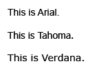
Arial is the most commonly used sans serif font today, but Tahoma and Verdana are also widely available and were developed specifically for the screen.
Type size
-
Use 12- or 14-point type size for body text.
Here is an example of 12-point type.Here is an example of 14-point type.
- Make it easy for people to change the text size directly from the screen. For example, on www.NIHSeniorHealth.gov, users can change the type size on any page using buttons at the top of the page:

Other websites allow users to adjust text size like this:
Change Text Size A A A
Type weight
- Use medium or boldface typeface.
- For headings, increase the size and weight or use a color. If you use bold for body text, make headings stand out with size or color.
Taking MedicinesMedicines and Your BodyUnderstanding how medicines work in your body can help you learn why it is important to use medicines safely and effectively. |
Capital and lowercase letters
- Put all text in uppercase and lowercase letters. Never use all capitals. All capitals take up more space. It is also more difficult to distinguish different letters in capitals.
TEXT IN ALL CAPITALS IS HARD TO READ.
Text in uppercase and lowercase is easier to read.
Avoid using italics
Italics are hard to read, especially online.
Justification
Left-justified type is best for older adults.
Left justification allows an even left margin and an uneven right margin. Lines start at the same place on the left side of the screen but do not always end at the same place on the right.
Backgrounds/Contrast
- Use dark type or graphics against a light background.
- Avoid patterned backgrounds.
- Make it easy for people to change contrast without having to use browser controls. For example, on www.NIHSeniorHealth.gov, you can change the contrast on any page using buttons at the top of the page.

Color
- Use high-contrast color combinations, such as black type against a white background. Avoid layering shades of the same color, such as dark blue type on a light blue background. Avoid colors that clash. For example, dark blue on red is very difficult on the eye.
- Avoid yellow and blue and green in close proximity. The differences in these colors are difficult for many older people to see.
- Use colors to group information visually.
Making Web Information Easy for Older Adults to Find
Computer conventions that younger people seem to use automatically—such as scrolling, clicking buttons and links, and using menus—may be unfamiliar to older adults. In addition, advanced age may bring changes in spatial memory, the ability to recall the location of objects in a given space and actually find them. Therefore, it is especially important for navigation elements to be consistent, explicit, and predictable.
Layout
Providing obvious and consistent "signposts" will help older adults orient themselves on your site.
- Use standard page designs (templates).
- Use the same symbols and icons throughout the site.
- Use the same set of navigation buttons in the same place on each page.
- Put the page title in the same place on each web page.
- Avoid using features that may distract attention, such as pop-ups and visuals that are not relevant to the task.
Navigation
- Use consistent navigation throughout the website.
- Use explicit step-by-step navigation whenever possible.
- Structure navigation to ensure that the fewest possible clicks are needed to achieve a given task.
- Incorporate buttons such as "Previous Page" and "Next Page" for ease of navigation between related web pages.
- Make sure that the "Back" button behaves predictably.
Menus
Make menus easy to use.
- If you use pull-down or fly-out menus, make them open and close on a click.
- Do not use menus that require users to slide the mouse and click all in one movement.
Links
- Write descriptive, easy-to-read links that help people predict what will happen next.
- Use action words (verbs) when the link is about taking an action.
Avoid:
My account
Use instead:
Go to my account
- Use words that are meaningful and understandable on their own. If you use "Click here," make the link include words that describe what will happen when the user clicks on that link.
Avoid:
Click here for more information on arthritis.
Use instead:
Click here for more information on arthritis.
- Each link in a list should start with different, distinct, and relevant keywords.
- Make links obviously clickable. Using color and underlining is the most common way of doing that. Do not underline anything that is not a link.
- Make visited links change color.
Icons and Buttons
Icons and buttons are easier to find when they are large, bright, and in a color that contrasts with the background.
- Use large buttons that do not require precise movements to activate.
- Make buttons and icons stand out. Colors for buttons and icons should be different from the color of the surrounding text.
- Make buttons obviously clickable.
Make bullets (in whatever shape: round, square, arrows) in navigation lists active links that go to the same place as the words that follow them.
Mouse
- Use single mouse clicks to access information.
- Treat double clicks as single clicks. That is, if a person clicks more than once on a link or button, accept the first click and ignore the other clicks.
Scrolling
- Do not use automatically scrolling text.
- Do not set pages so that people have to scroll horizontally.
- Minimize vertical scrolling.
- Avoid bars, rules, and other horizontal features that may suggest the bottom of a page when there is actually more below.
Search
- If the site has many pages and they cannot all be listed easily together, include a way to search your site using keywords.
- Make sure that the search box is in the same place on every page of the site. People expect to see the search box in the upper left or upper right side of the web page.
- Choose an easy-to-use search engine that doesn't require special characters or knowledge of Boolean logic.
- Be tolerant of what people put in "Search." For example, offer alternatives for misspellings.
Contact Information
- Provide a way to contact the site owners if people cannot find what they need on the site.
- Offer a telephone number for those who would prefer to talk to a person or provide an e-mail address for questions or comments.
Including Other Media
Because there are individual differences in the way people age, delivering information in a single format may not meet the needs of all older adults. For example, people with declining vision may find an audio format easier to understand, and those who have trouble reading may prefer video. In addition, research suggests that older adults who receive the same information in more than one mode retain more of it. Incorporating still images, video, audio, and other media into your website can support the learning needs of a wider range of older users.
Illustrations and photographs
- Make sure that pictures relate to the text. Visuals should support the text rather than being decoration, which can be distracting.
- Make sure that pictures of people reflect the diversity of your audience.
- Include pictures of older people when talking about, or to, older adults.
Animation, video, and audio
- Use short segments to reduce download time on older computers and dial-up connections.
- Provide transcripts of video and audio for accessibility.
Text alternatives
- Provide text alternatives such as open captioning or access to a static version of the text for all animation, video, and audio.
- Put Alt-Text tags with meaningful descriptions on images so that a screen-reader can tell a visually impaired person what the image shows. For more about using Alt-Text and other ways to make web pages accessible to people with special needs, go to www.section508.gov.
- Provide a speech function that lets users hear text read aloud. For example, on www.NIHSeniorHealth.gov, you can activate the speech function using buttons at the top of the page:

Making Sure That Older Adults Can Use Your Website
Following the guidelines in this tip sheet should make your website easier for older adults to use. In the end, however, you cannot know for sure how well the site will work for the older adults you are trying to serve until you watch and listen to some of them working with the site. Usability testing allows you to see how well your site will work while you are still developing it. In a usability test, you can watch and listen as a few people from your target audience try to do real tasks on the site. Conducting usability testing on your website can help you discover and correct problems early. By watching and listening to people trying out your site, you can also evaluate how accessible it is, whether people think it is friendly and inviting, and whether it has the information they are looking for.
When usability testing:
Observe older adults using the website. Watch and listen without training them, helping, or hinting.
Take notes. Note where people have problems, ask questions, or get lost.
Test throughout the design and development process. Start at the beginning when you may have only a paper prototype or just a few pages ready. Don't wait until it's all done because then it may be too late to make changes.
Use what you learn. Revise the site and then test again.
Resources
These resources were used in the development of this tip sheet.
Bernard, M., Chia, H.L., and Mills, M. Effects of font type and size on the legibility and reading time of online text by older adults. Conference paper, Association for Computing Machinery. Special Interest Group on Computer-Human Interaction. 2001. Available at http://psychology.wichita.edu/mbernard/articles/elderly.pdf
Bohan, M., and Scarlett, D. Can expanding targets make object selection easier for older adults? Usability News 5.1. February 2003. Available at www.surl.org/usabilitynews/51/Expanding-target.asp
Chadwick-Dias, A., McNulty, M., and Tullis, T. Web usability and age: How design changes can improve performance. Presentation, Aging by Design. September 2004.
Chisnell, D., Lee, A., and Redish, J.C. Recruiting and working with older participants. AARP. 2004. Available at www.aarp.org/olderwiserwired/oww-features/Articles/a2004-03-03-recruiting-participants.html
Chisnell, D., and Redish, J.C. Designing web sites for older adults: Expert review of usability for older adults at 50 web sites. AARP. February 2005. Available at www.aarp.org/olderwiserwired/oww-resources/designing_web_sites_for_older_adults_expert_review.html
Coyne, K.P., and Nielsen, J. Web Usability for Senior Citizens. Nielsen Norman Group. April 2002. Available at www.nngroup.com/reports/seniors.
Craik, F.I.M., and Salthouse, T.A. The Handbook of Aging and Cognition. Mahwah, NJ: Lawrence Erlbaum Associates, 2000.
Echt, K.V. Designing web-based health information for older adults: Visual considerations and design directives. In: R.W. Morrell (ed.). Older Adults, Health Information, and the World Wide Web, 61-88. Mahwah, NJ: Lawrence Erlbaum Associates, 2002.
Fox, S. Older Americans and the Internet. Pew Internet and American Life Project. March 2004. Available at www.pewinternet.org/PPF/r/117/report_display.asp
Fox, S. Generations Online Data Memo. Pew Internet and American Life Project. January 2009. Available at www.pewinternet.org/~/media//Files/Reports/2009/PIP_Generations_2009.pdf (87K)
Grahame, M., Laberge, J., and Scialfa, C. Age differences in search of web pages: The effects of link size, link number and clutter. Human Factors, 46: 385-98. 2004.
Gribbons, W. Functional illiteracy and the aging population: Creating appropriate design support. Presentation, Aging By Design. October 2006.
Morrell, R.W., ed. Older Adults, Health Information and the World Wide Web. Mahwah, NJ: Lawrence Erlbaum Associates, 2002.
Nahm, E., Preece, J., Resnick, B., and Mills, M.E. Usability of health web sites for older adults. Computers, Informatics, Nursing, 22(6):326-34. November/December 2004.
Redish, J.C., and Chisnell, D. Designing web sites for older adults: A review of recent research. AARP. 2004. Available at www.aarp.org/olderwiserwired/oww-resources/a_review_of_recent_literature_2004.html
U.S. Department of Health and Human Services. Research-Based Web Design and Usability Guidelines, version 2. 2006. Available from www.usability.gov/guidelines
Wright, P., Belt, S., and John, C. Fancy graphics can deter older users: A comparison of two interfaces for exploring healthy lifestyle options. In: E. O'Neill E., P. Palanque, and P. Johnson (eds.) People and Computers 17: Proceedings of HCI 200. Designing for Society, 315-25. London: Springer-Verlag Ltd. 2003.
For more information about health and aging, contact:
National Institute on Aging
Information Center
P.O. Box 8057
Gaithersburg, MD 20898-8057
800-222-2225 (toll-free)
800-222-4225 (TTY/toll-free)
www.nia.nih.gov
To order publications (in English or Spanish) or sign up for regular email alerts, visit www.nia.nih.gov/health
Visit NIHSeniorHealth (www.nihseniorhealth.gov), a senior-friendly website from the National Institute on Aging and the National Library of Medicine. This website has health information for older adults. Special features make it simple to use. For example, it has large type and a "talking" function that reads the text out loud.
FEBRUARY 2001 -- REVISED MARCH 2009
Publication Date: March 2009
Page Last Updated: January 11, 2013